Music Festival
Project Brief
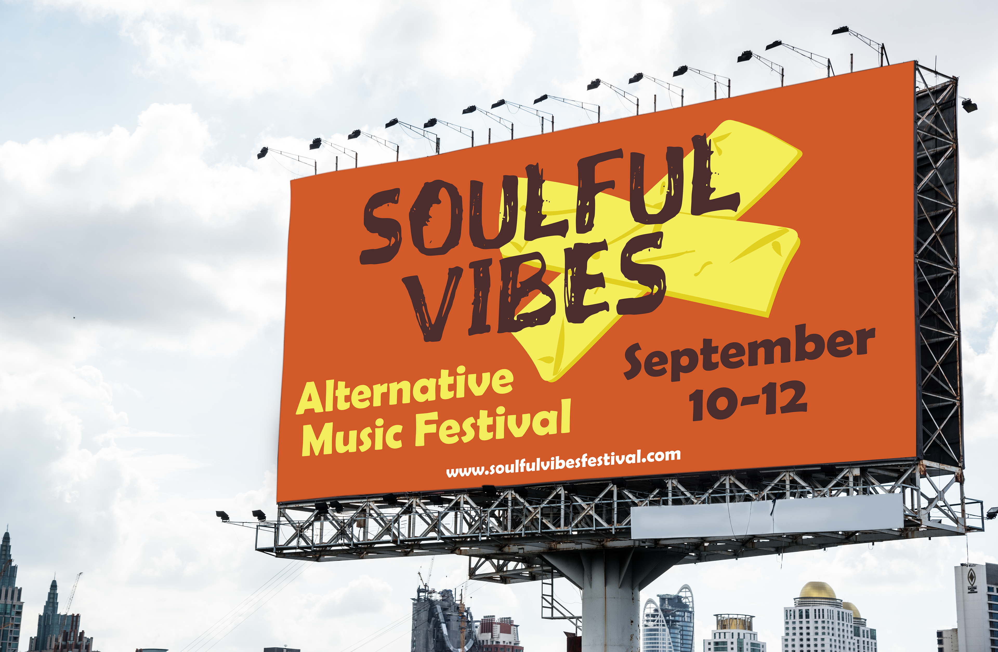
The primary goal of this assignment was to design an identity system for a fictional musical festival. Then apply that system to a variety of assets, such as a billboard, a poster, a t-shirt, and collateral. To do this, a music genre needed to be chosen to base the design system on. Alternative music was my preferred genre.
Research
Starting off, I used a sheet provided by my professor to understand marketing terms. After becoming familiar with that, I looked at popular music festivals like Coachella, Ultra Music, and Lollapalooza. I examined their posters, billboards, shirts, etc. I noticed different uses of font faces, the use of color systems, and that the designs were fun and lively. It wasn’t "professional" in the sense of offices and corporate design; instead, it was lively like music is. Which I wanted to take into account to try and replicate for my music festival.
Moodboard
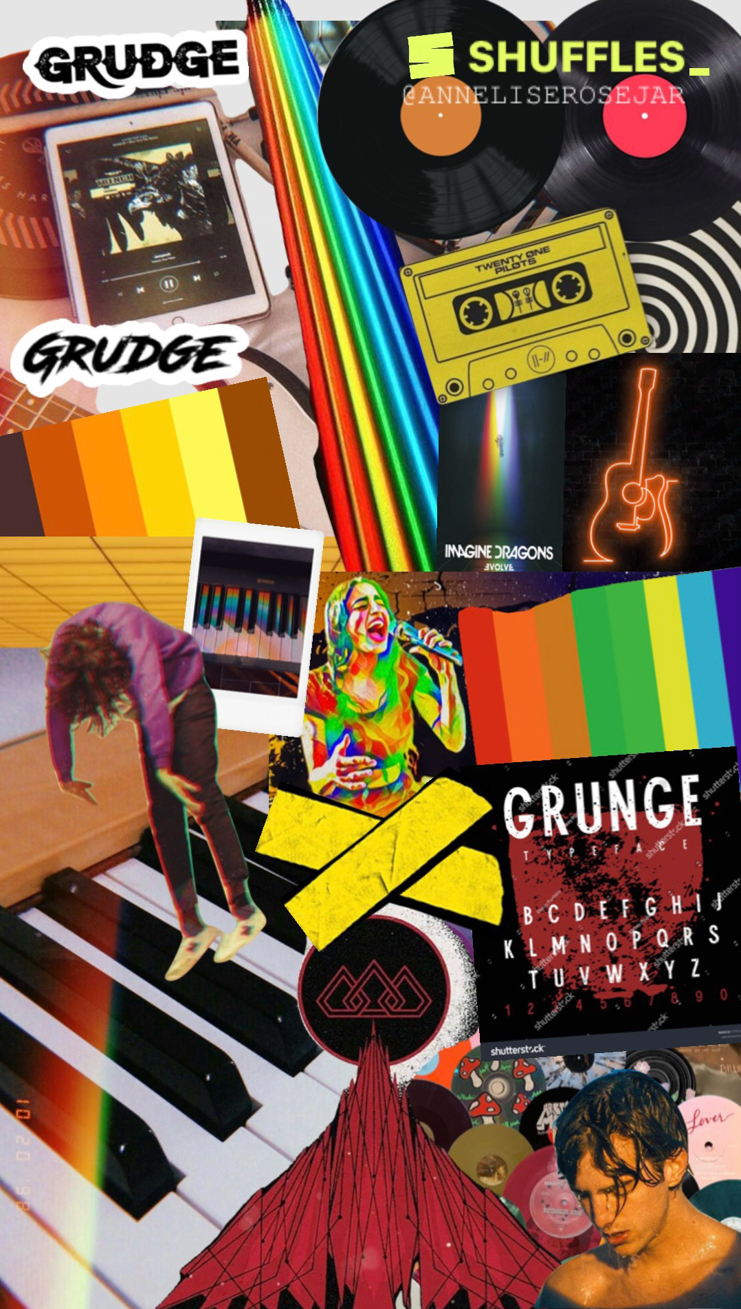
Music Genre
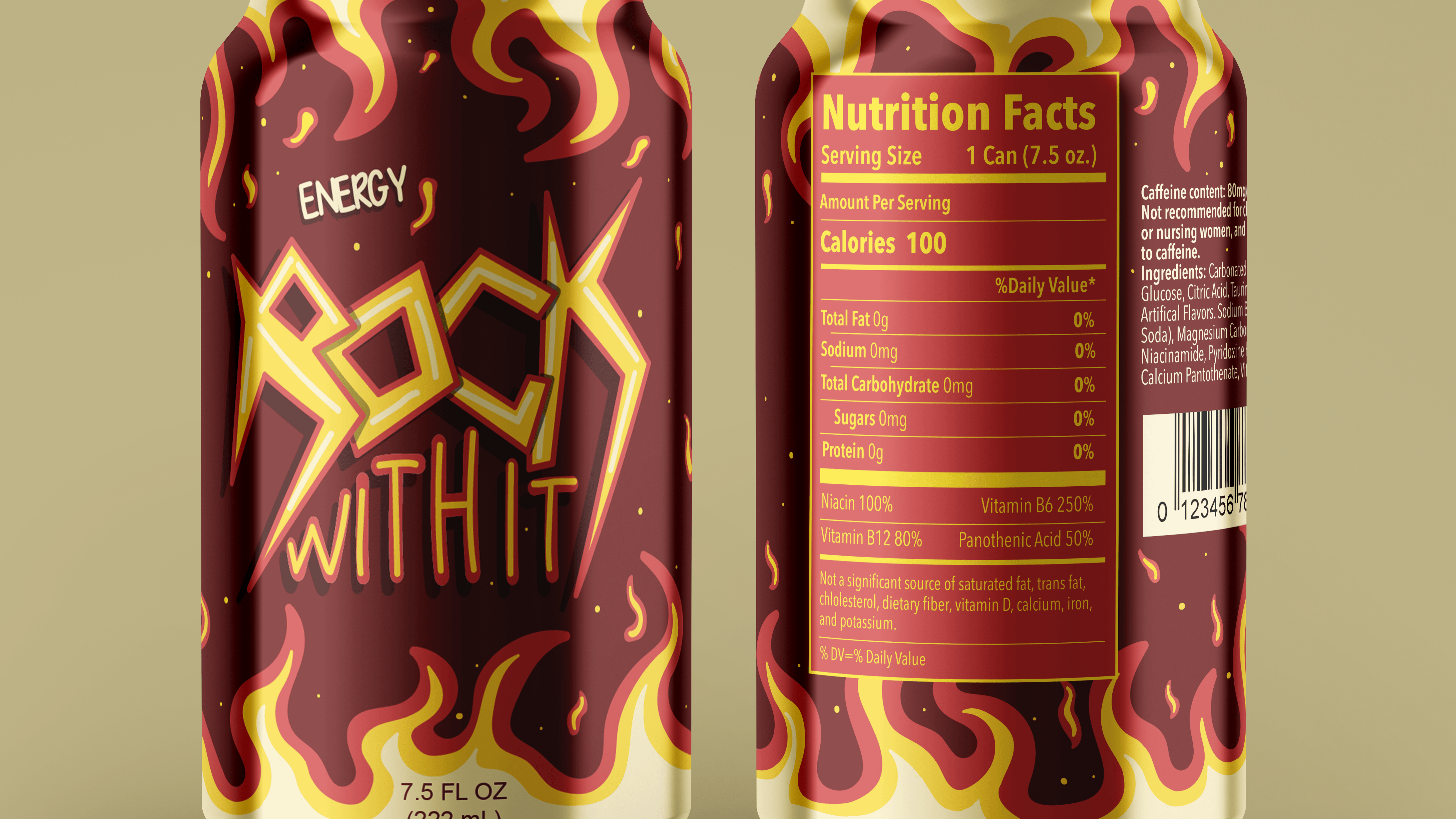
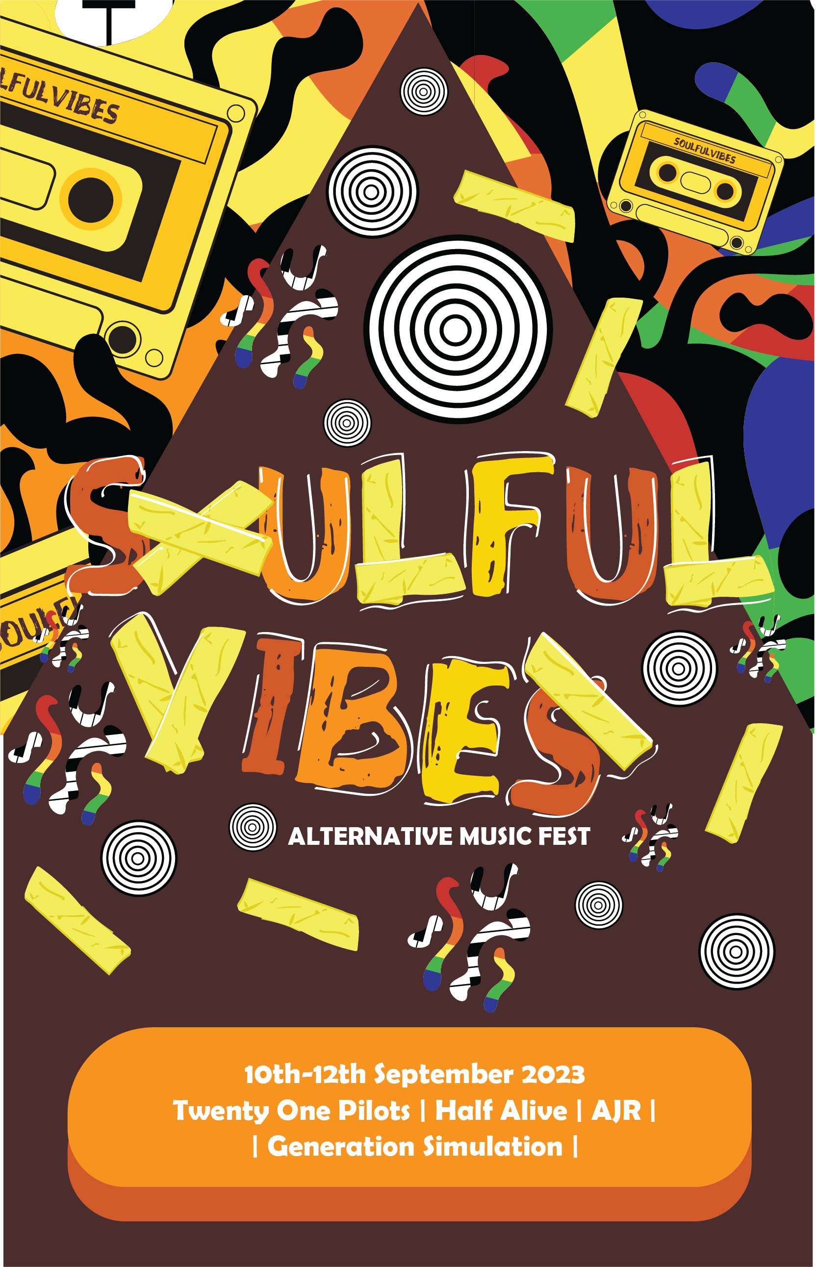
Alternative music was the genre I chose. I chose it because it's my favorite genre, and I wanted to enjoy this project by making it about something I love. So I looked up my favorite alternative bands for inspiration. I looked at their logos, colors, fonts, etc. For me, this genre is the best choice for this project because it is messy, maximalist, and fun. I don’t have to worry about perfection. It’s supposed to be busy and grungy, and it’s meant to stand out.
Evolution Of Work
Icon
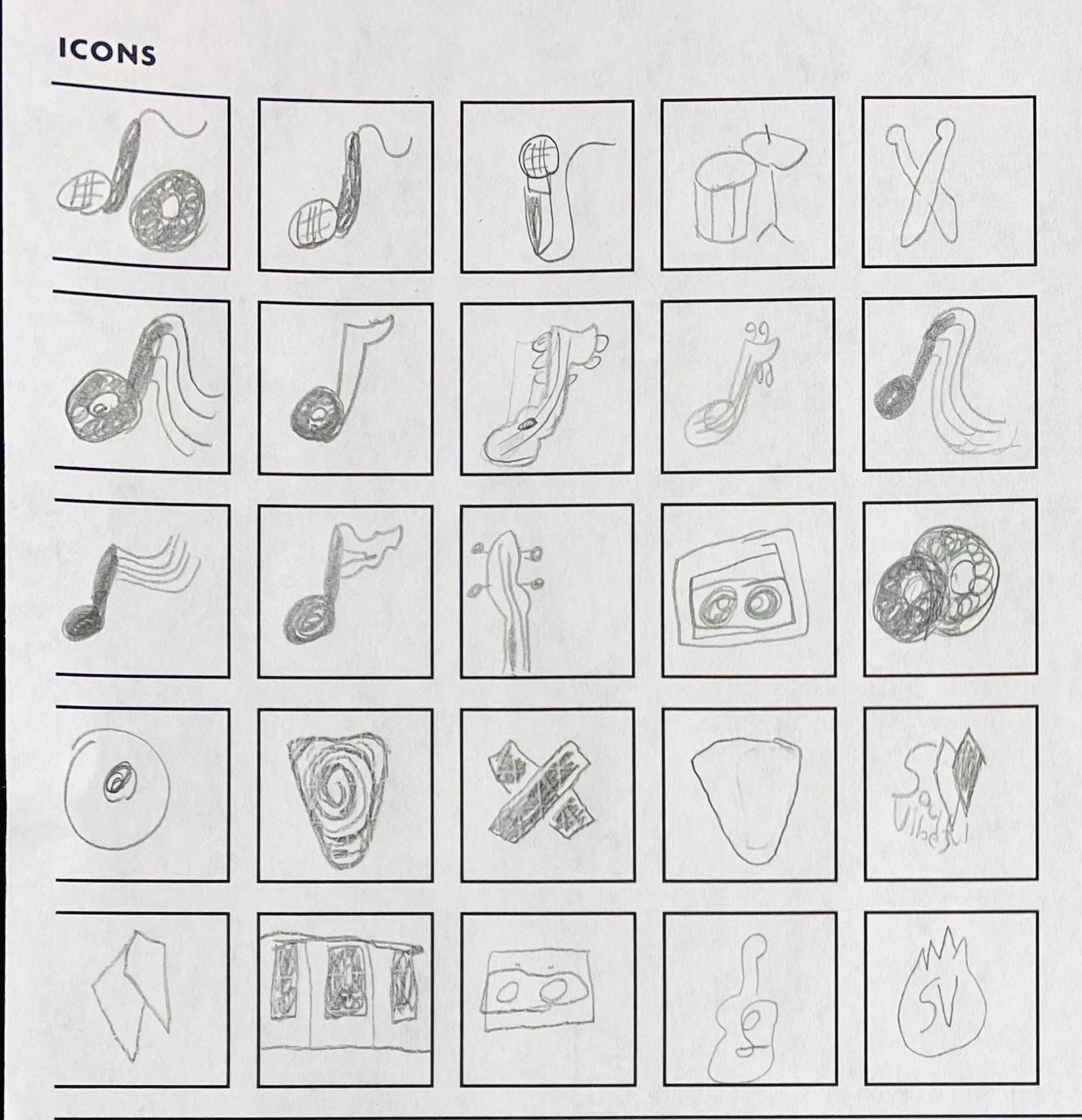
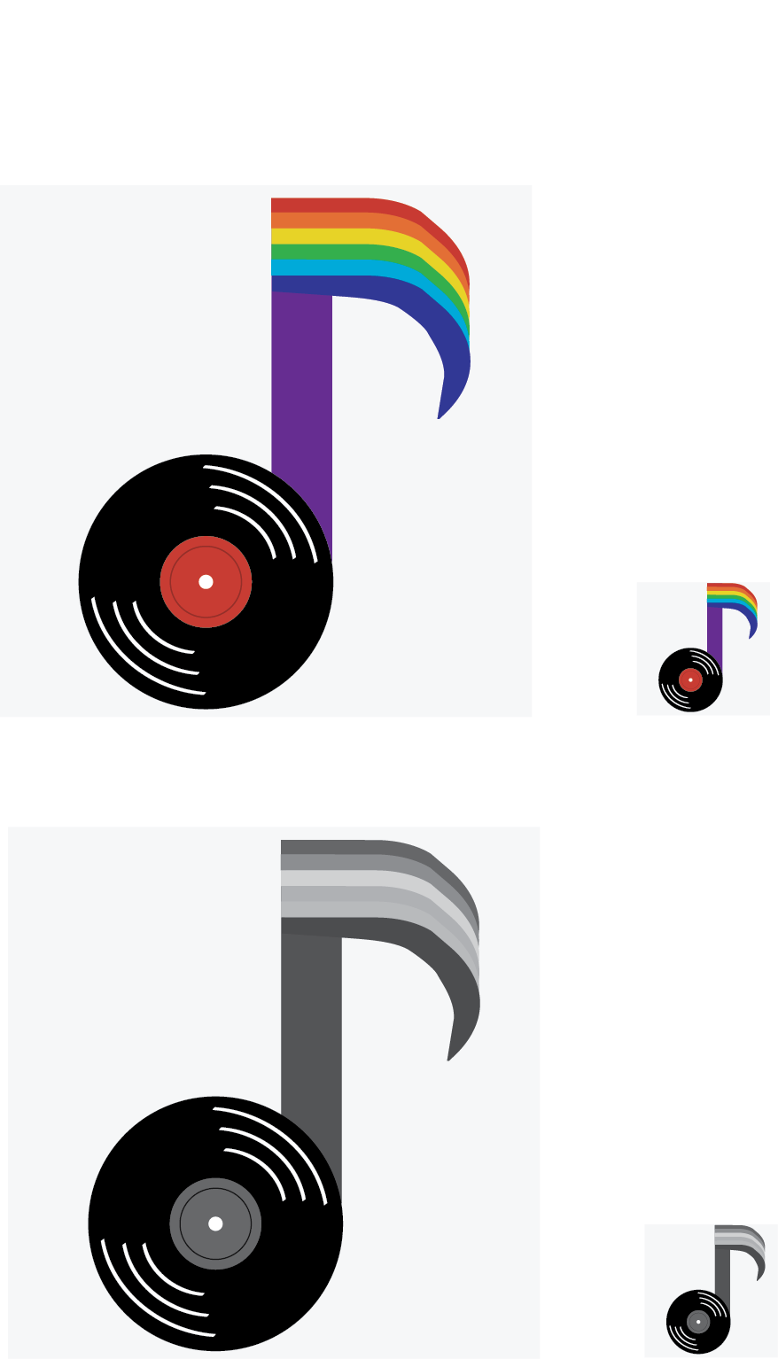
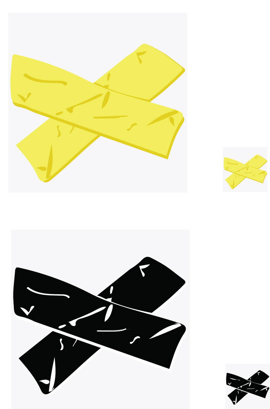
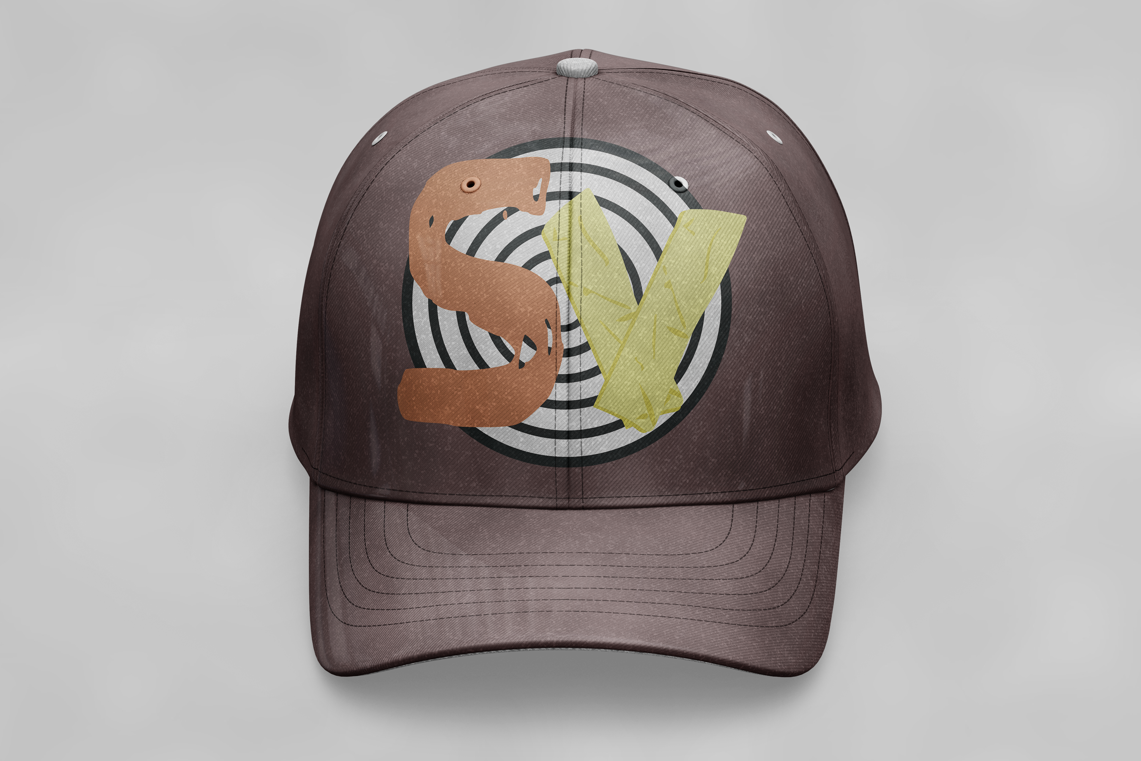
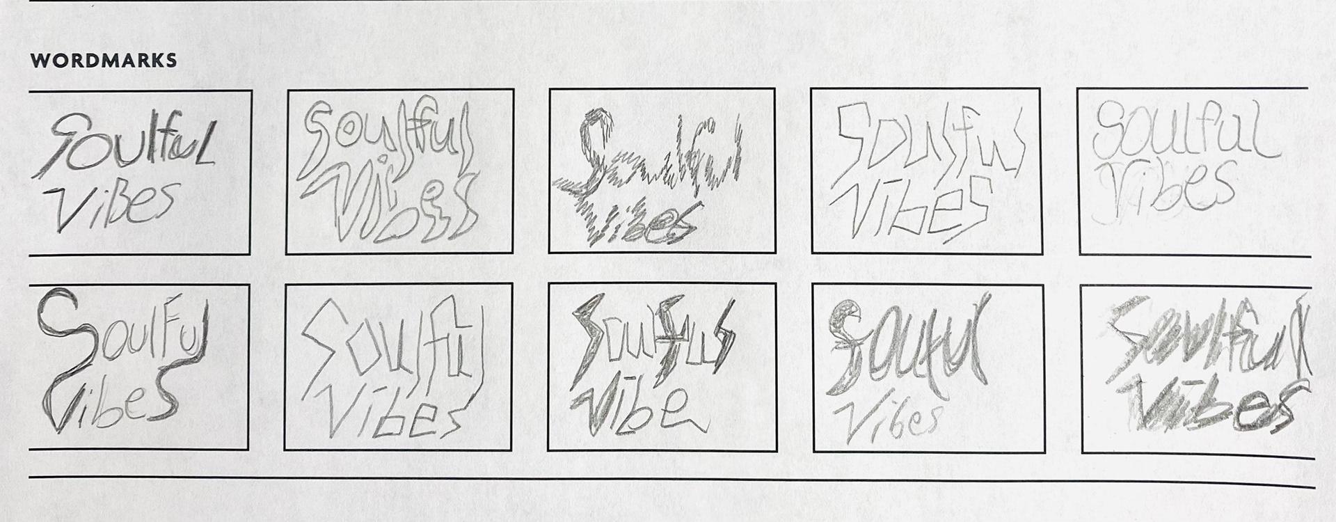
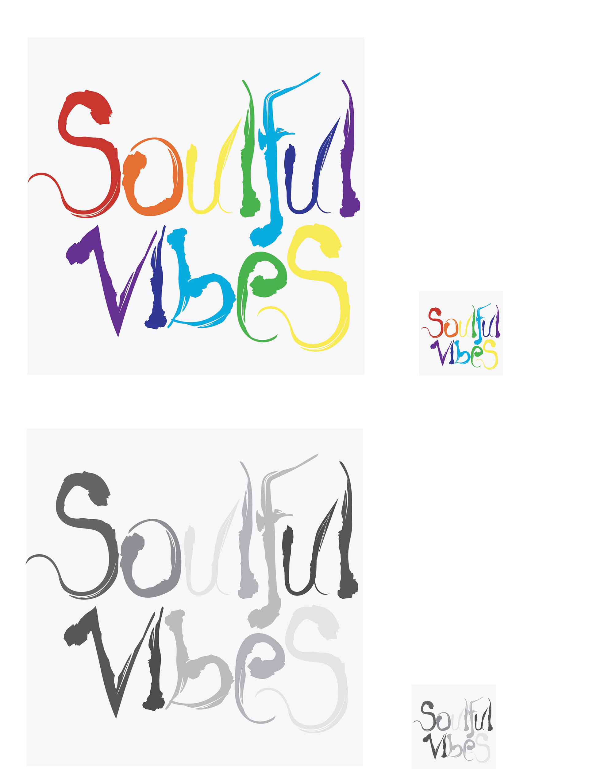
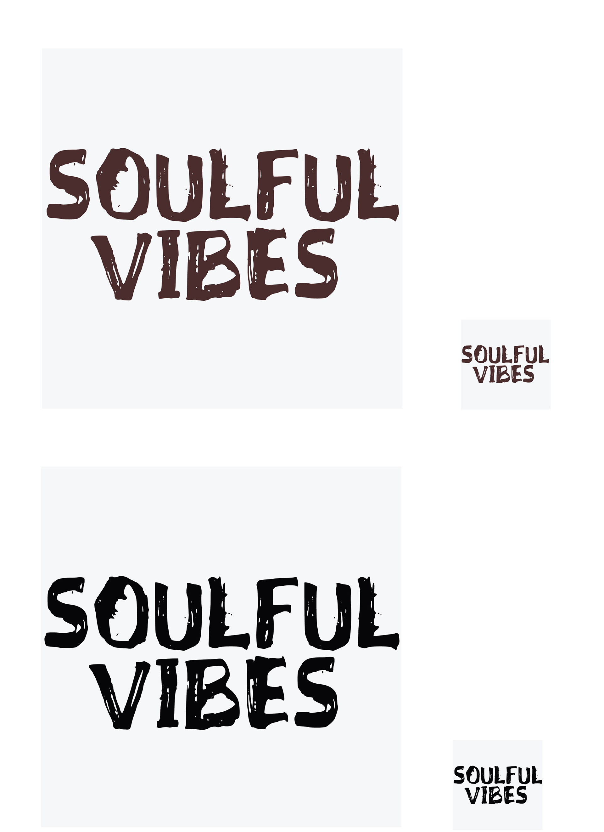
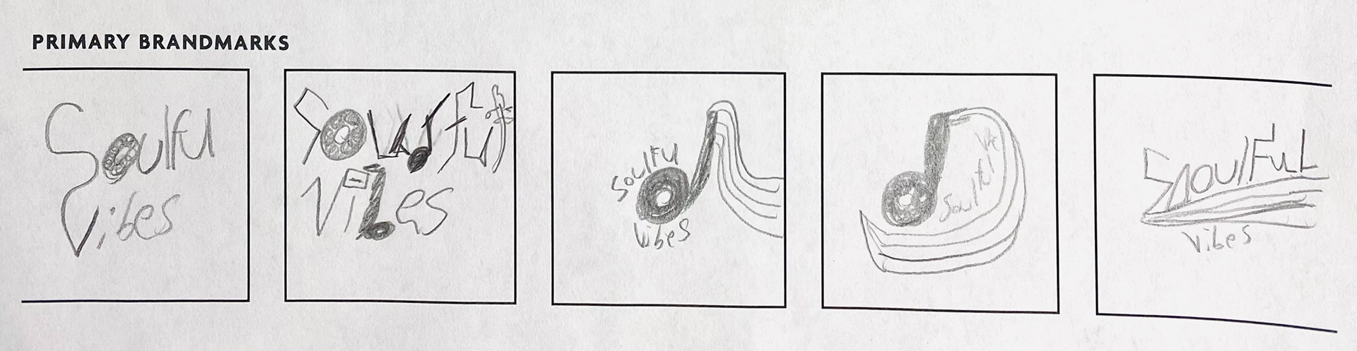
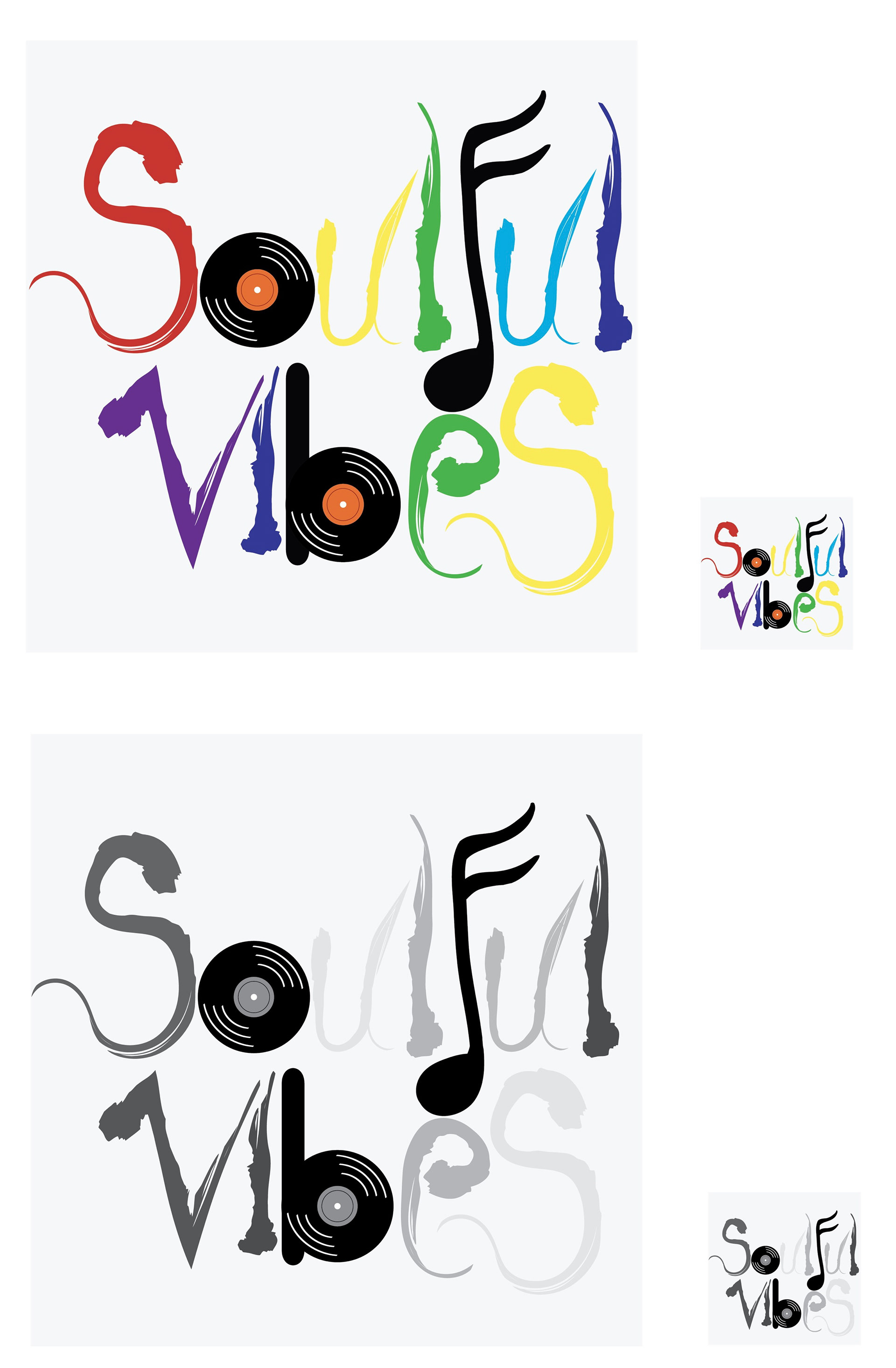
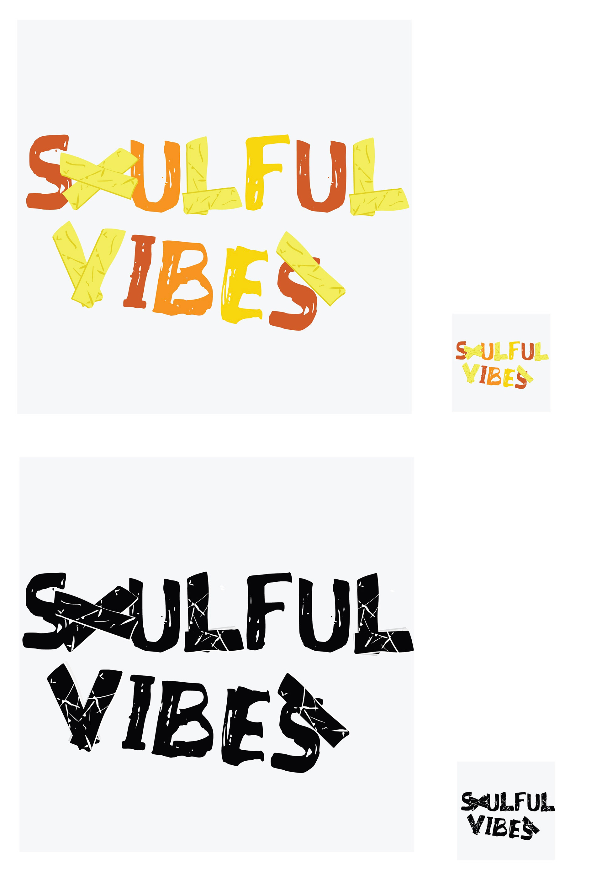
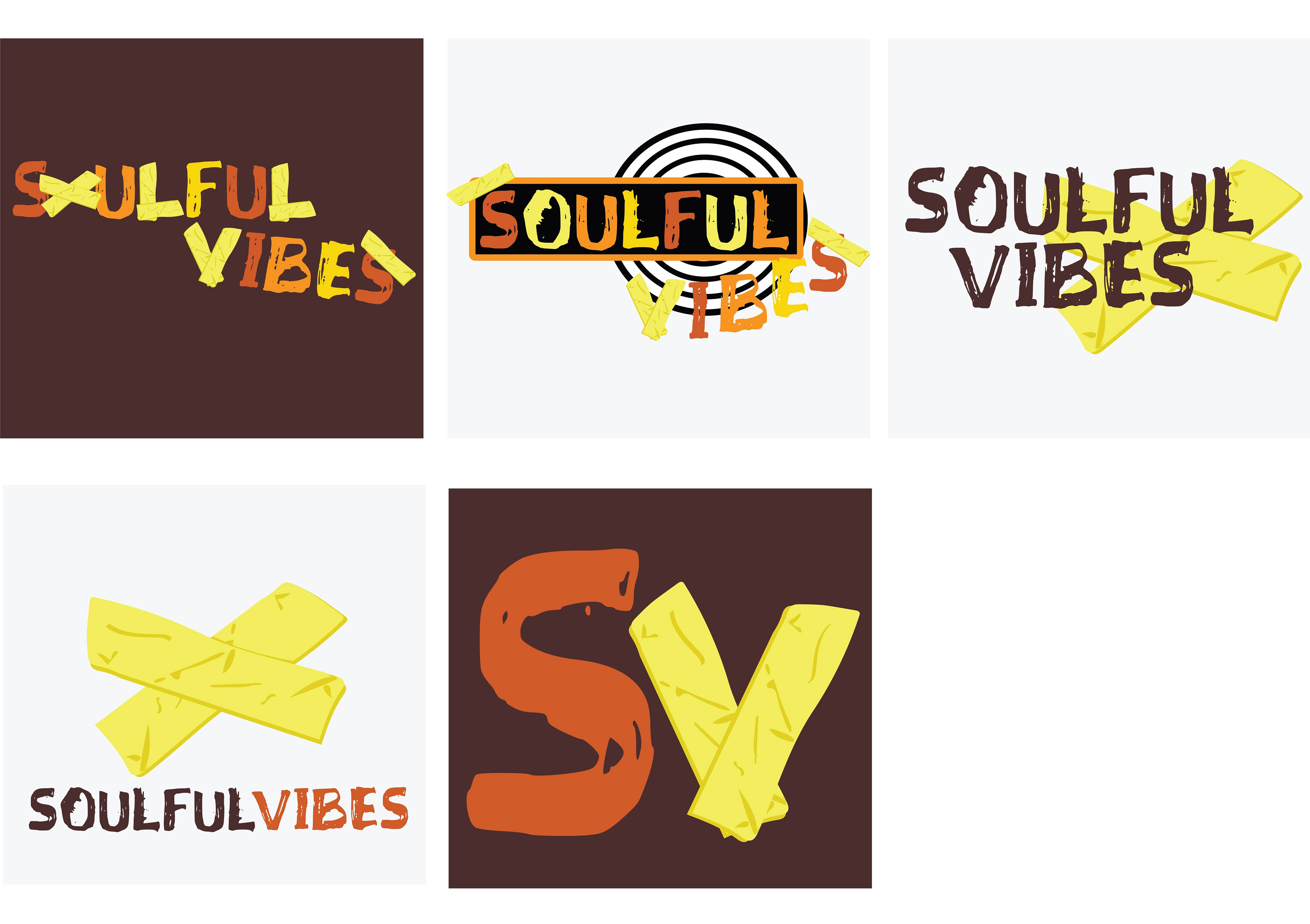
I drew a lot of influence for my moodboard from my favorite bands in order to come up with a unique idea and aesthetic. Starting out, I attempted to hand-letter my own wordmark. The design was detailed and colorful, and music notes were incorporated into it along with a vinyl, but I realized that it didn’t match my moodboard and that it wasn’t unique. So I looked for a new font—one that matched my mood board. This font was grungy and strongly matched the aesthetic. Then I worked on my icon. Originally, it was a music note combined with a vinyl, but it too did not match my festival's vibe. So, instead of a music note, it became two messy pieces of tape in an x shape. This made the design system for my music festival more original and made it match the grunge look I was aiming for.
Wordmark
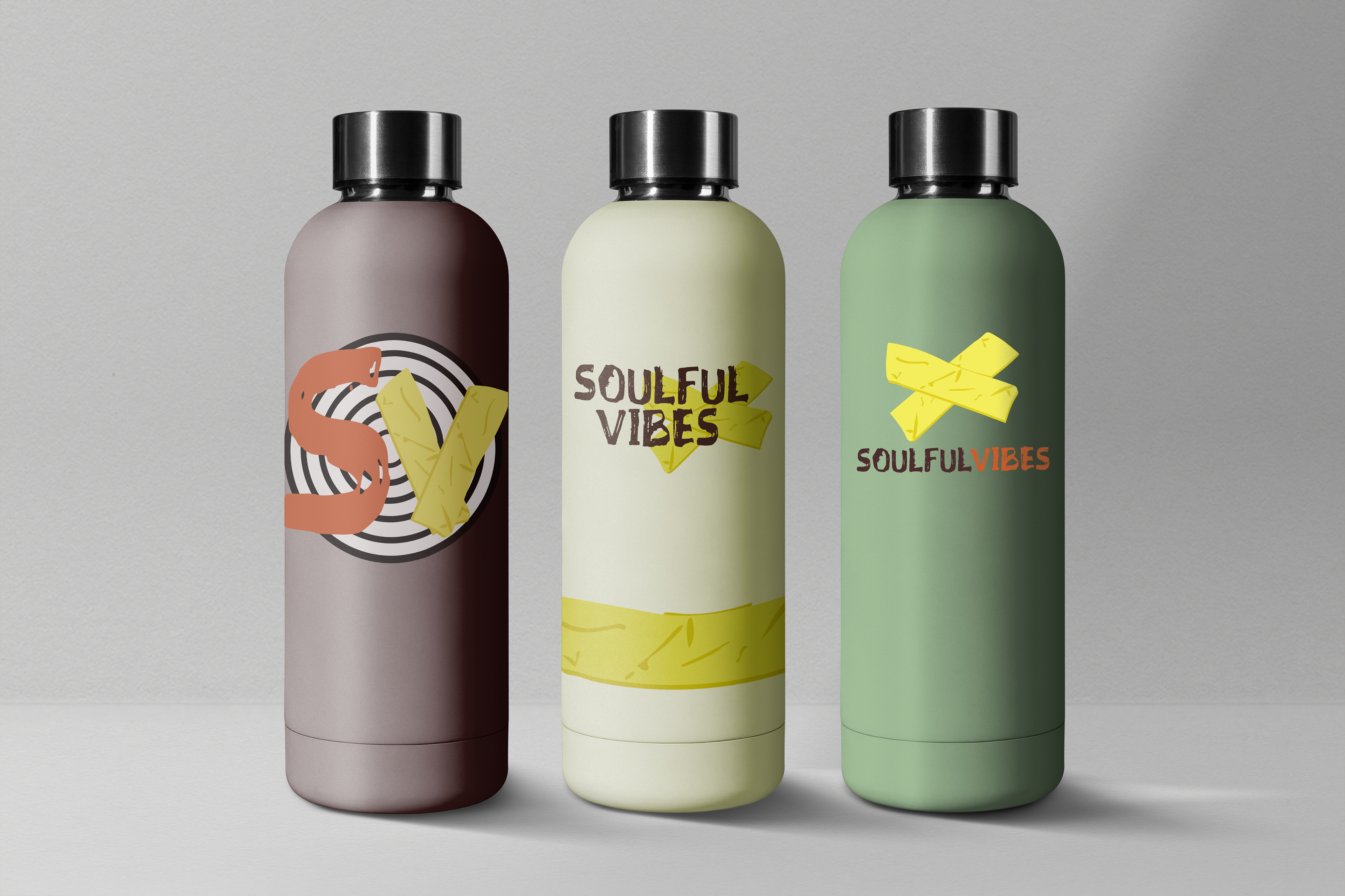
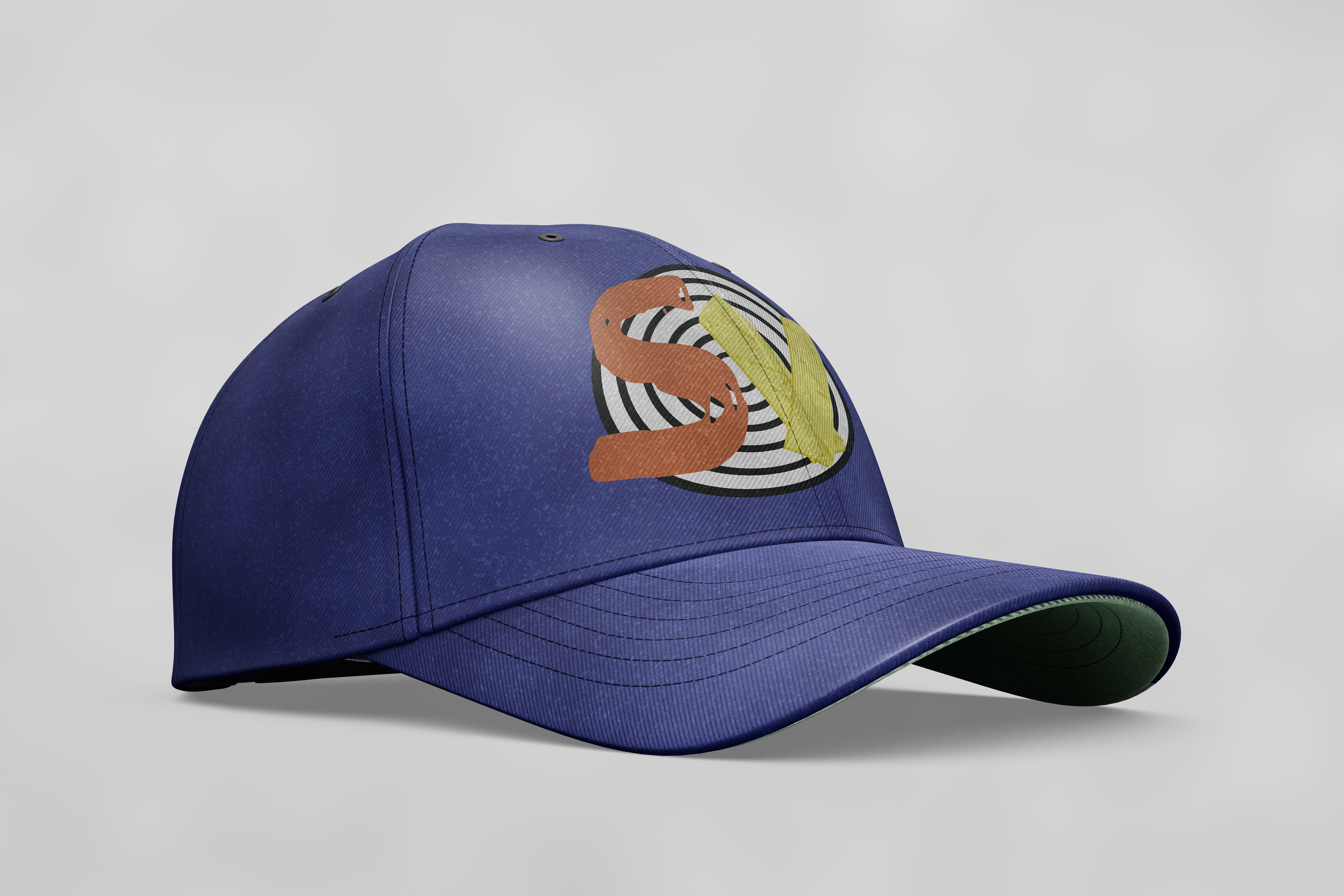
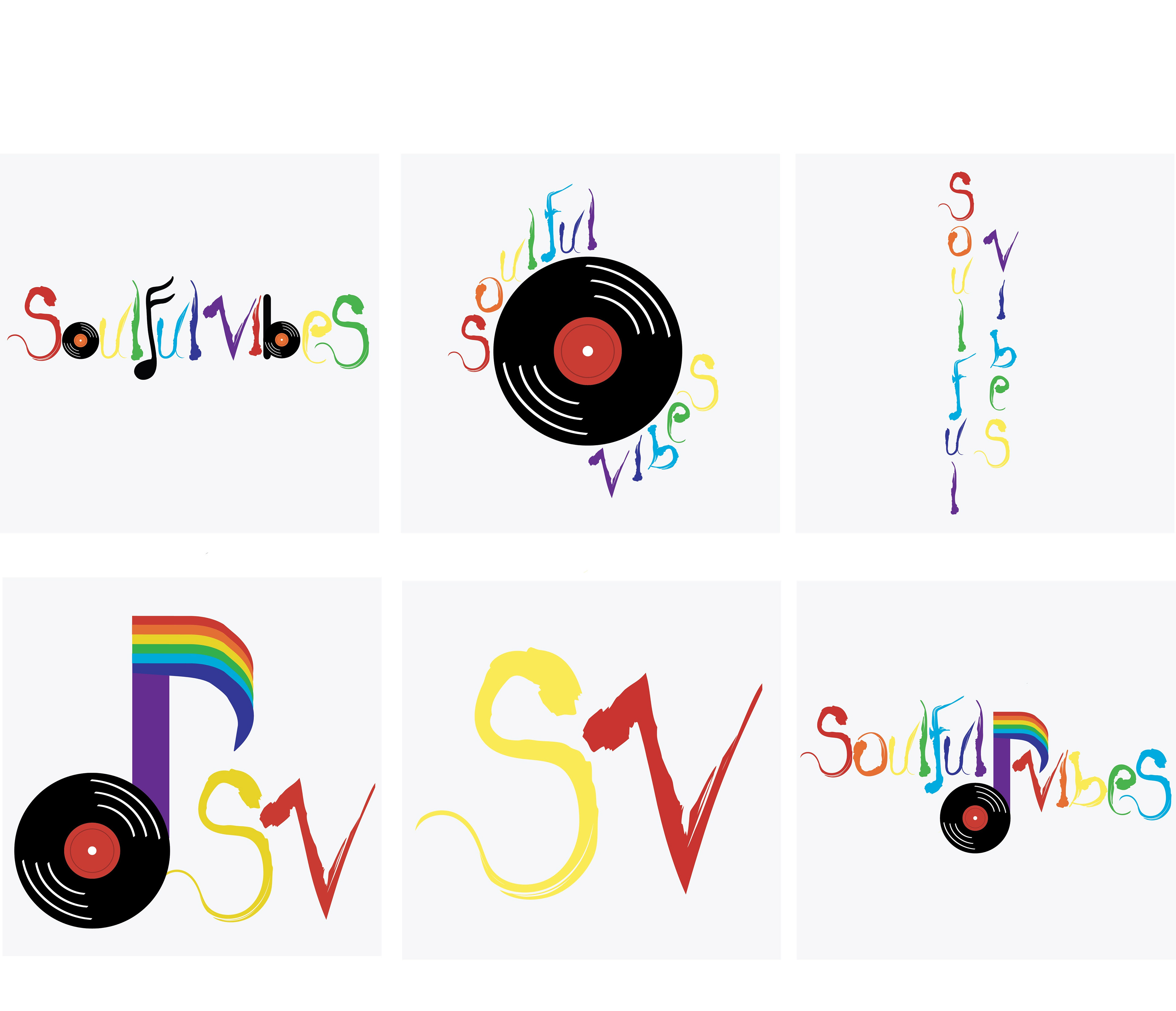
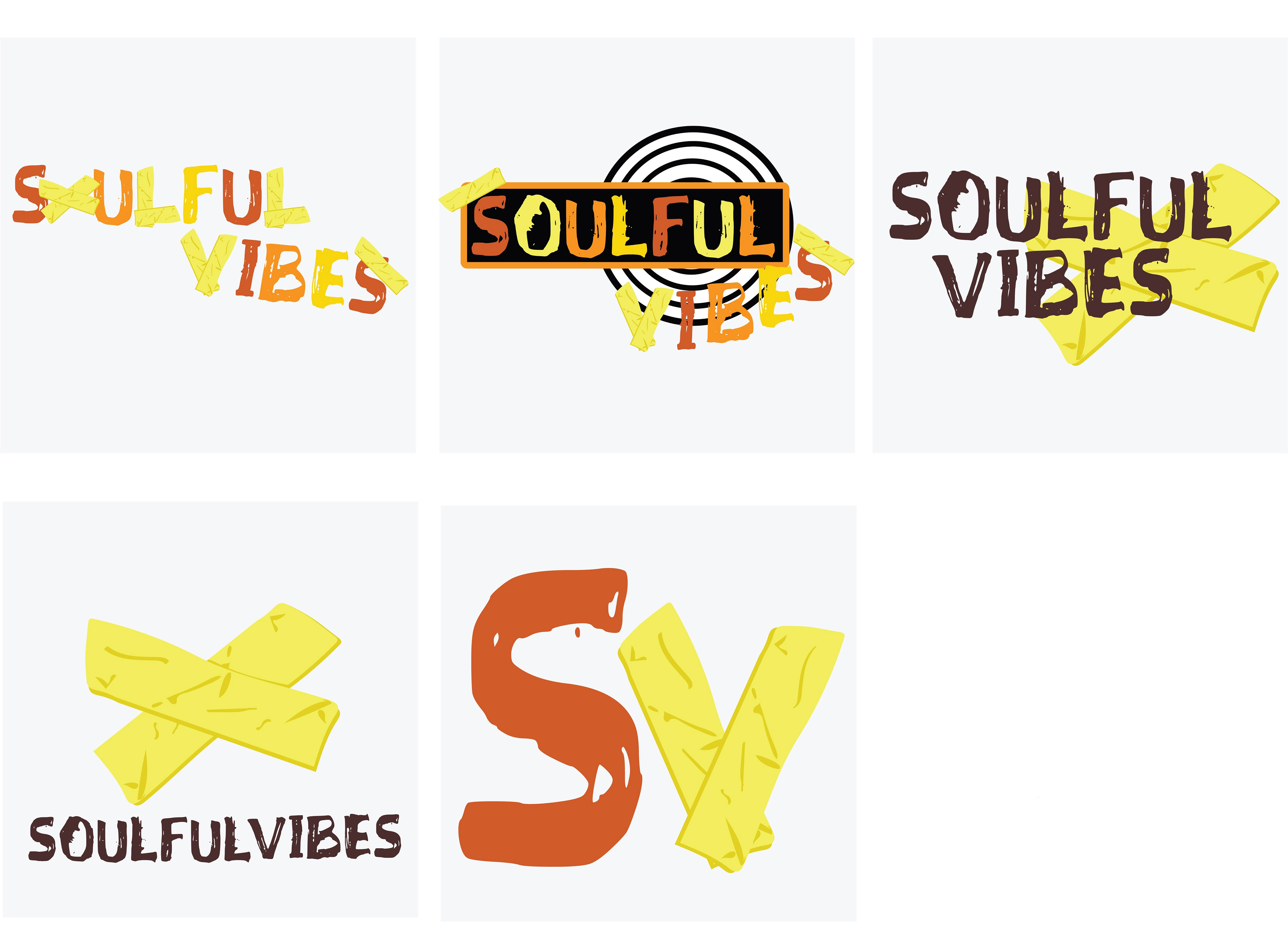
Primary Brand Mark
Lockup Variations
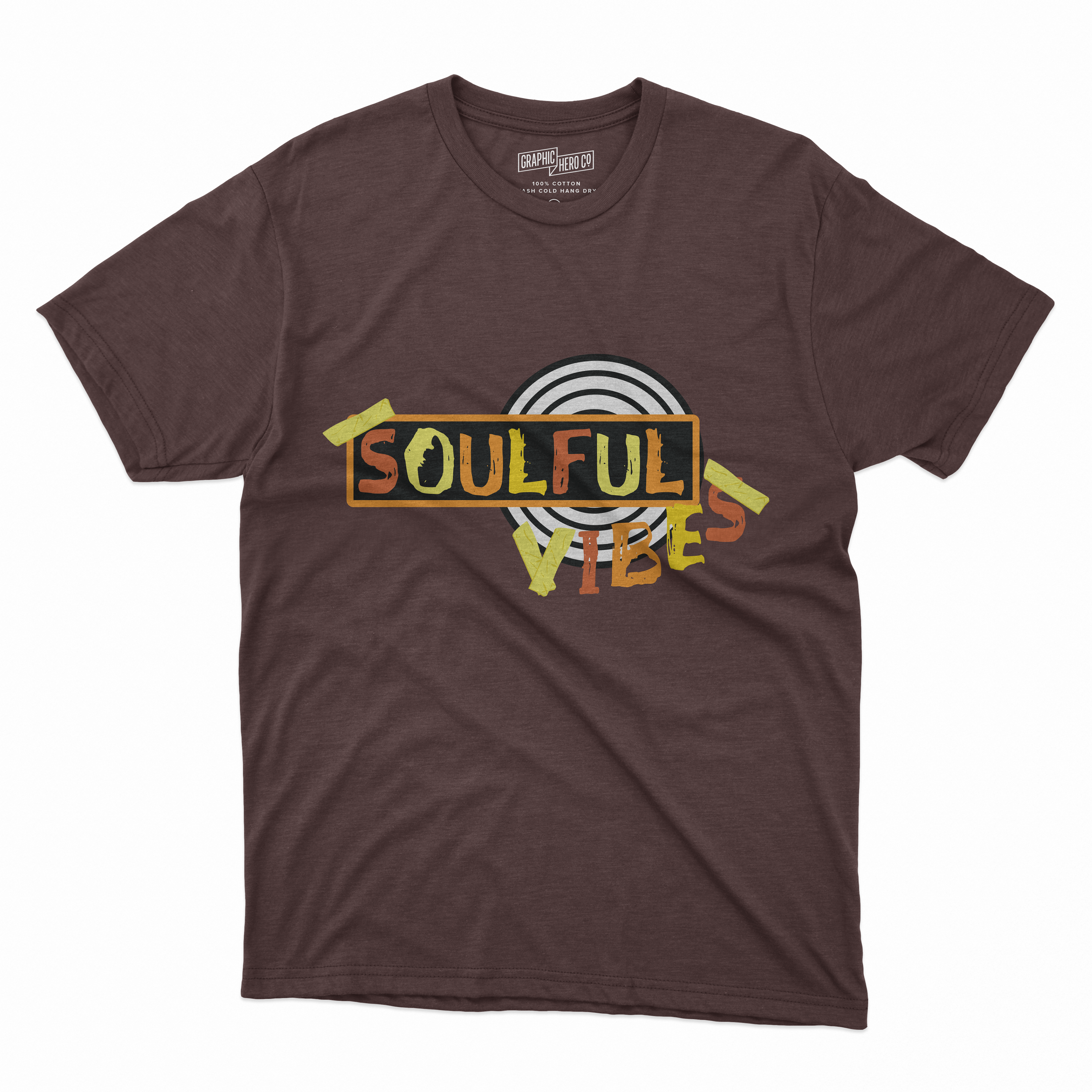
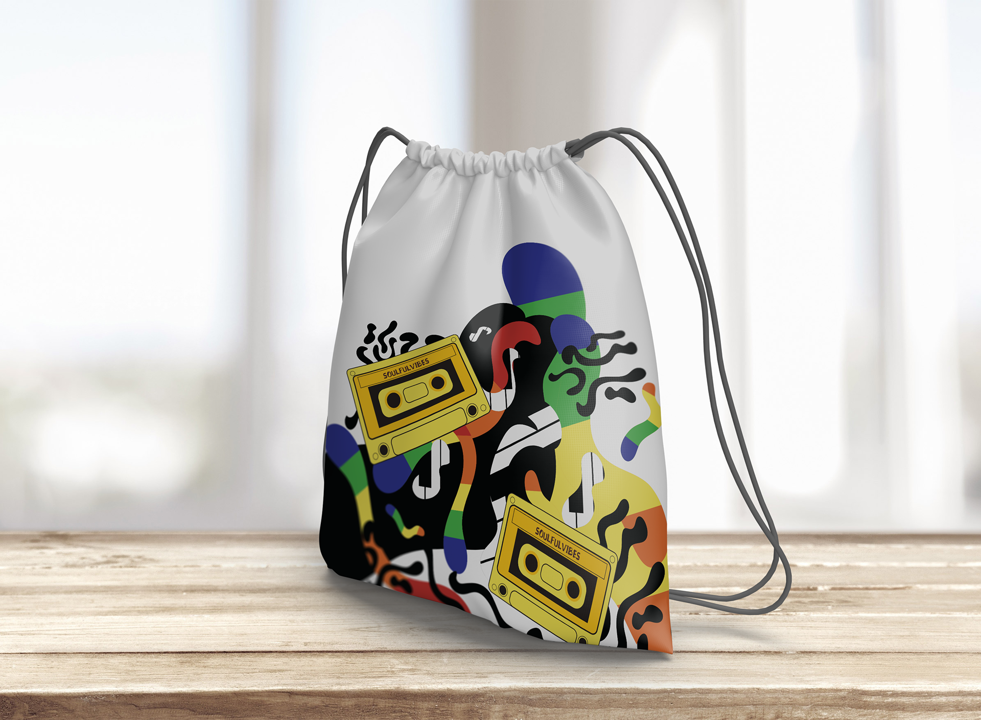
Brand Extensions
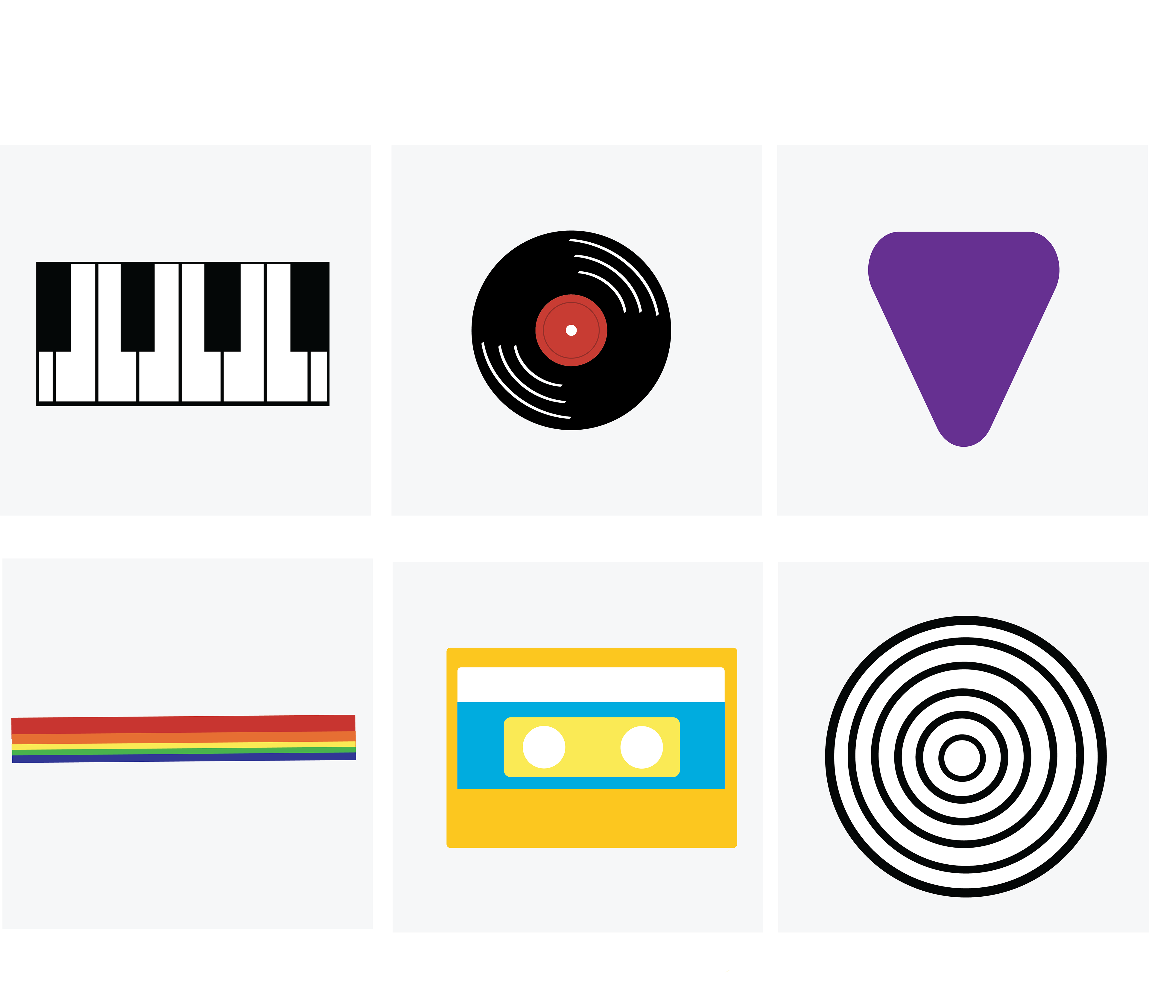
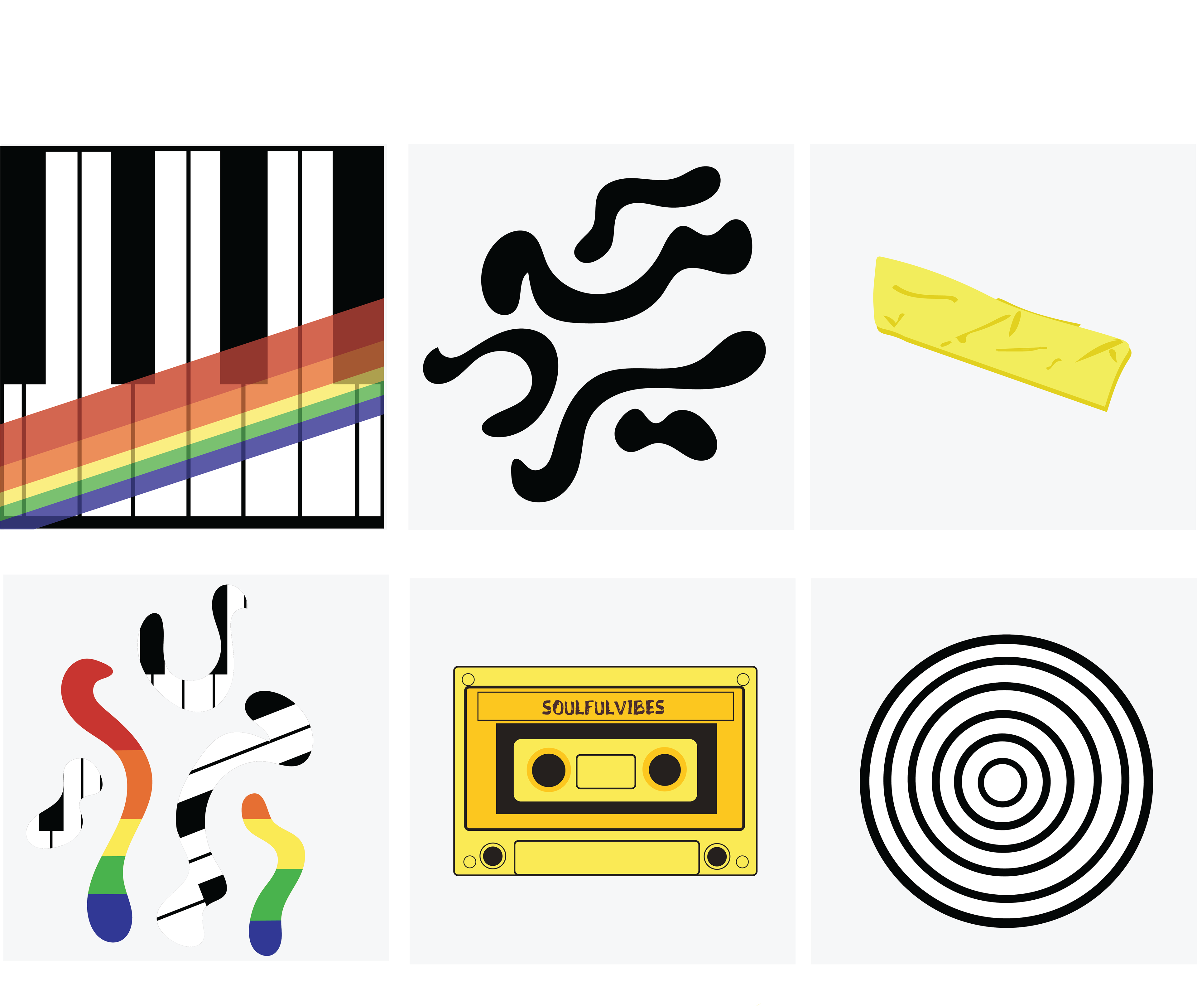


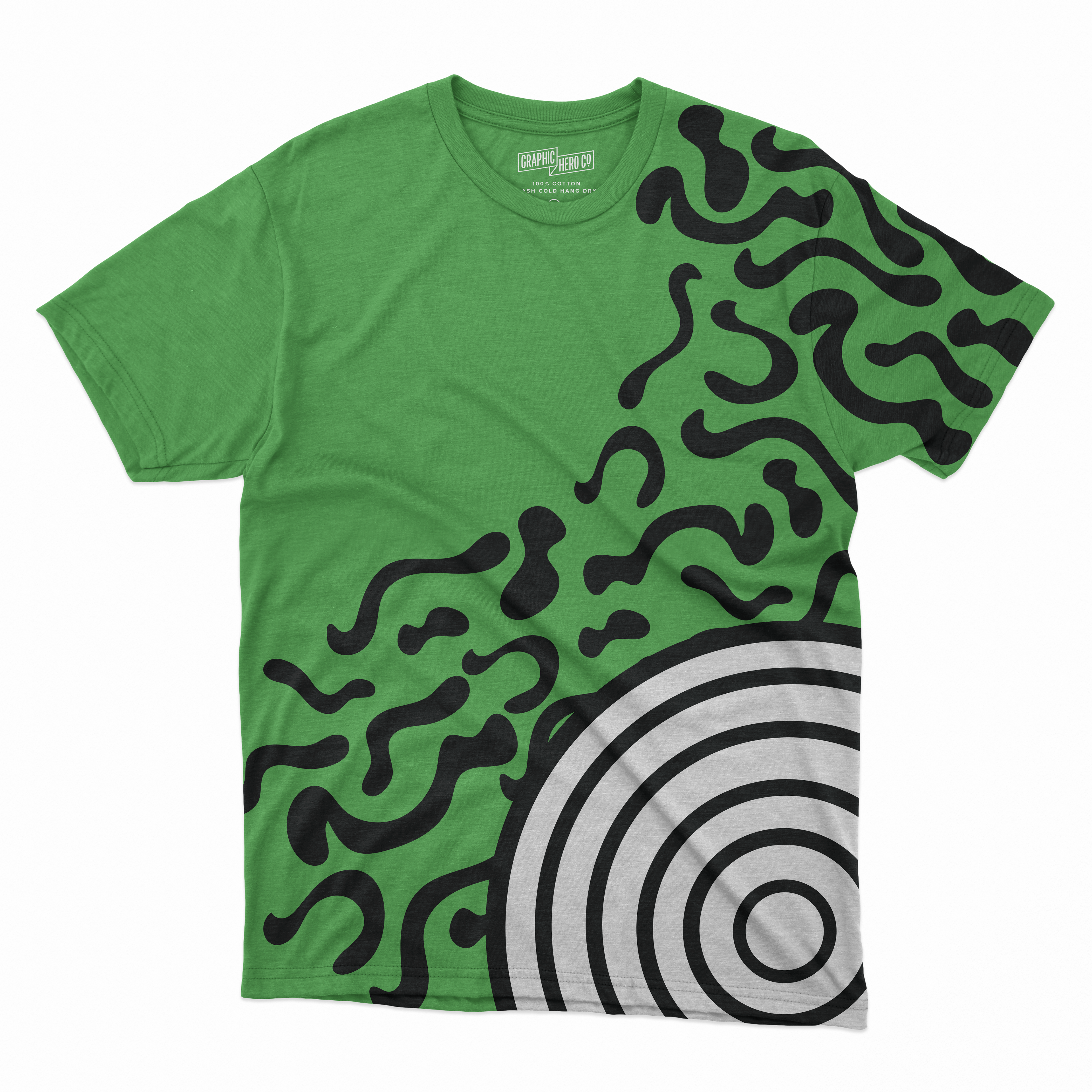

I also created small vector graphics for my brand extensions. This consisted of a yellow cassette tape, a rainbow-themed keyboard, a single piece of yellow tape, a circle with black and white stripes, and two types of squiggles, one black and the other rainbow and piano-themed. These were inspired by some of the motifs on my moodboard. My moodboard served as the foundation for this project's design. I would often refer back to it while illustrating and working on my typography. I used the eyedropper tool to pick colors directly from my moodboard. Focusing on my moodboard was a really useful method since it kept the aesthetic of my designs consistent and unified.
Final Thoughts
I was able to identify what needed to be fixed as I progressed through my concepts. I improved my understanding of word and design spacing. I discovered an easy method for creating a seamless design, which I applied to my drawstring bag. I believe I have a better understanding of logos. I also discovered the significance of icons, wordmarks, and logos. Overall, I enjoyed this assignment more than I anticipated. I normally like to just illustrate, but designing an identity system for a music festival was a lot of fun! I'm excited to try to make additional posters and collateral in the future.