Project Summary
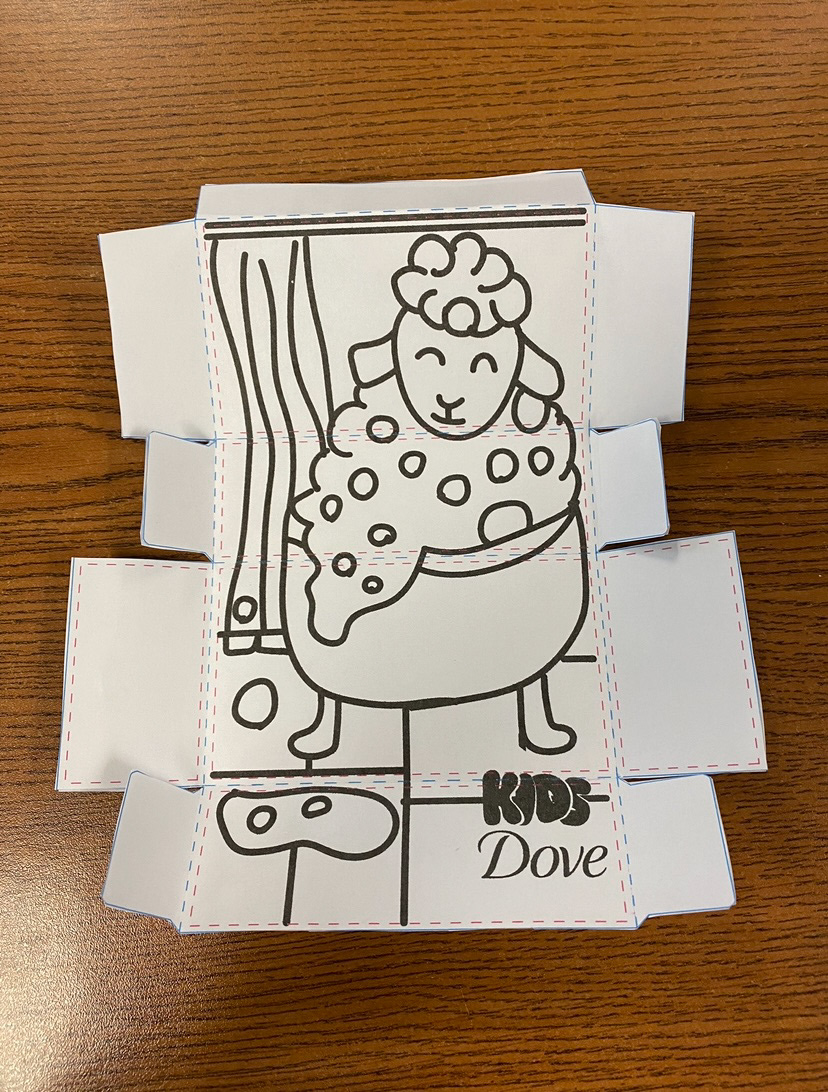
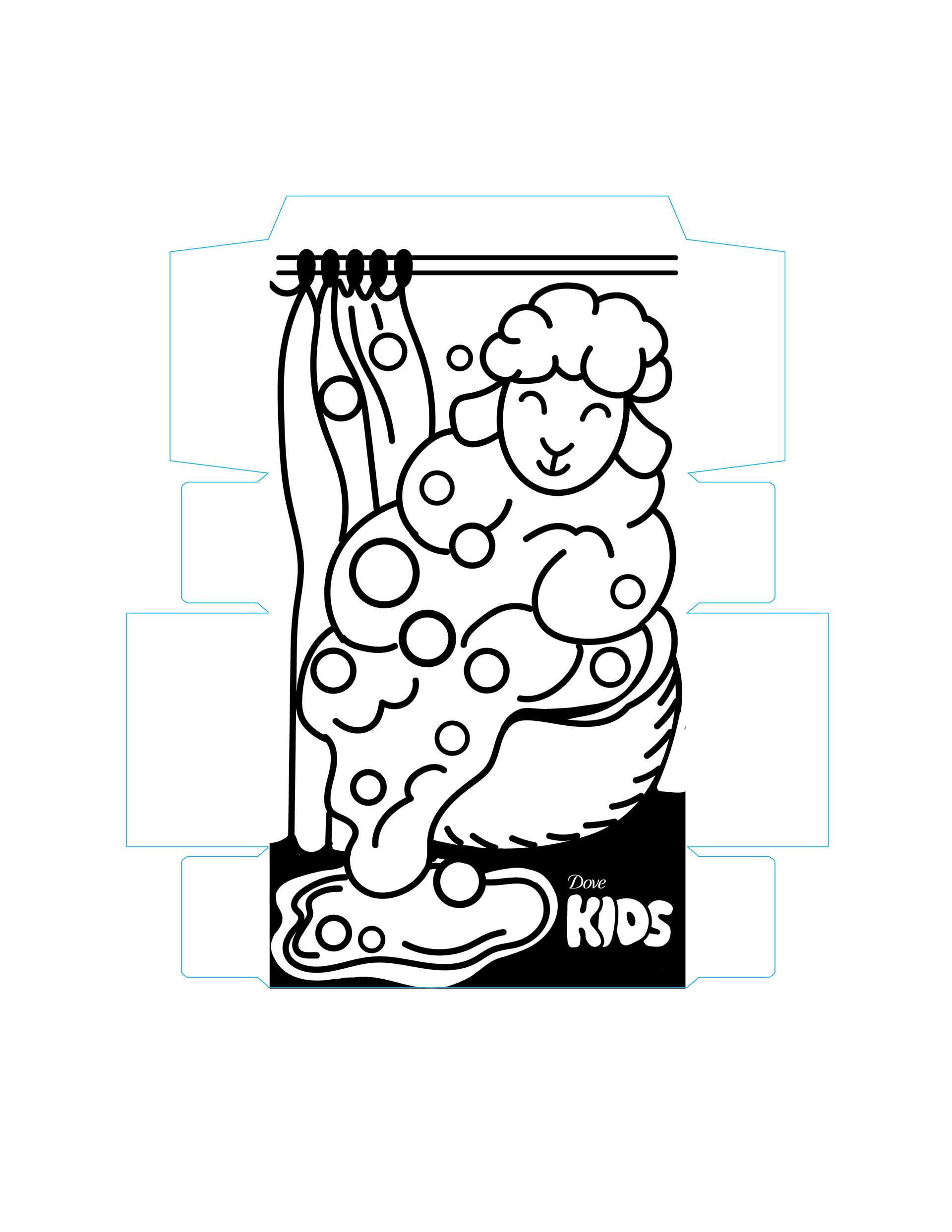
For this project, we were tasked with designing packaging for a children's bar soap. The goal was to create a design that would immediately capture a child's attention and feel inviting. Additionally, the interior of the packaging needed to include interactive elements to enhance its appeal, such as a coloring page, maze, or any activity that would engage children like those found in activity books.
The exterior design could also include hints about these interactive features inside, making it more appealing for parents to purchase for their kids. An important aspect of this project was that we were designing for Dove, and we had to ensure that the packaging maintained the essence of Dove while making it feel playful and appropriate for a children's product. Balancing Dove's brand identity with a fun, child-friendly approach was the key challenge of this assignment.
Goals
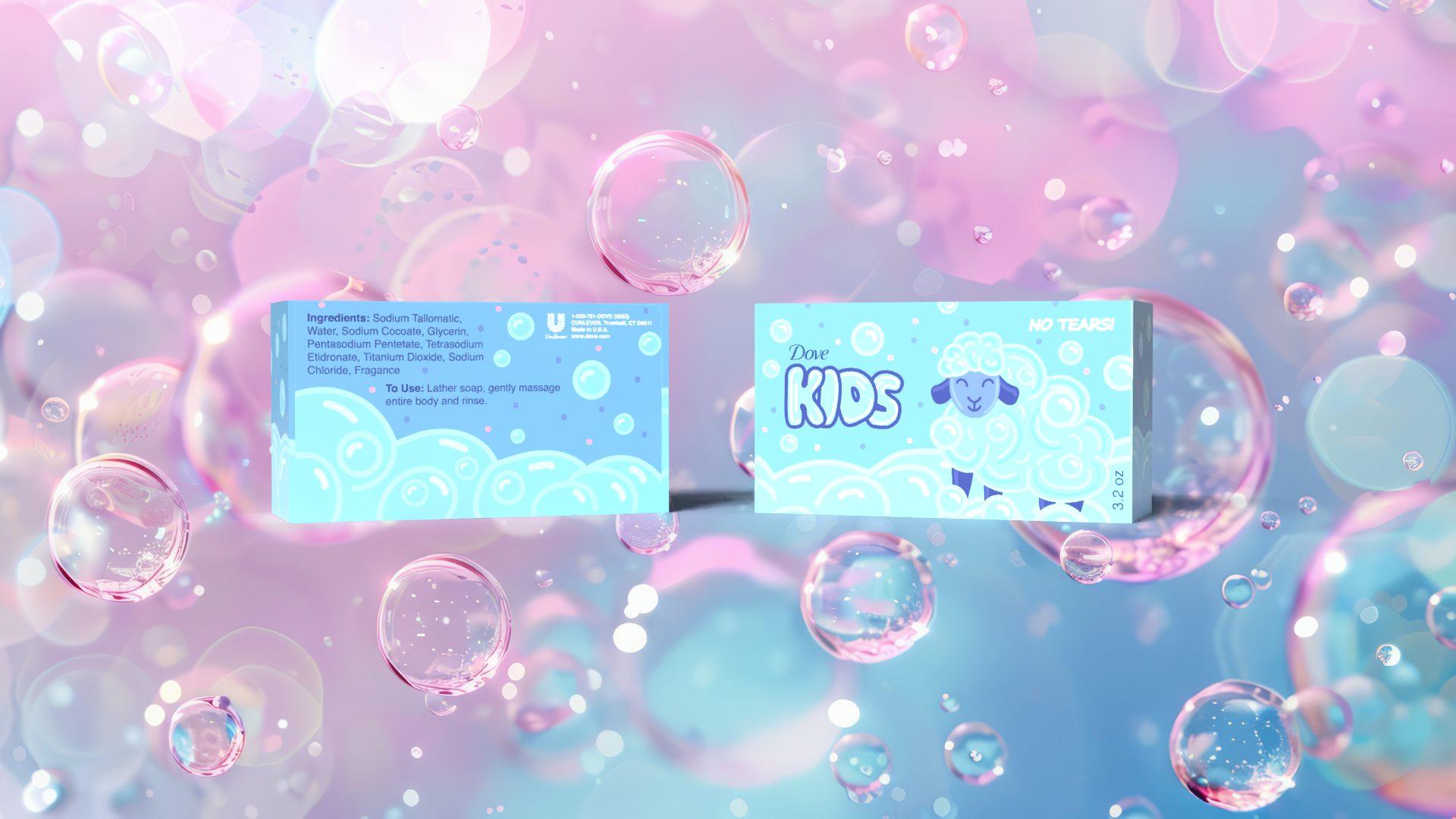
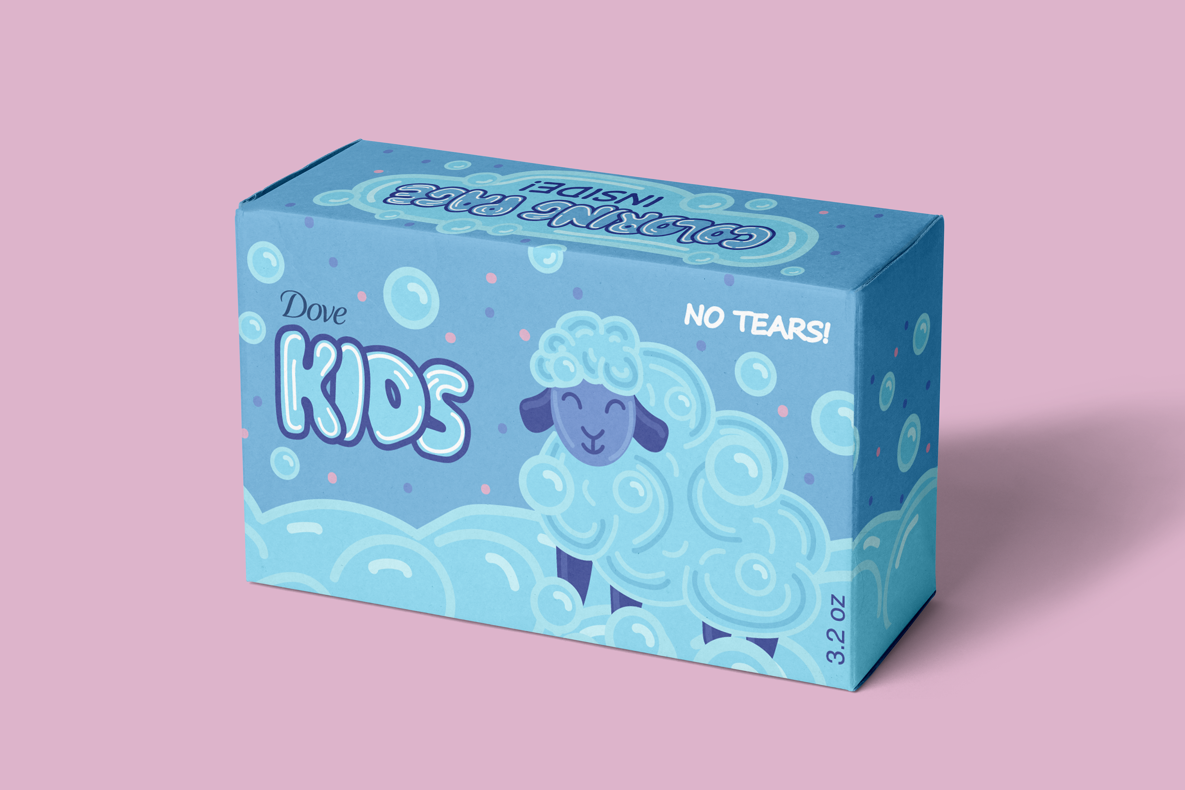
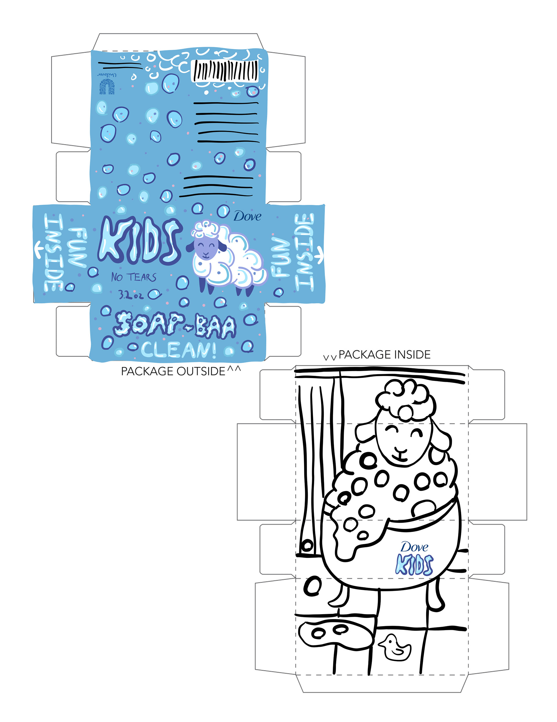
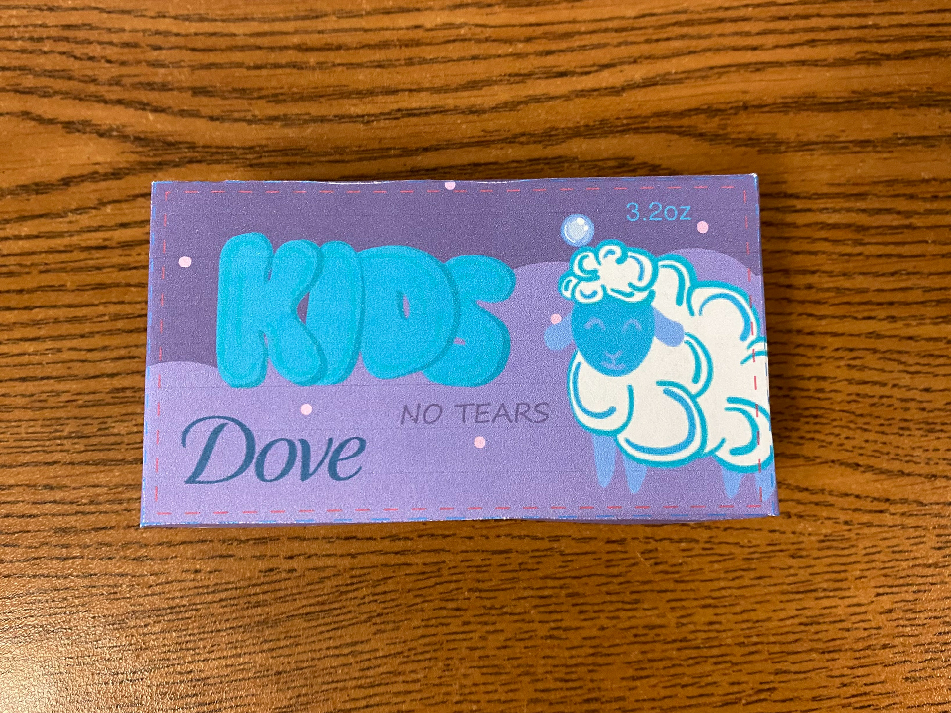
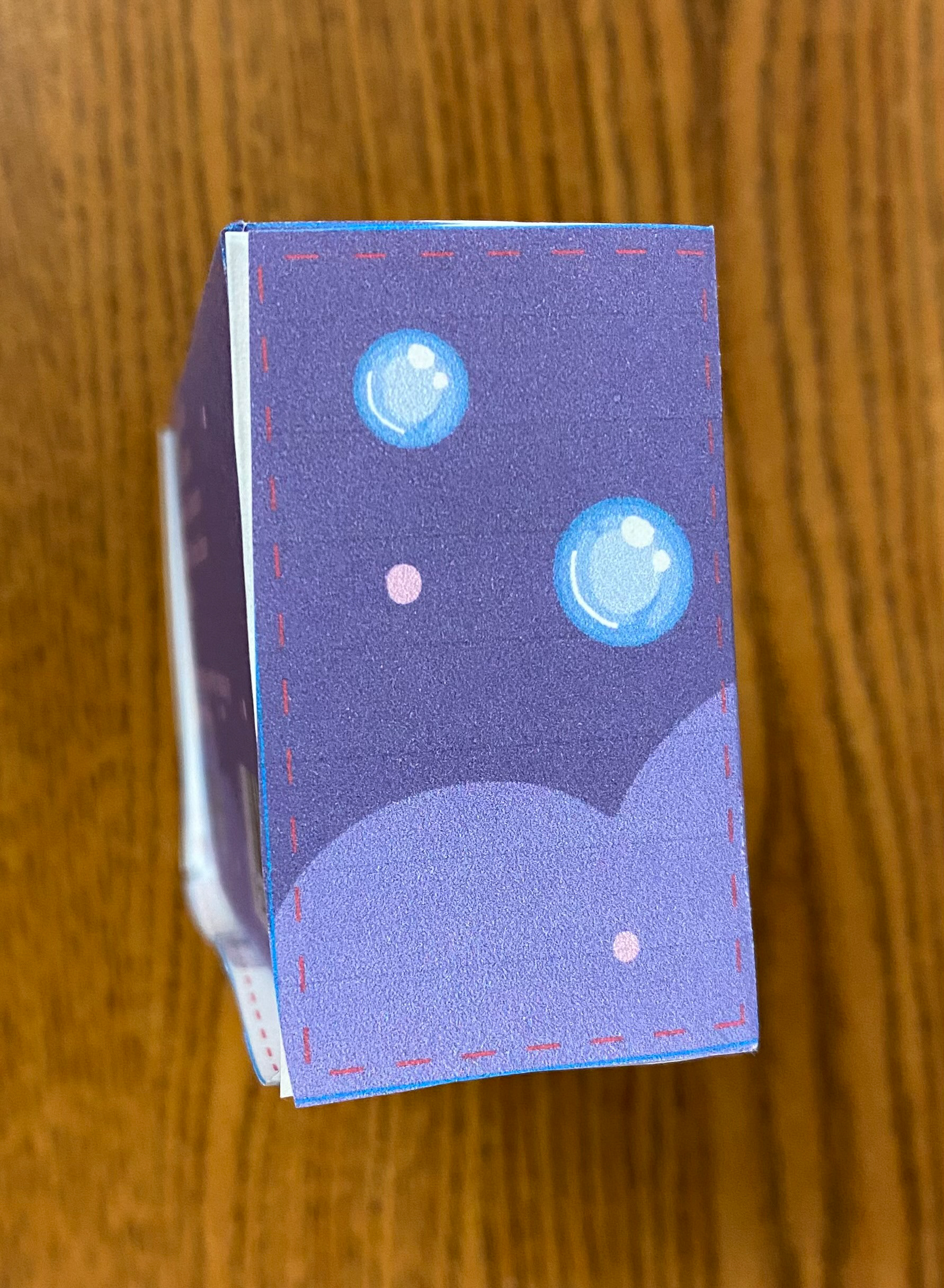
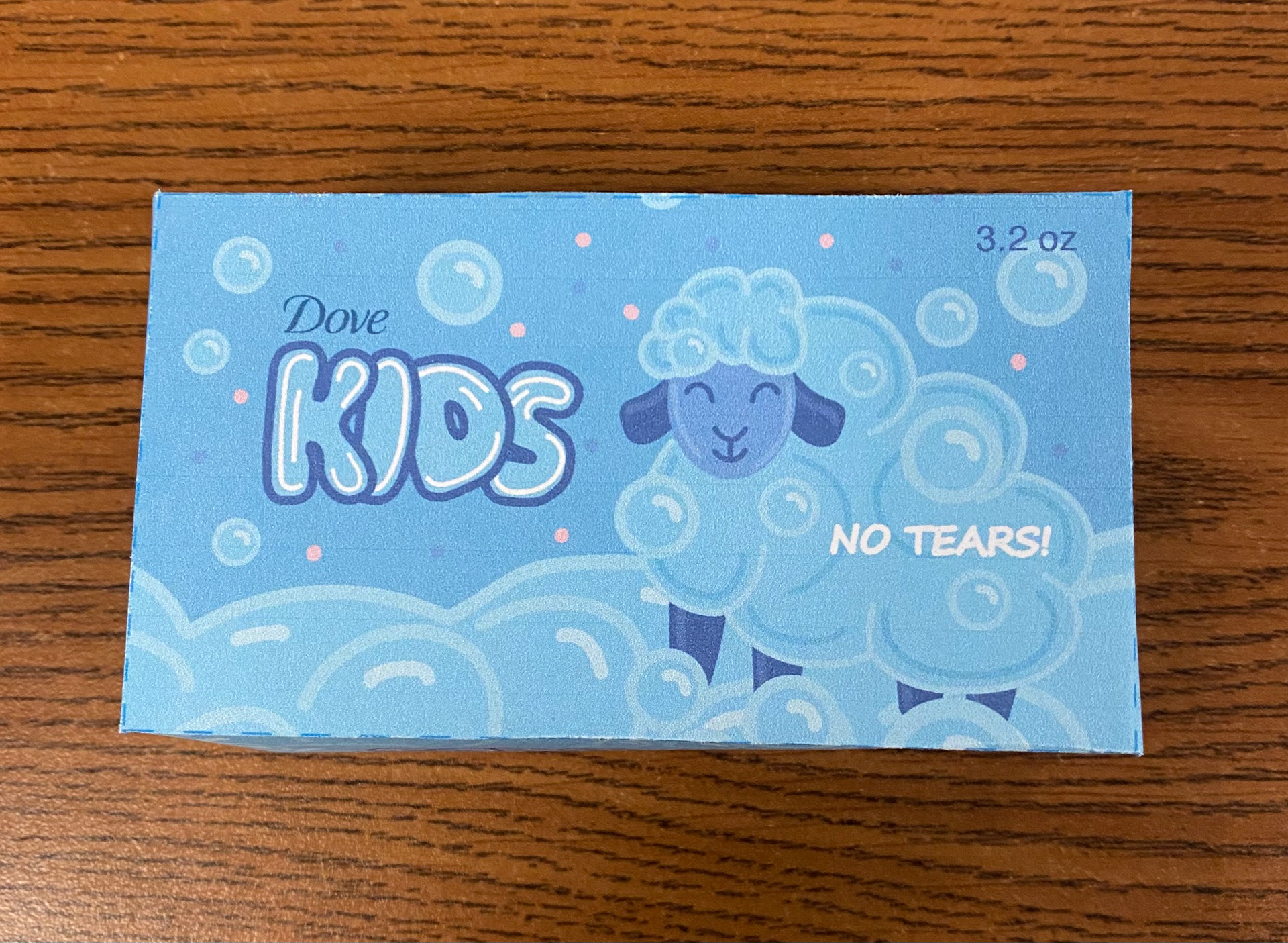
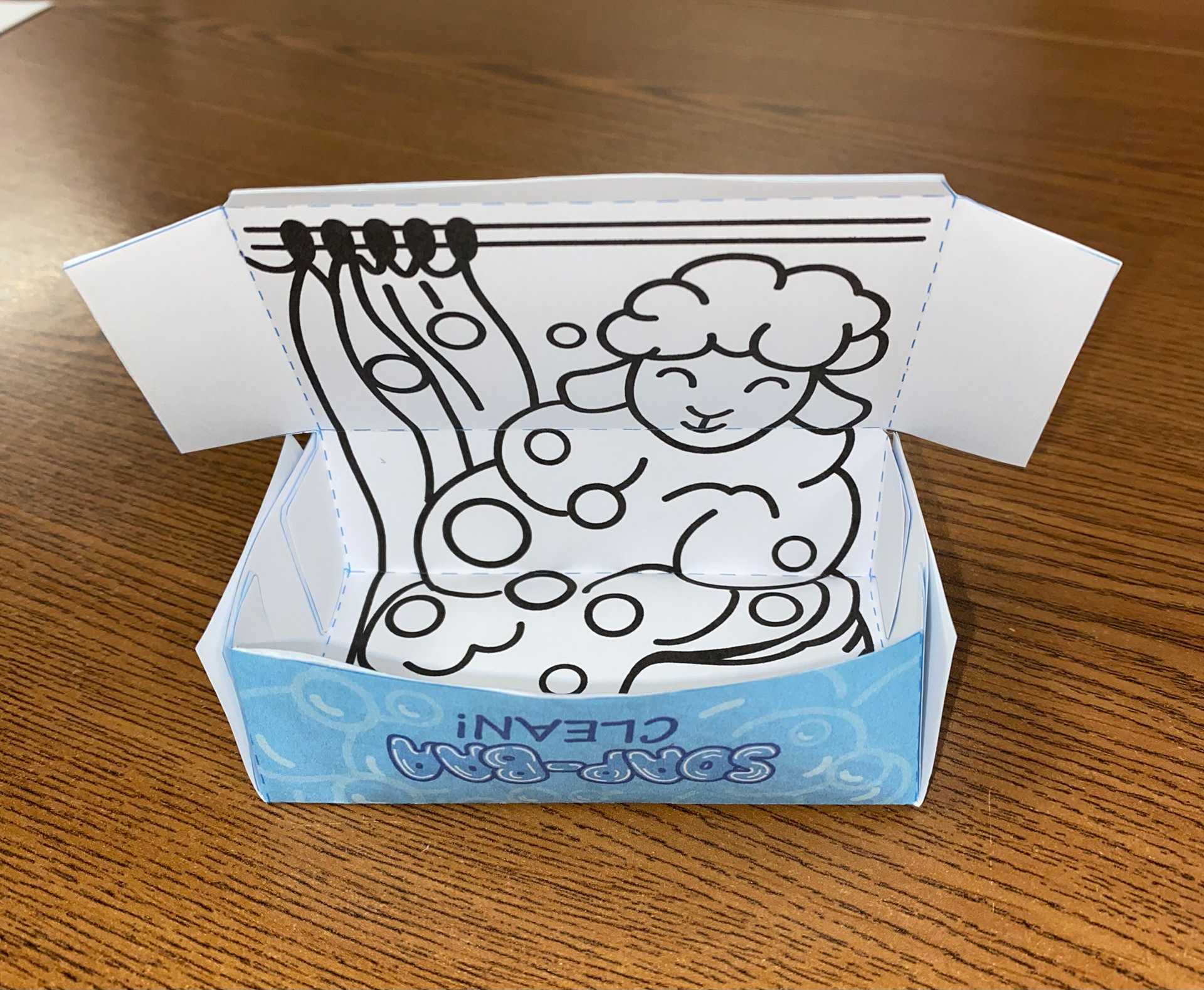
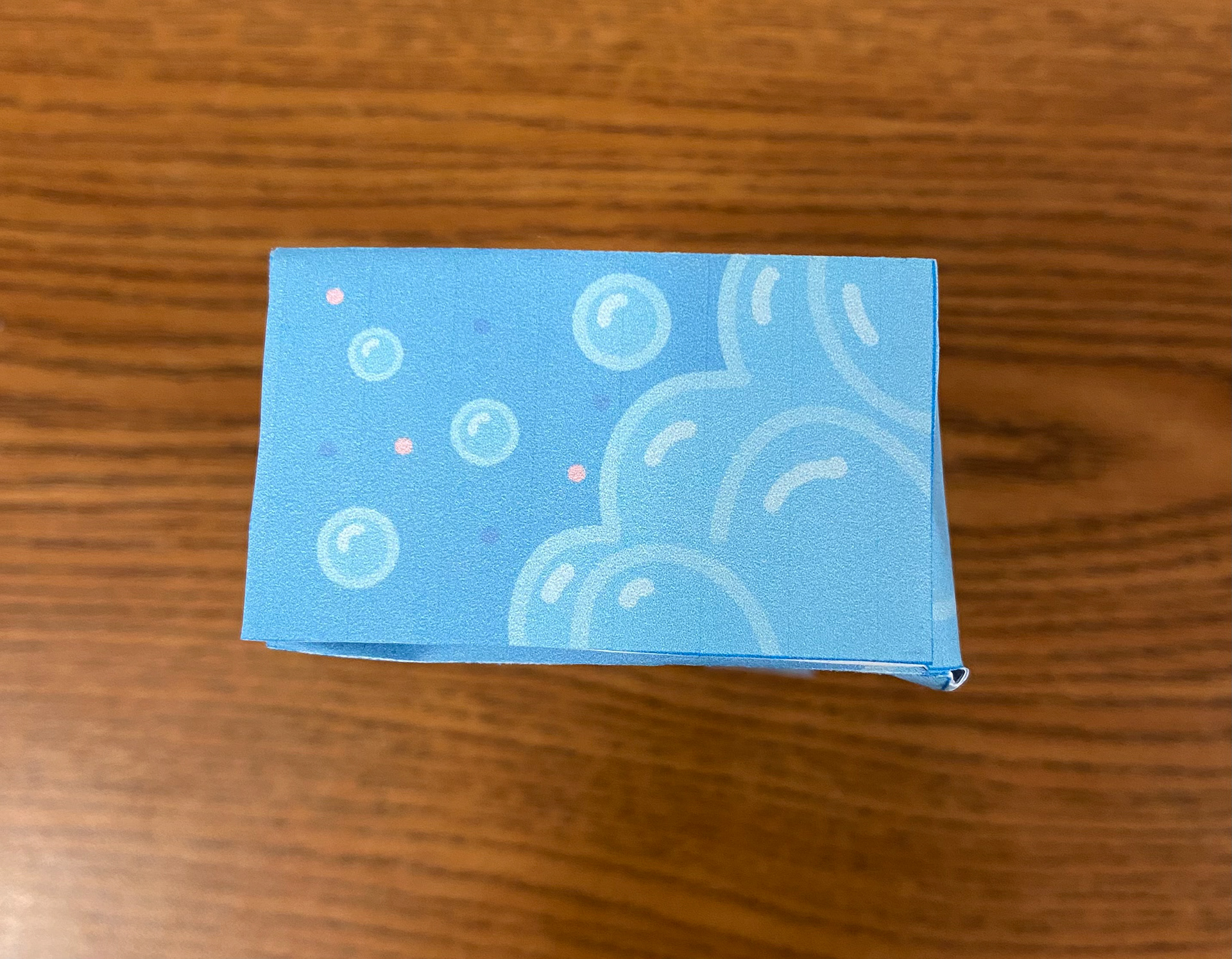
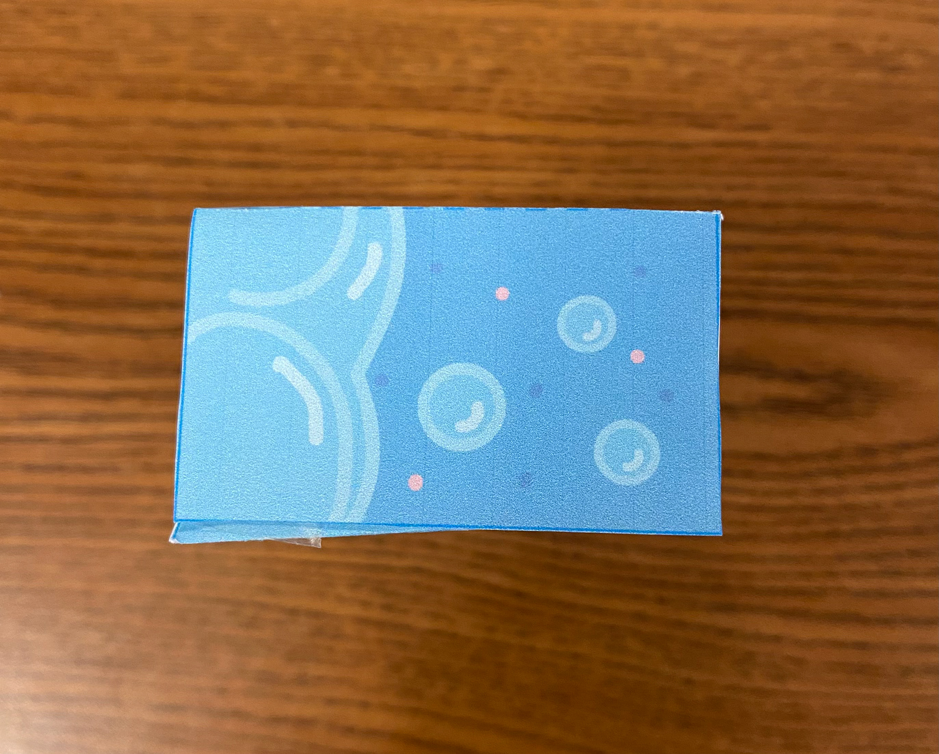
When I submitted the final sketch for this project, my goal was to create a design that felt fun and gentle at the same time. I wanted the overall look to be visually engaging for children while maintaining a soft, clean appearance. To achieve this, I used soft blues with light pink accents, incorporating shiny, soft bubbles to enhance the gentle feel. The central character, a sheep, was designed to reinforce the ideas of softness and care—qualities parents look for in a product for their children.
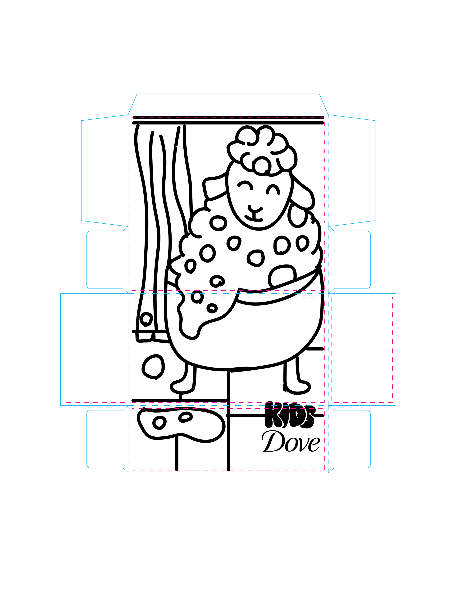
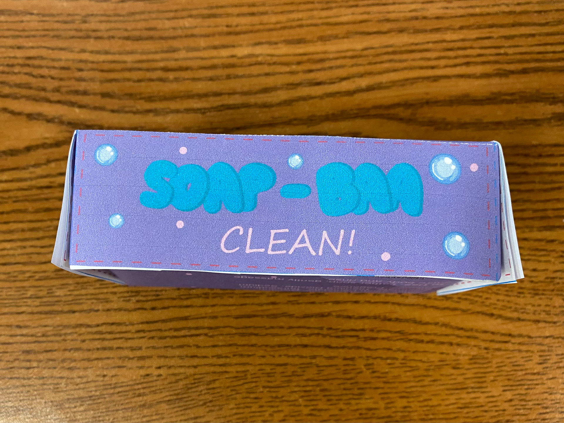
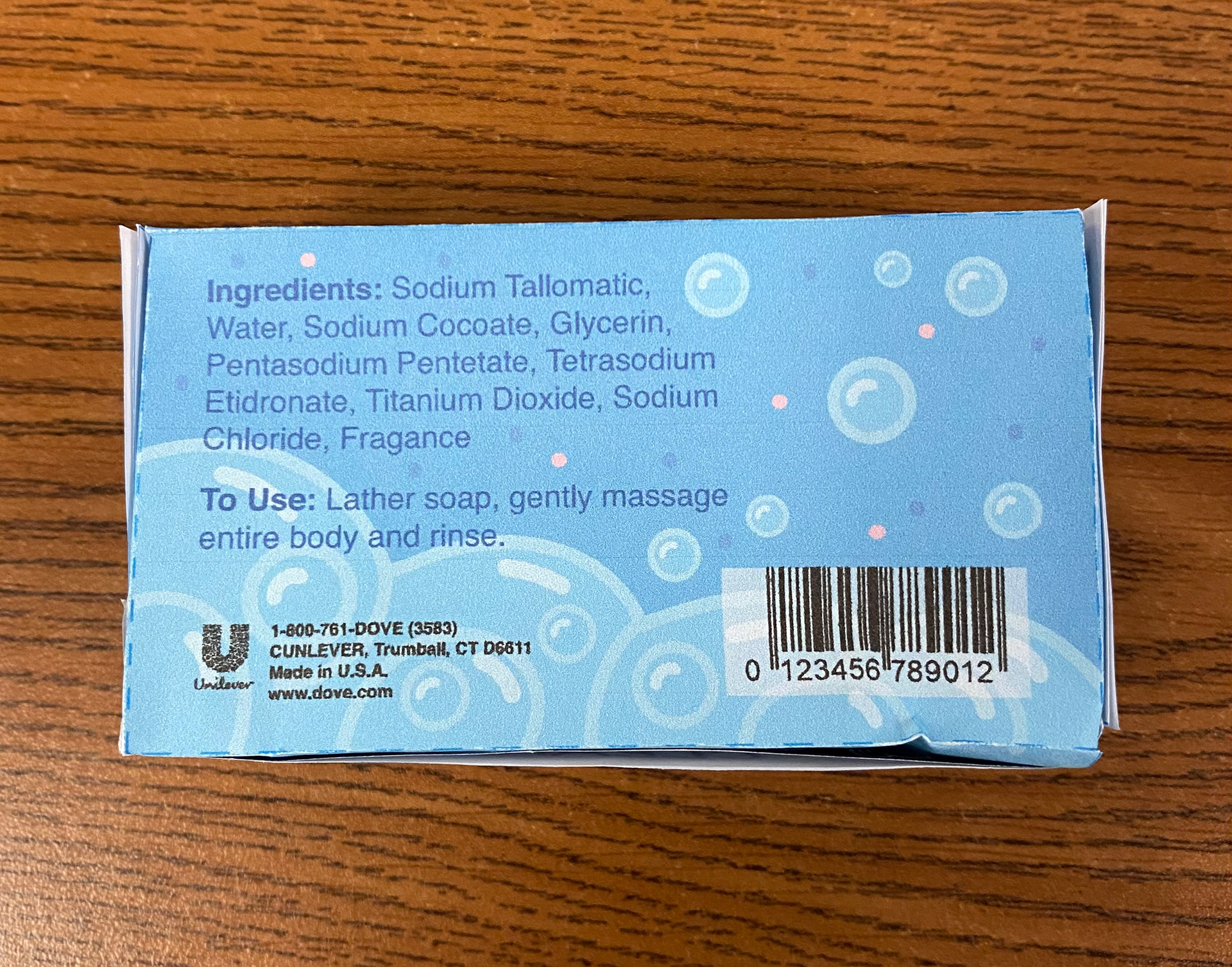
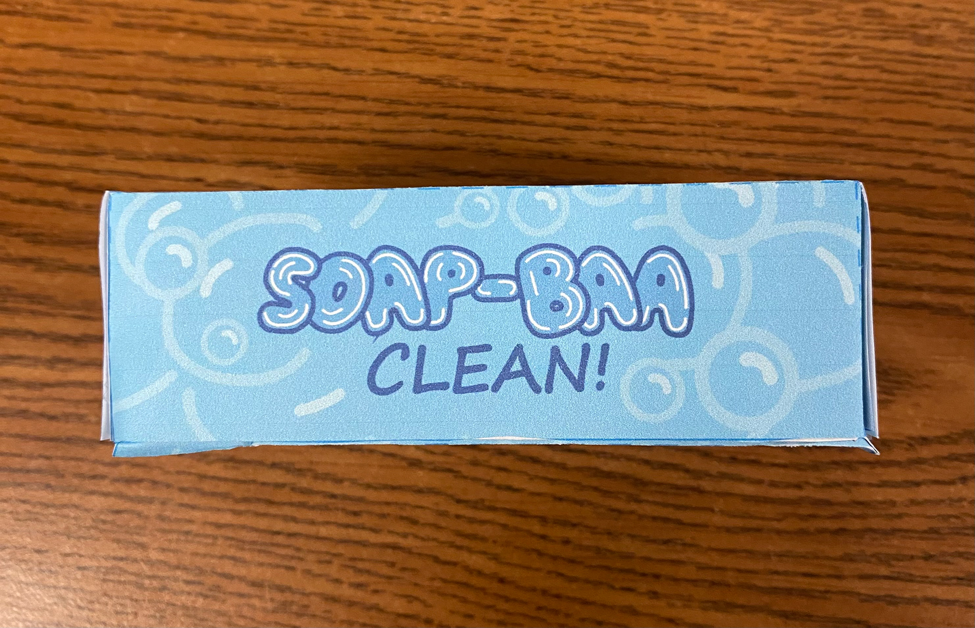
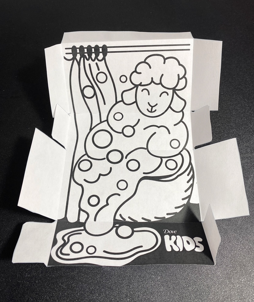
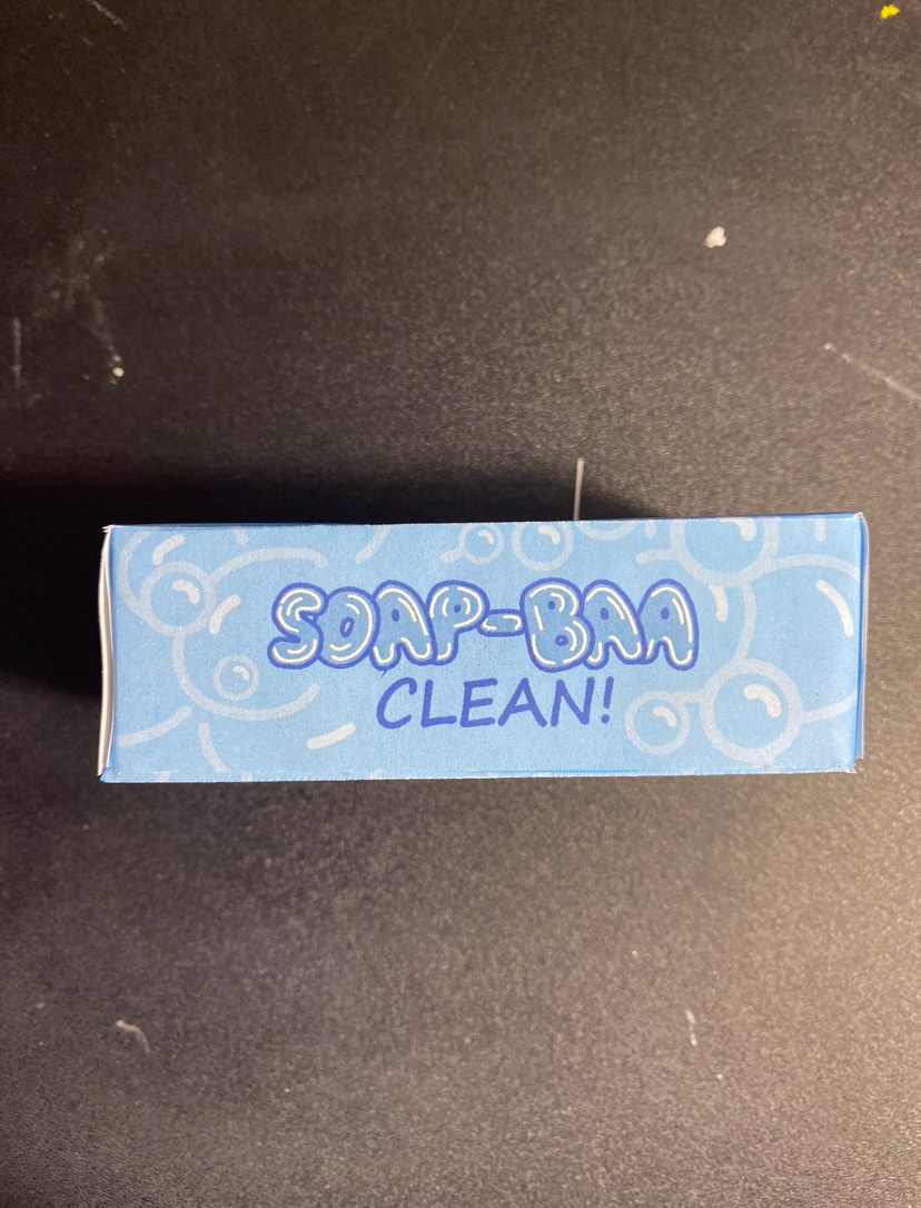
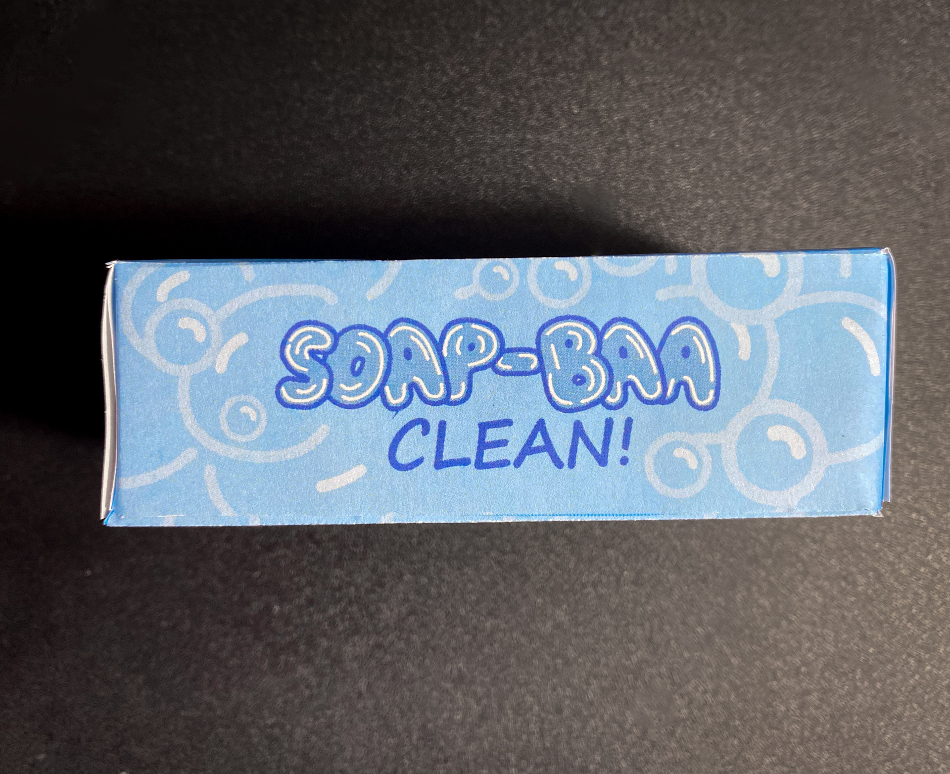
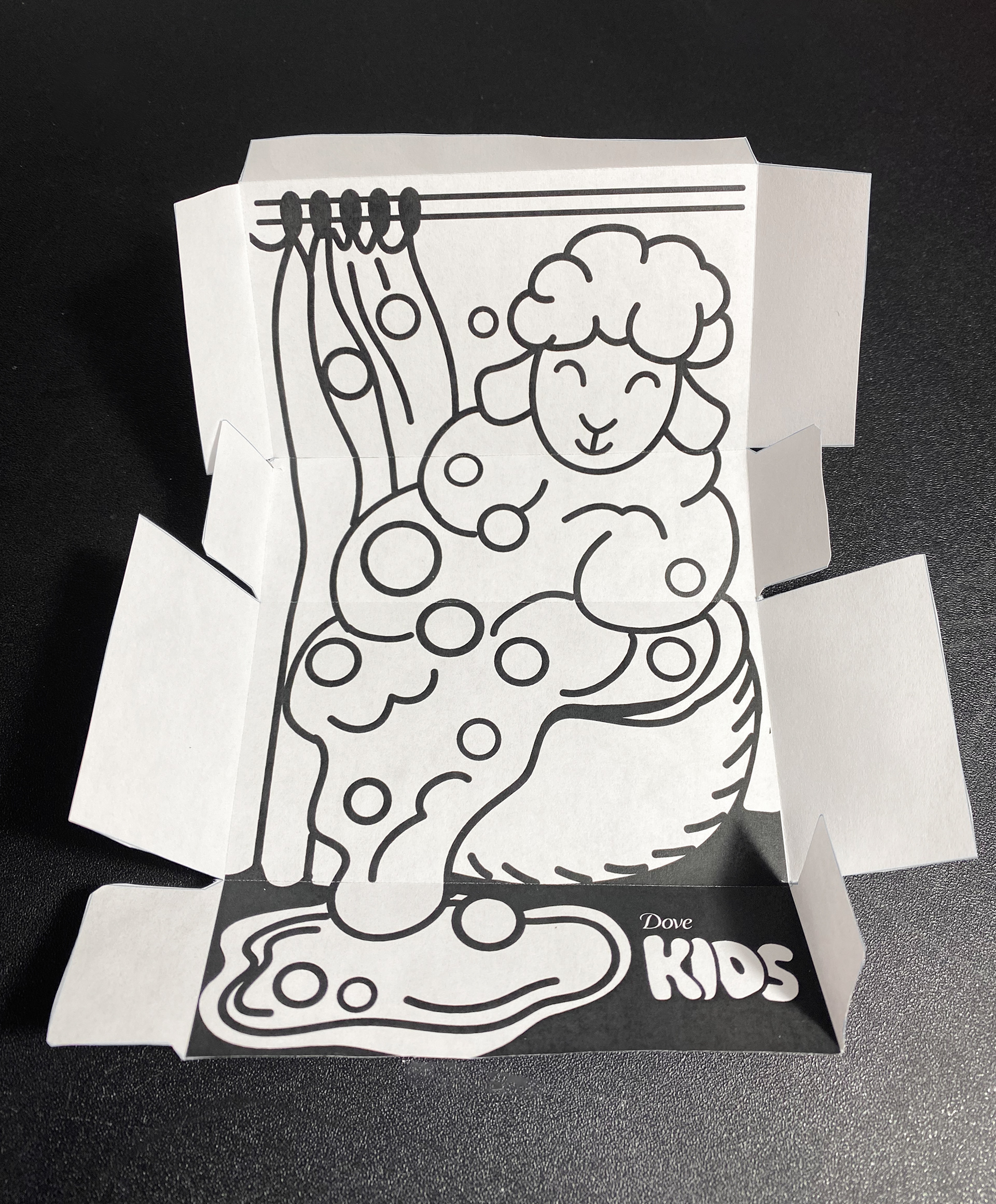
To make the design more playful, I created the sheep entirely out of bubbles, adding a unique, fun element that would appeal to kids. The smiling sheep brings a cheerful, welcoming vibe, making the product more inviting. Additionally, I added a panel with a pun that could add a lighthearted touch for parents to share with their kids. The phrase "Soap-BAA clean!" plays off the familiar "Super clean!" while using "BAA," the sound a sheep makes, to tie into the playful theme.
Now that the project is complete, I feel that the design successfully balances the fun and softness I originally aimed for, while staying true to the Dove brand identity.
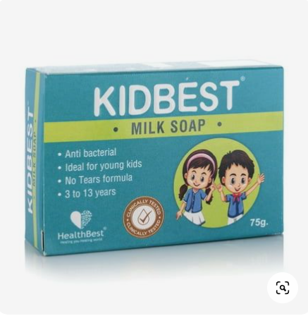
Preliminary Research
LIKE
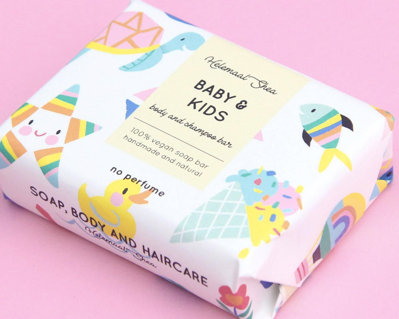
The design is inviting and visually appealing due to its bright color palette and simple, cartoony illustrations. The cheerful and playful imagery creates a positive and friendly vibe, making it suitable for a children's product. Additionally, the clean typography complements the illustrations without competing for attention, resulting in a harmonious and well-balanced overall design.
The design is inviting and visually appealing due to its bright color palette and simple, cartoony illustrations. The cheerful and playful imagery creates a positive and friendly vibe, making it suitable for a children's product. Additionally, the clean typography complements the illustrations without competing for attention, resulting in a harmonious and well-balanced overall design.
LIKE
The design is visually captivating and engaging, especially with the way the illustration wraps around the soap bar. The small details in the artwork invite closer inspection, making the packaging more memorable. The elegant and clean typography complements the playful illustration, which feels like it could belong in a children’s book, enhancing its appeal to both kids and parents.
The design is visually captivating and engaging, especially with the way the illustration wraps around the soap bar. The small details in the artwork invite closer inspection, making the packaging more memorable. The elegant and clean typography complements the playful illustration, which feels like it could belong in a children’s book, enhancing its appeal to both kids and parents.
DISLIKE
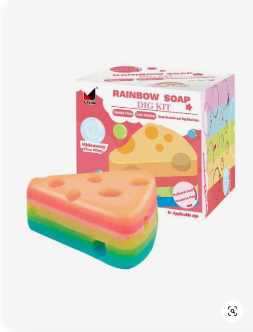
The design feels overwhelming because there are too many competing elements. The use of color is inconsistent, with the holes in the cheese and the edge using shades that don’t match the established color palette. Additionally, the typography is chaotic, with each text element styled differently, making the overall layout appear cluttered and disorganized.
The design feels overwhelming because there are too many competing elements. The use of color is inconsistent, with the holes in the cheese and the edge using shades that don’t match the established color palette. Additionally, the typography is chaotic, with each text element styled differently, making the overall layout appear cluttered and disorganized.
DISLIKE
Although the layout and hierarchy are functional, the design lacks visual appeal. The muted colors and plain typography make it look like a generic medicine product, failing to capture a child’s attention. The small, crowded text and lack of engaging visuals do not effectively communicate a playful or fun experience for kids.
Workshop 1
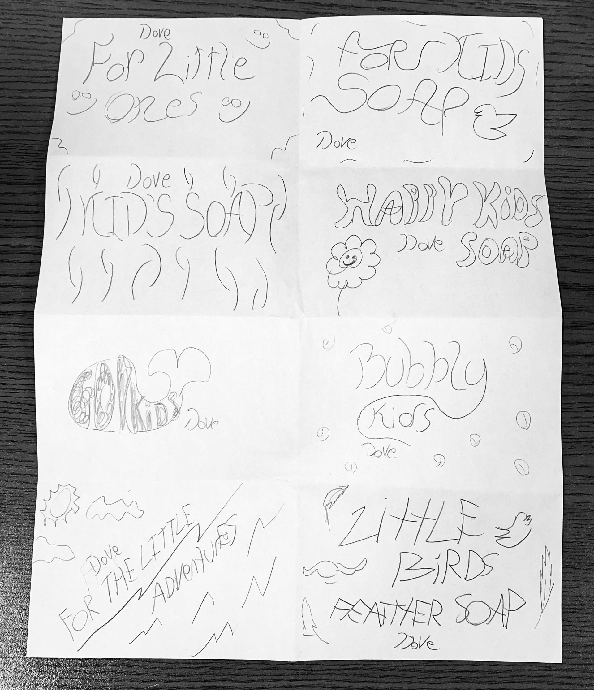
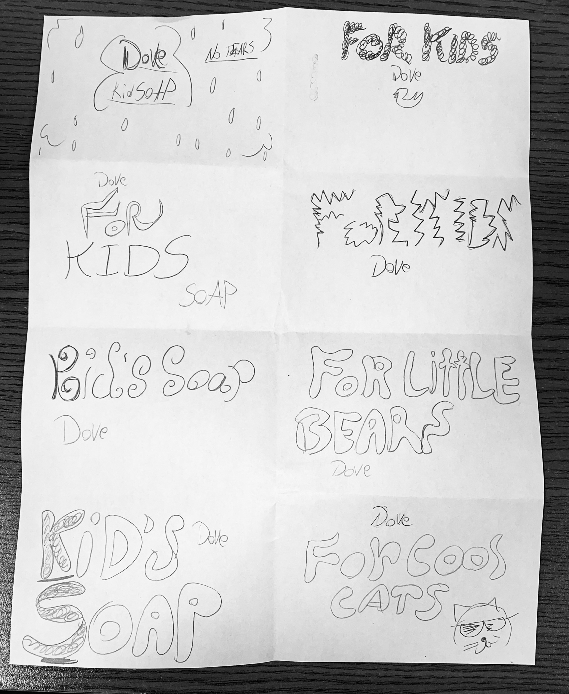
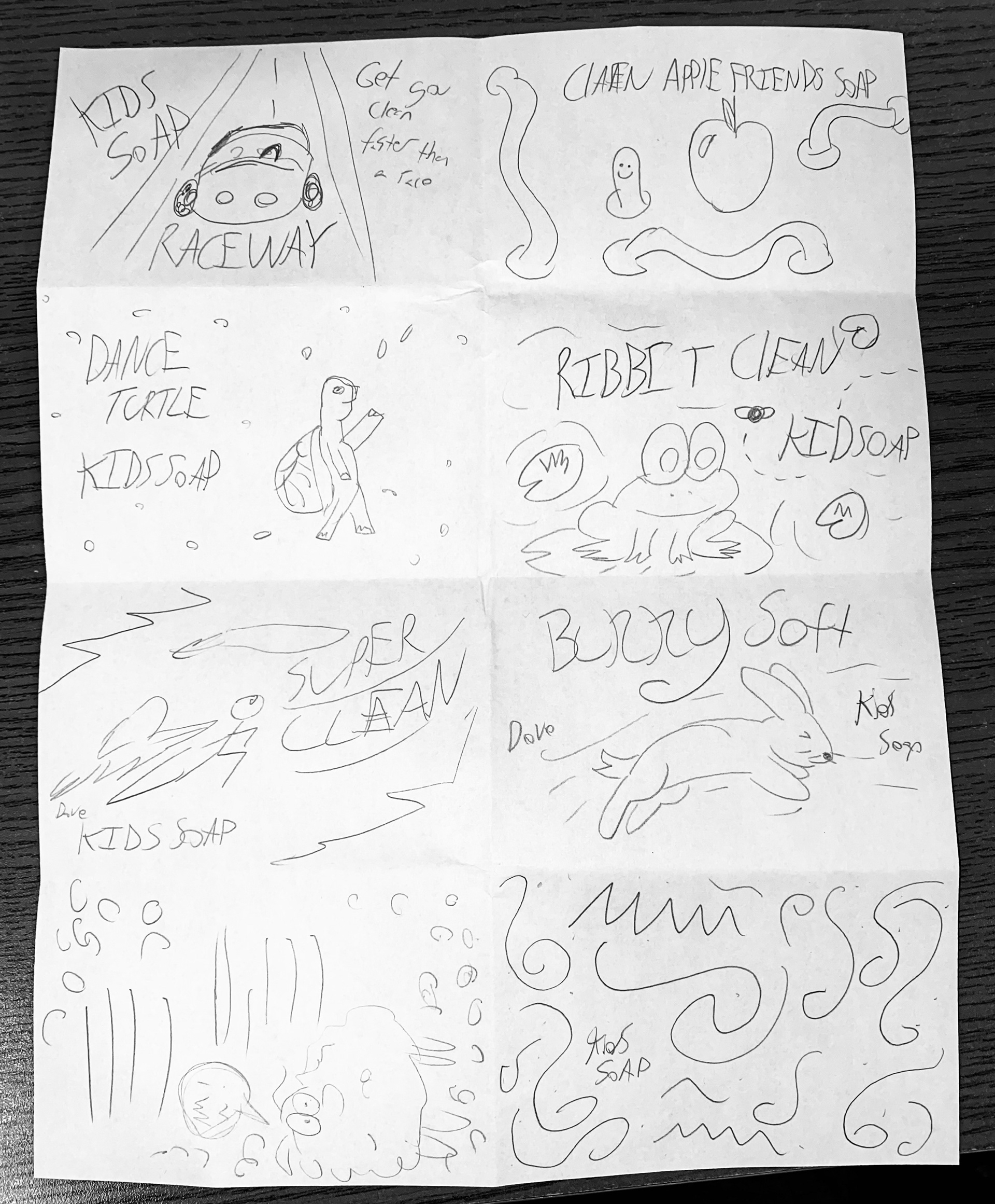
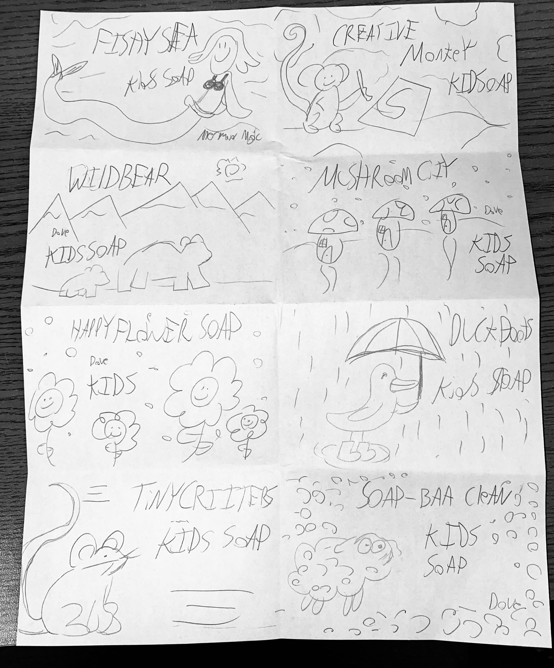
2 Rounds of Crazy 16 Sketches
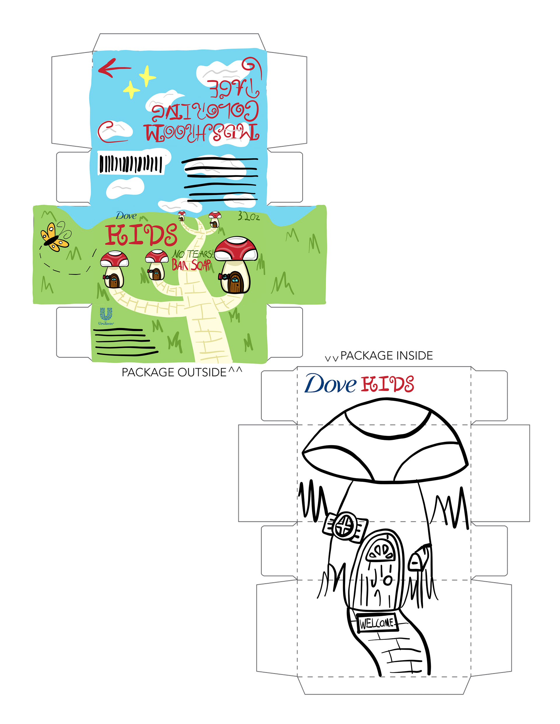
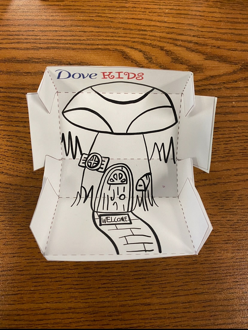
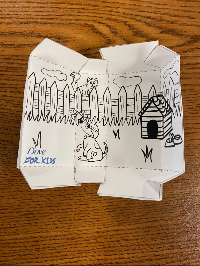
For this exercise, we were instructed to create quick 1-minute sketches before moving on to the next idea. I completed 16 sketches focused on typography and 16 that explored various concepts and themes for the design. The standout concepts were "Wildbear Soap," "Mushroom City," and "Soap-Baa Clean." From this point, I had the option to further develop these ideas or explore new ones in more detailed sketches.
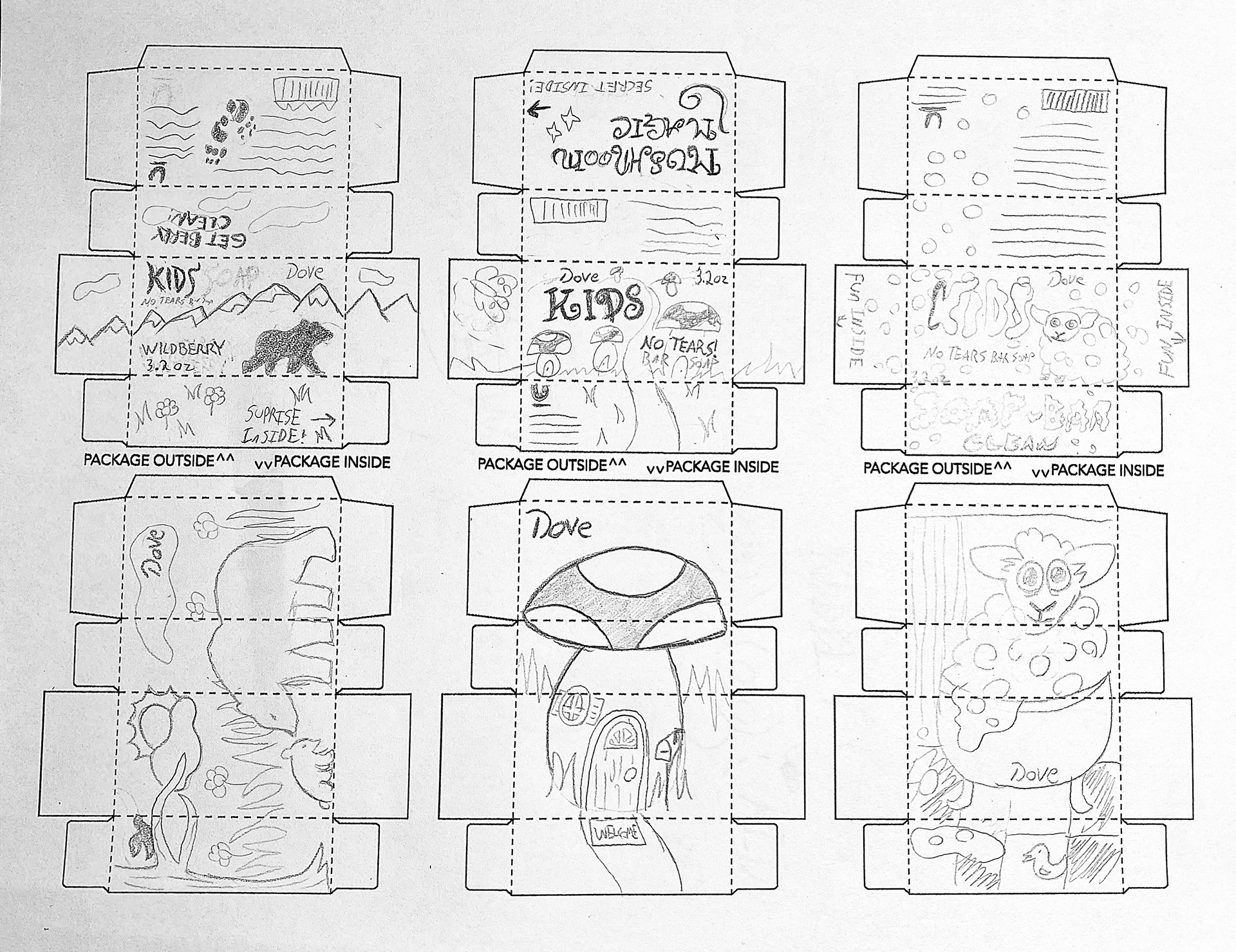
Sketches Round 1
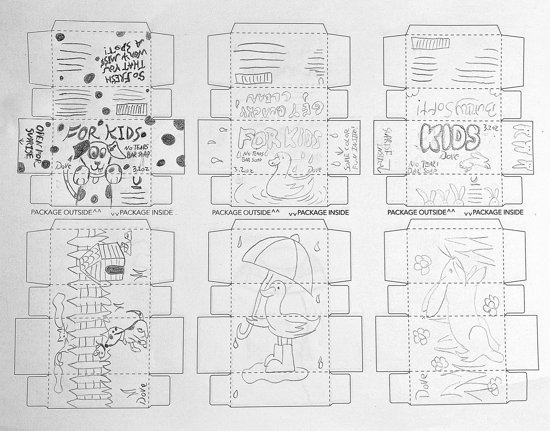
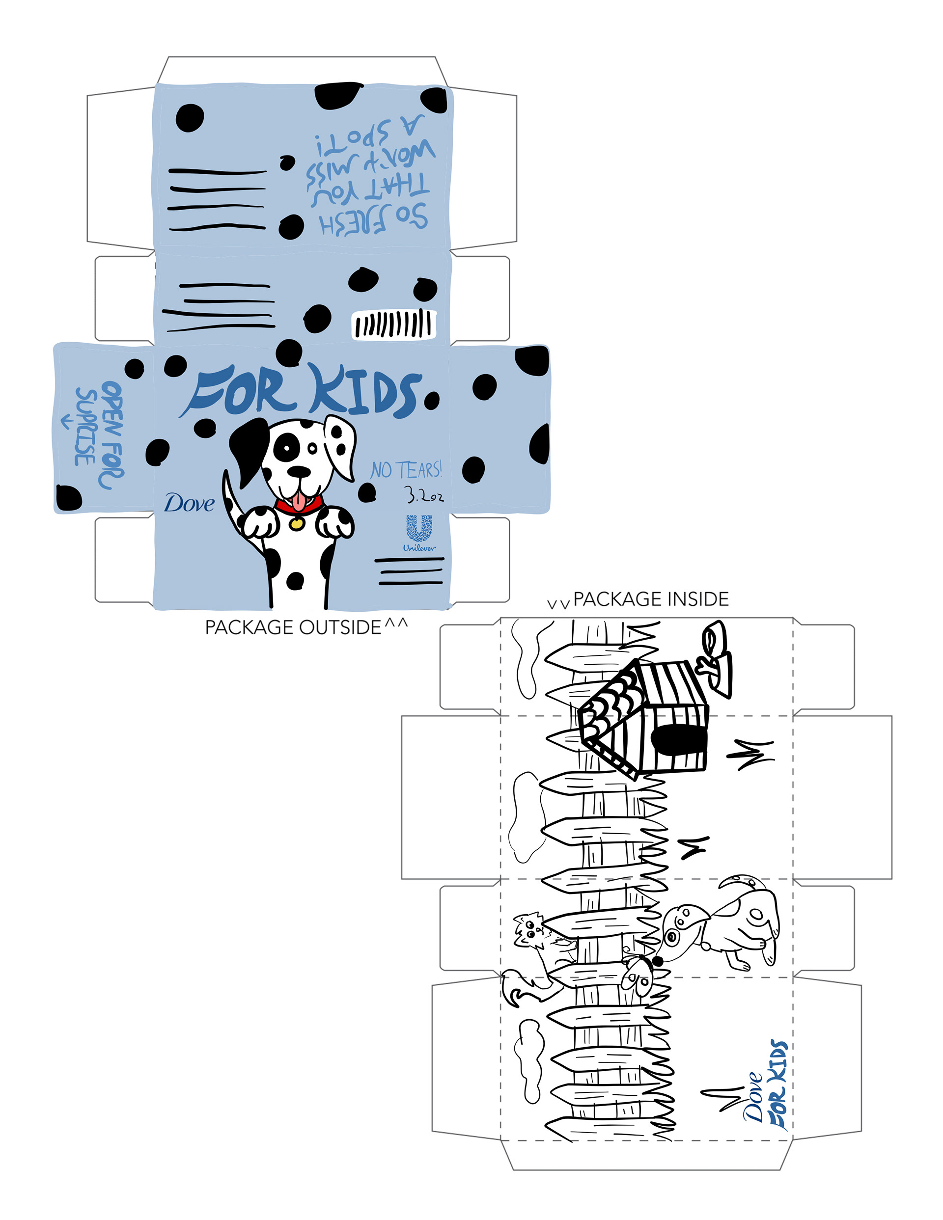
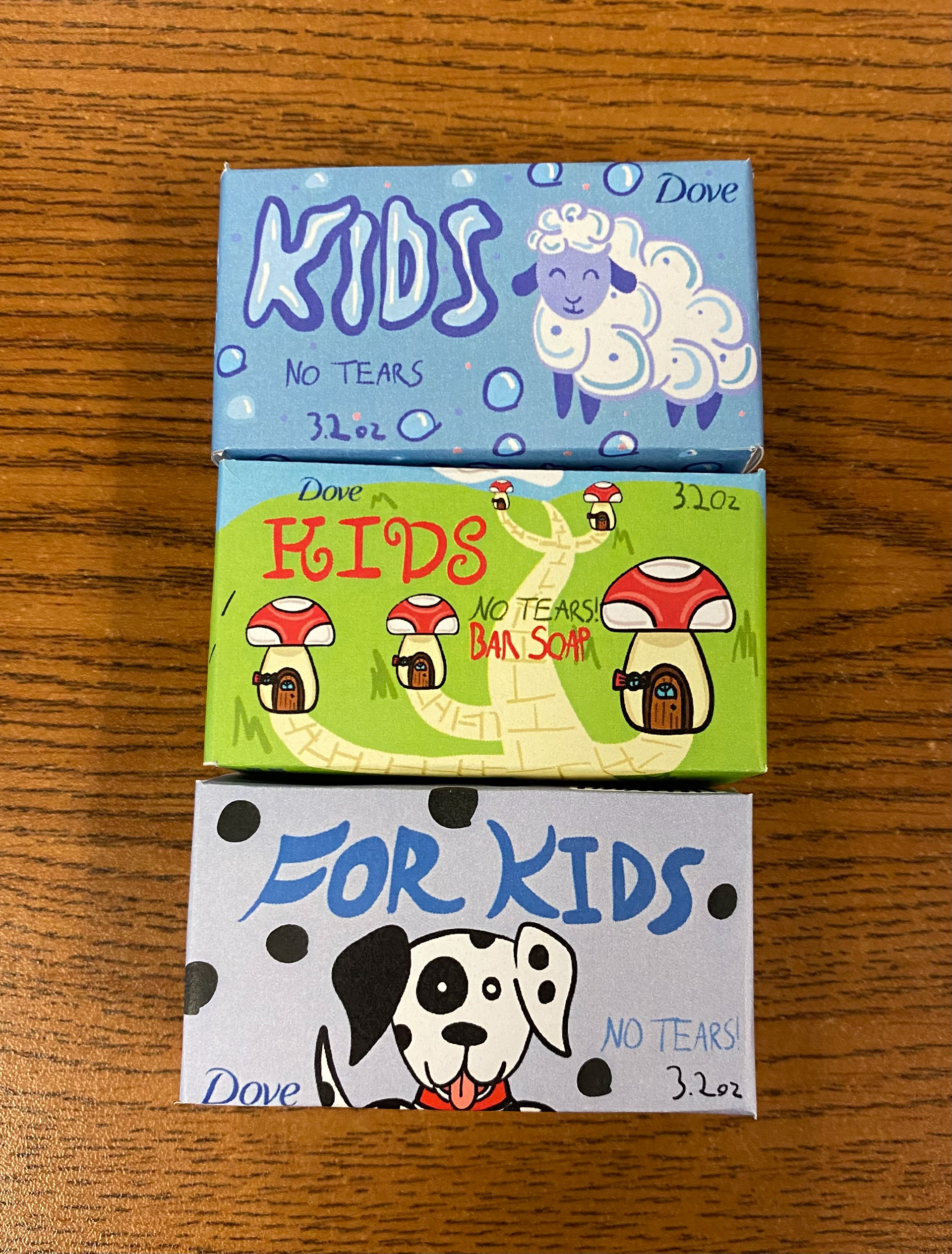
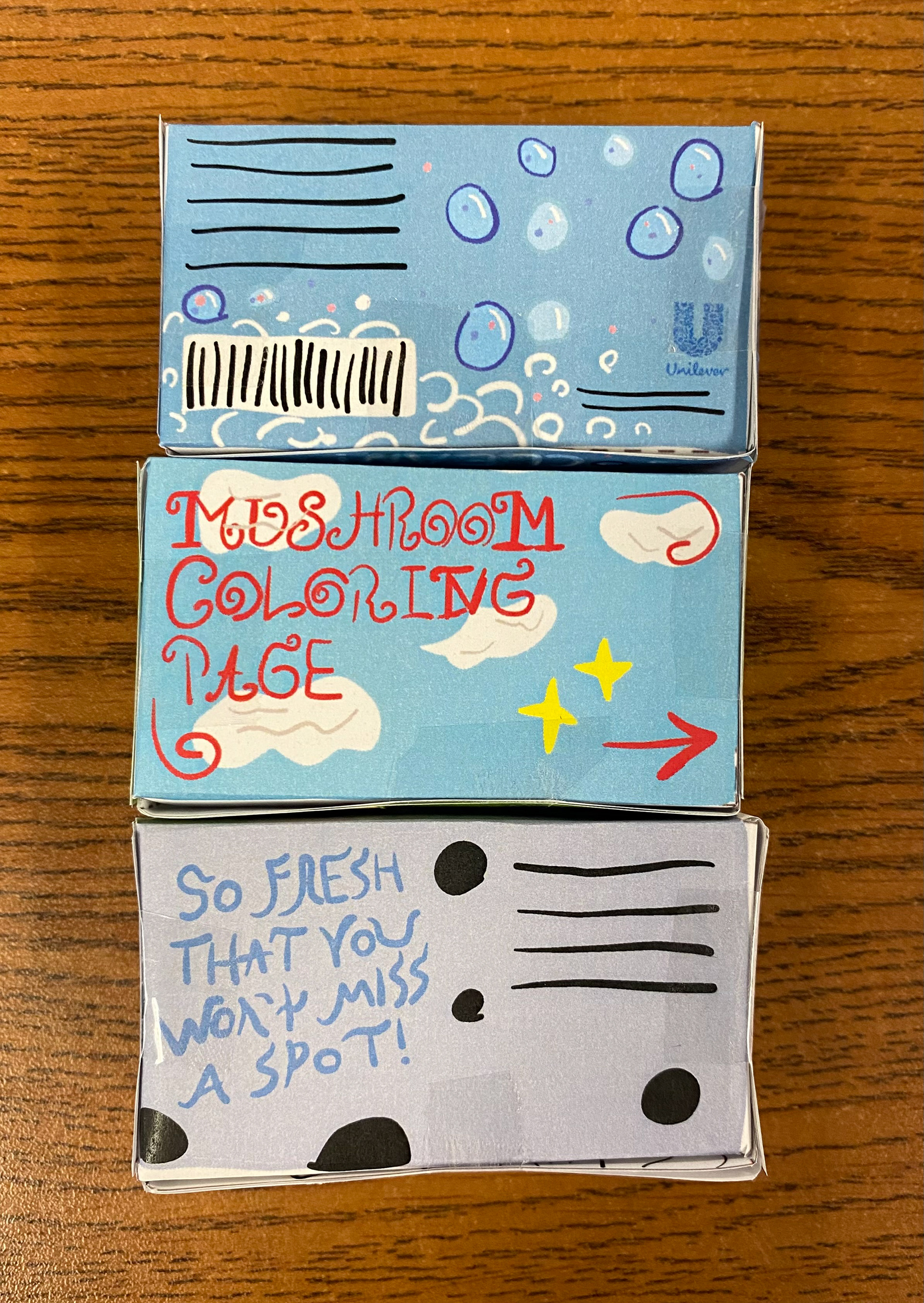
These sketches were further developed without the restriction of the 1-minute time limit. Four of the concepts received positive feedback from my professor and classmates, but I had to choose one to eliminate since only three ideas could move forward. The final selections for this round were "Mushroom City," "Soap-Baa Clean," and the "Dalmatian Dog."
Workshop 2
Sketches Round 2
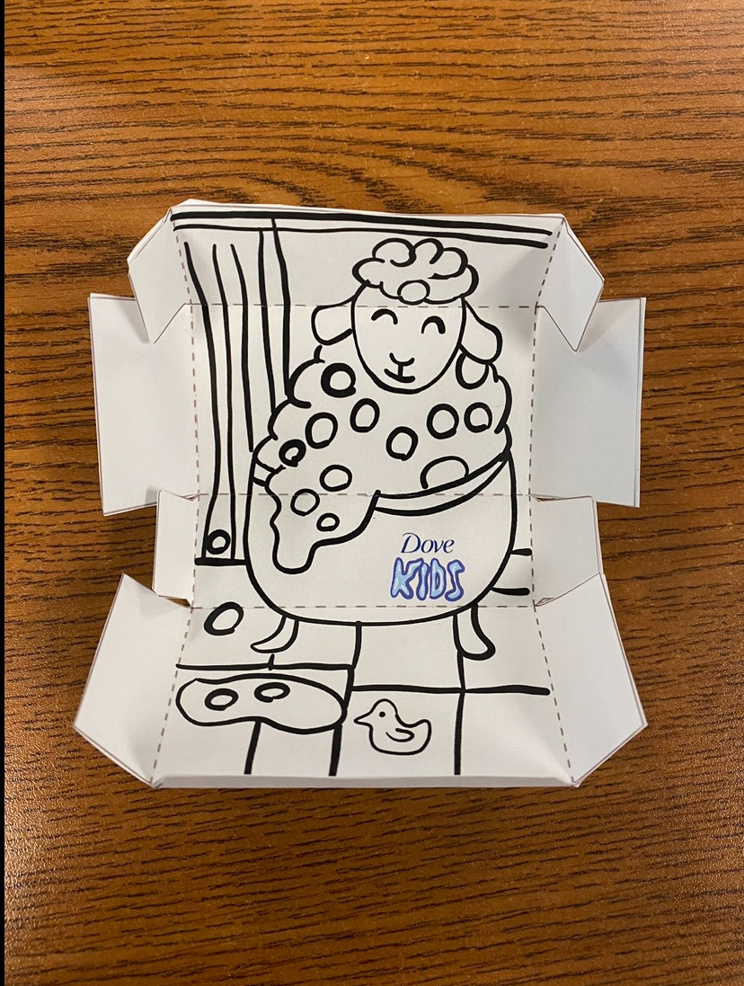
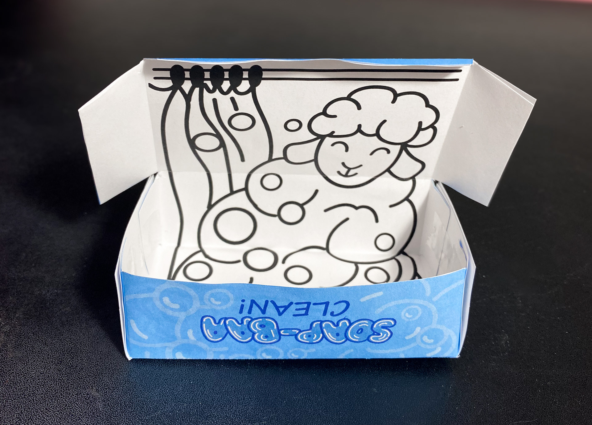
With these sketches now more developed, featuring improved layouts and better spatial awareness, it became easier for me to visualize the design. I also had the opportunity to design the interior of the boxes during this round. After presenting the updated versions in class, I received mixed feedback. My classmates were enthusiastic about the "Bubble Sheep," while my professor preferred the "Mushroom" concept. After considering both options, I ultimately decided to move forward with the "Bubble Sheep." I was most drawn to this idea because it had a softer style and design, which aligned with my vision for a children's product.
Workshop 3
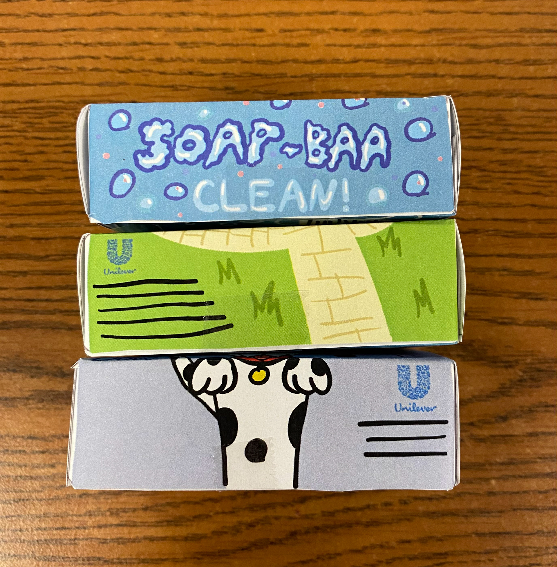
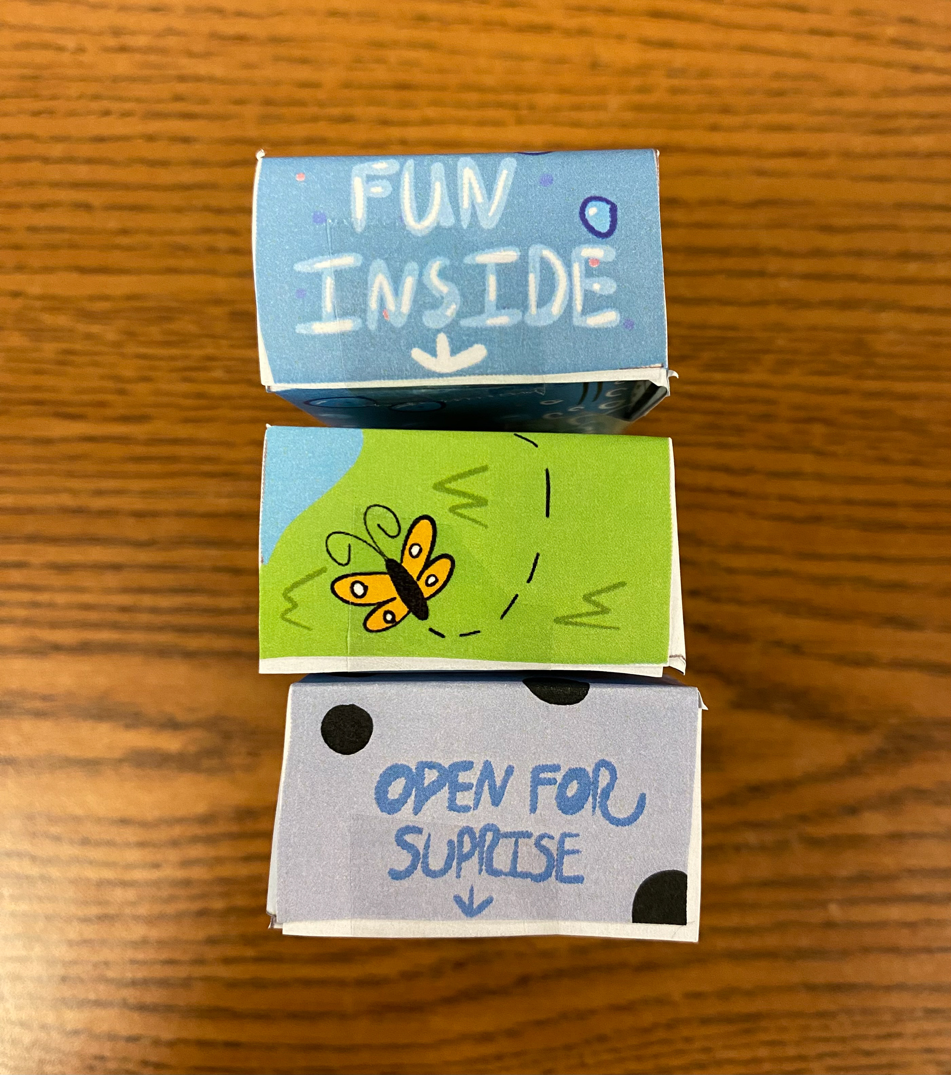
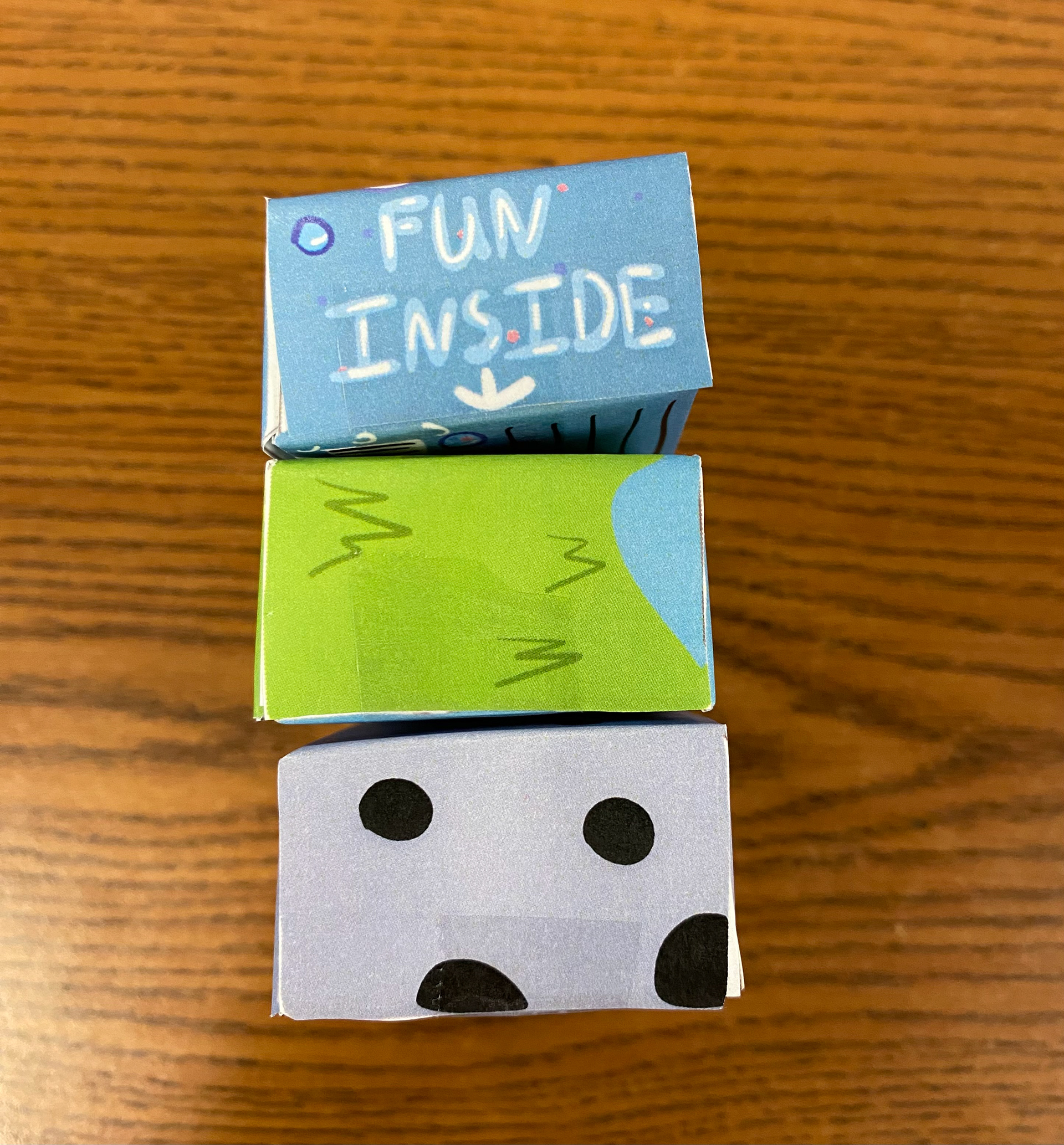
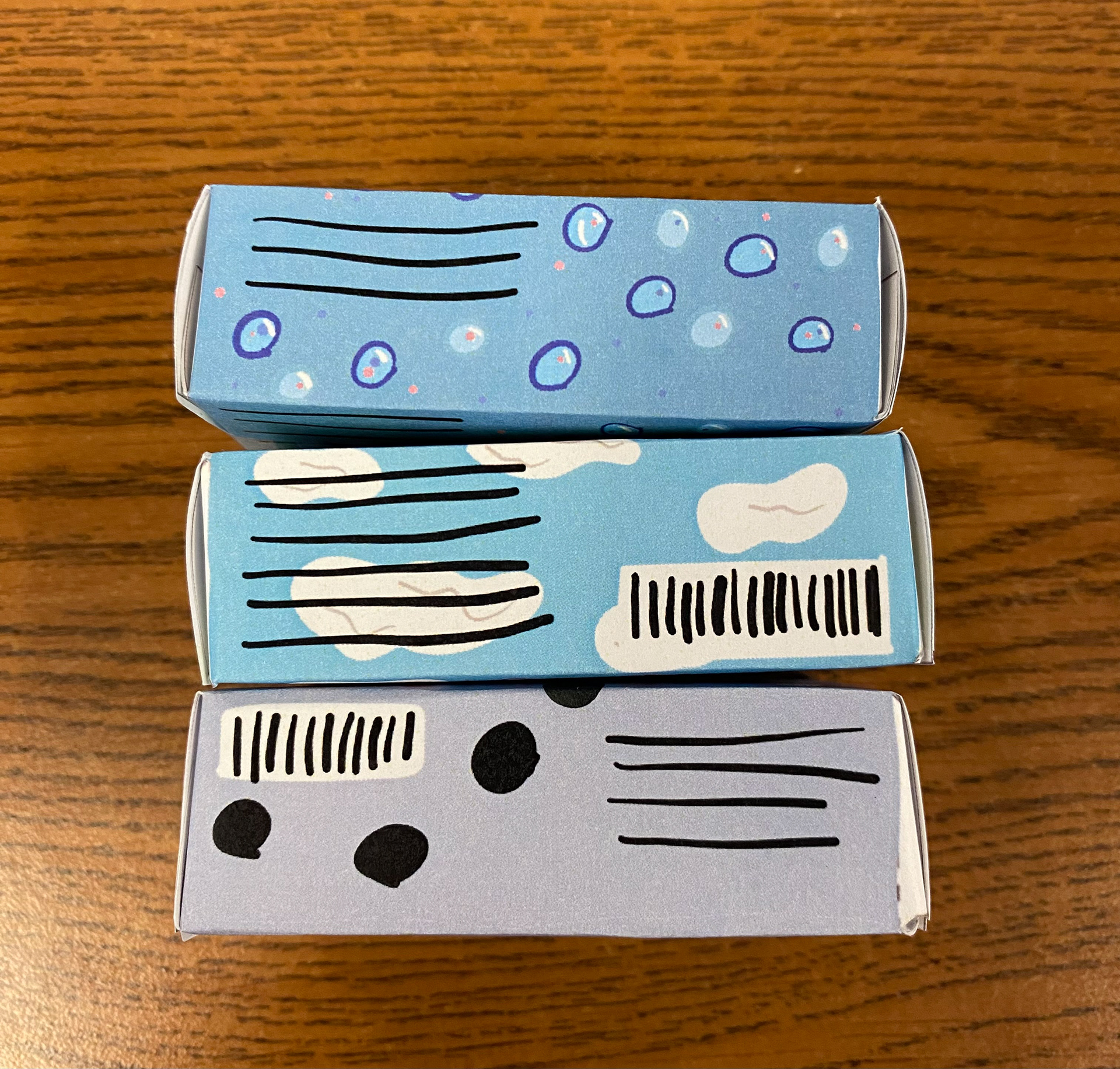
Tangible Mock-Ups
These are the first mock-ups I created for this project. Seeing them come to life as 3D physical boxes gave me a better understanding of the design process and how the final product would look. This experience also helped me refine my focus on the main concept, the "Bubble Sheep."
Digital Work Development
Oct. 3rd
In this first stage of development, I encountered a setback. I thought I needed a different color palette from the previous version of my "Bubble Sheep" design, but after working with it, I realized it wasn’t achieving the look I was aiming for. The colors gave off more of a nighttime, "goodnight" vibe, while I was striving for something playful and clean. It ended up looking more like stars and night, which didn’t align with my vision. On top of that, the typography and layout didn’t meet my expectations either.
Oct. 8th
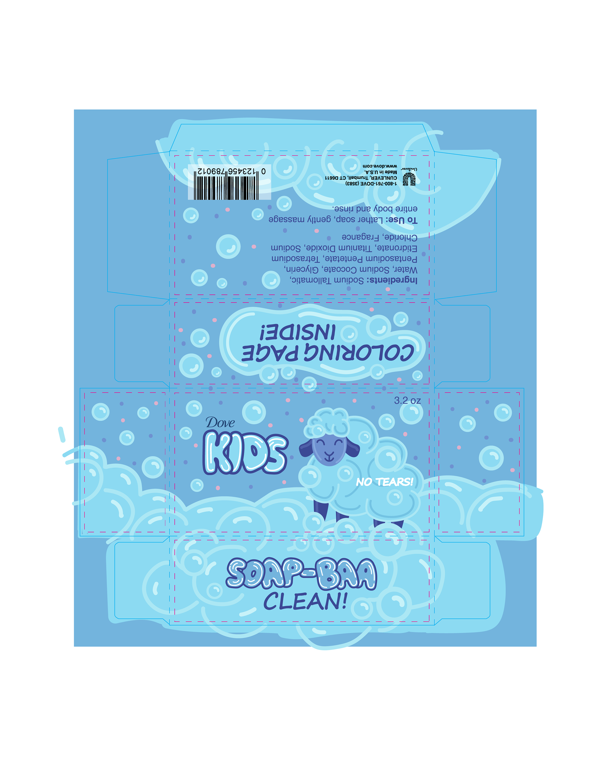
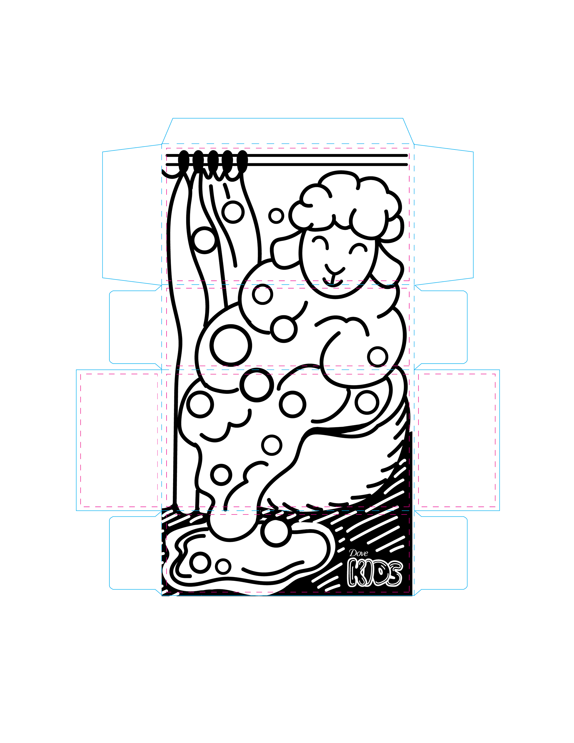
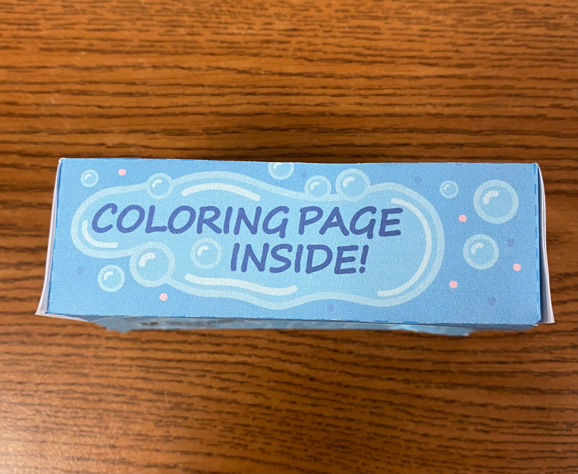
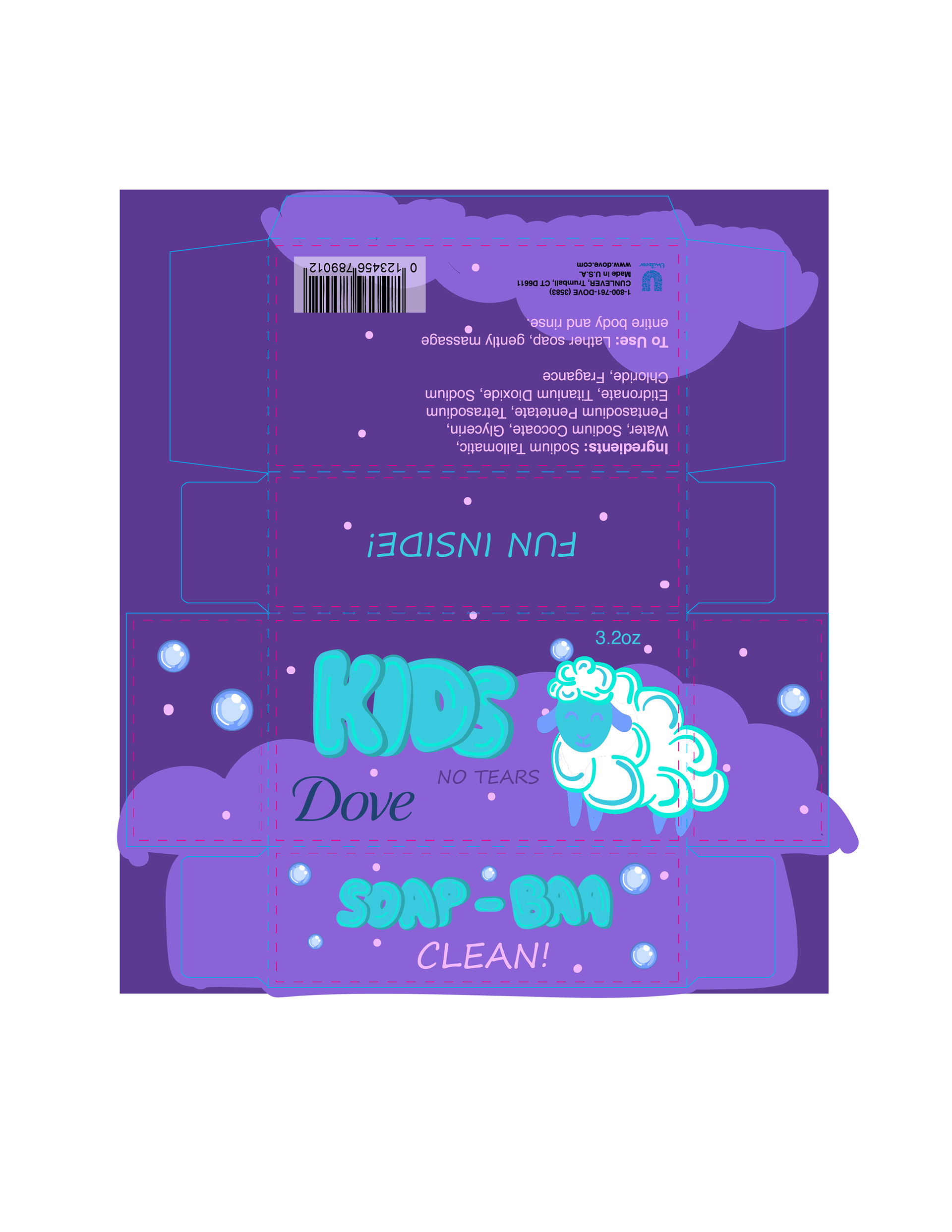
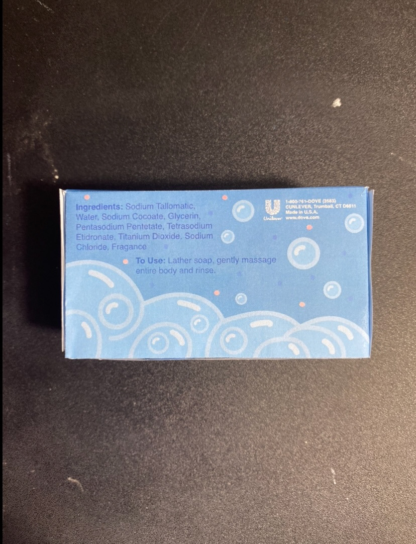
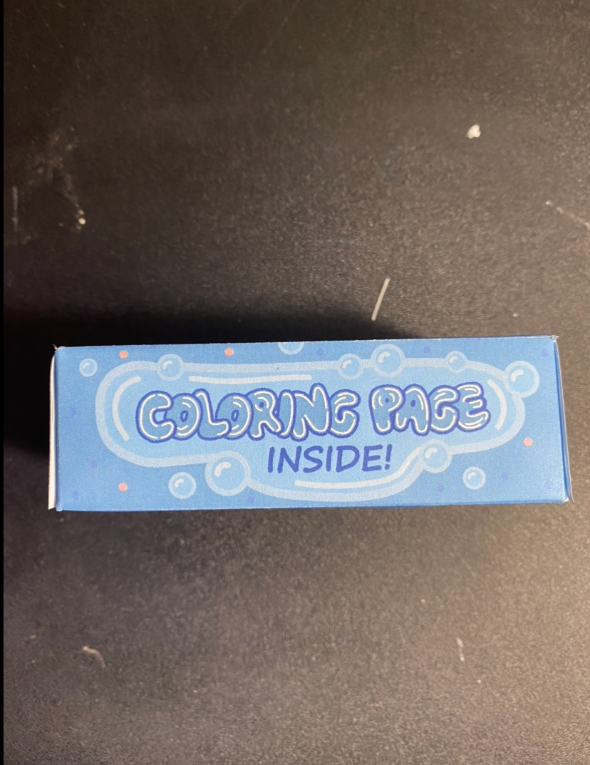
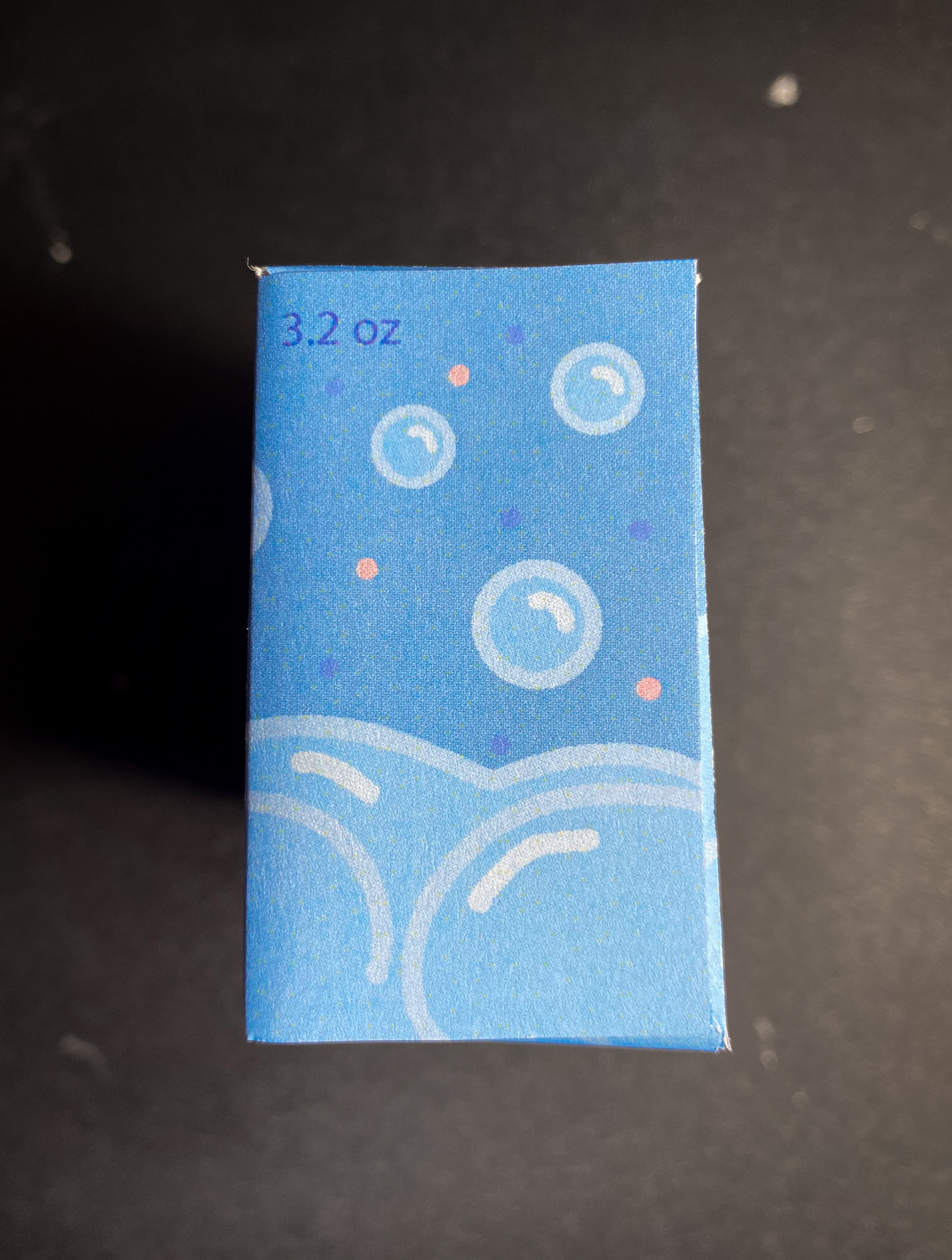
For this version, I returned to my original color palette, which I feel works much better, as it gives the softer appearance I was aiming for. While I was more satisfied with this version, there were still a few adjustments needed. In class, a few suggestions were made, such as removing elements from on top of the bubbles—especially on the back—as it detracted from the overall design. It was also recommended to change the "coloring page" text on the top flap to match the font used for "kids" and "Soap-Baa." Additionally, I was advised to enlarge the "kids" logo and move "no tears" off of the sheep. The "3.2 oz" label also needed to be relocated, and the lines on the floor of the coloring page needed to be removed. Lastly, I needed to adjust the logo on the coloring page be clearer and easier to see.
Oct. 10th
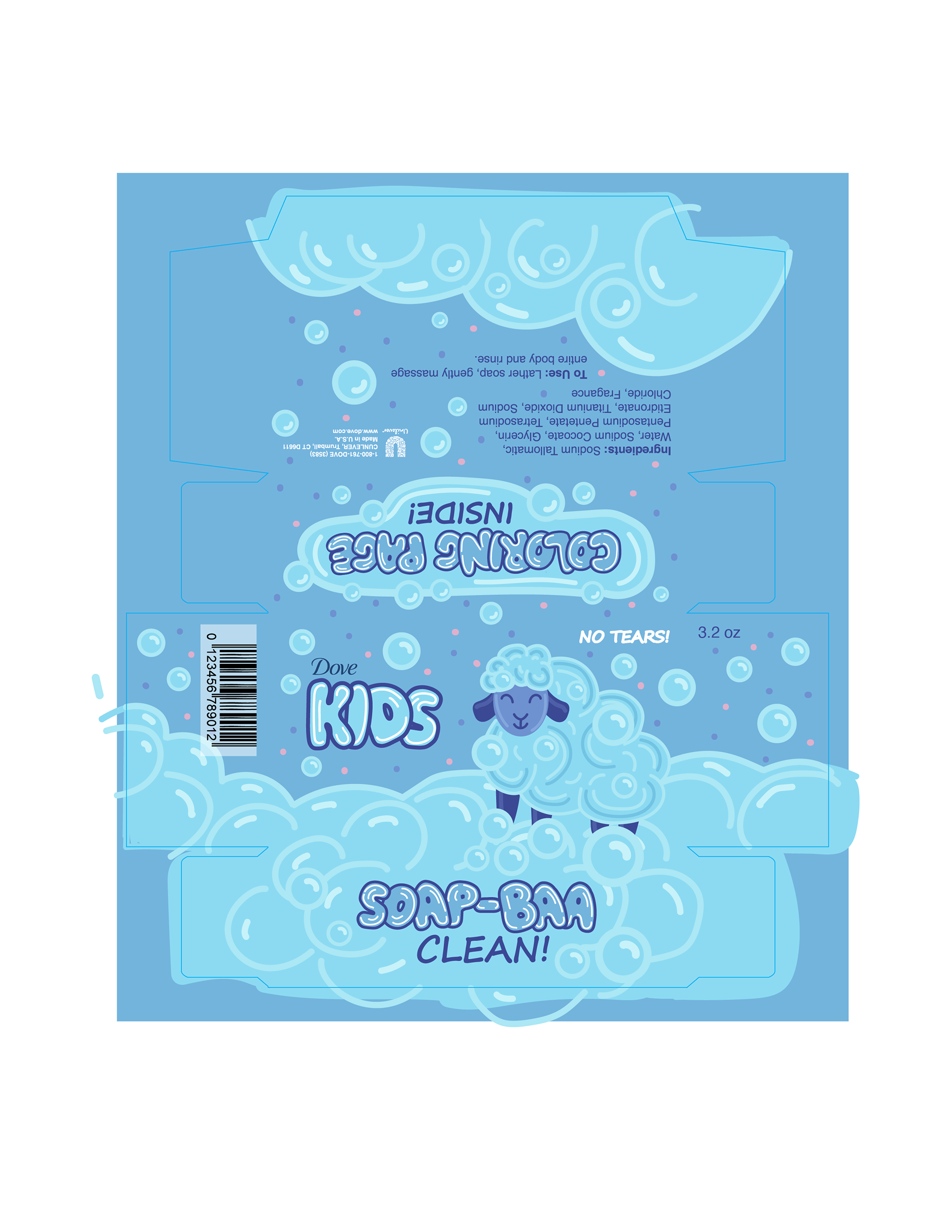
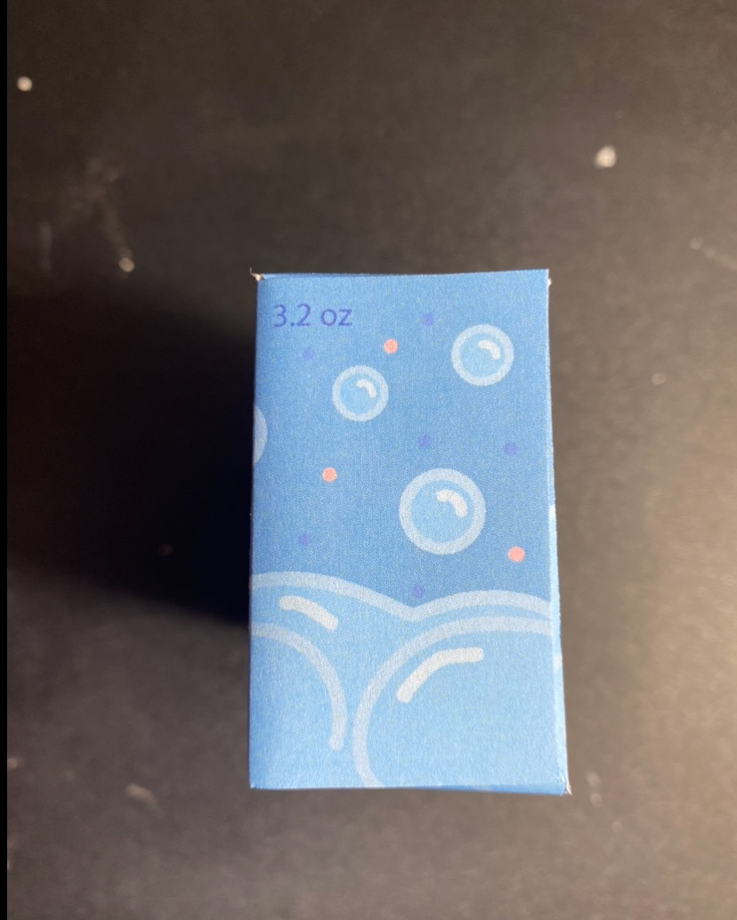
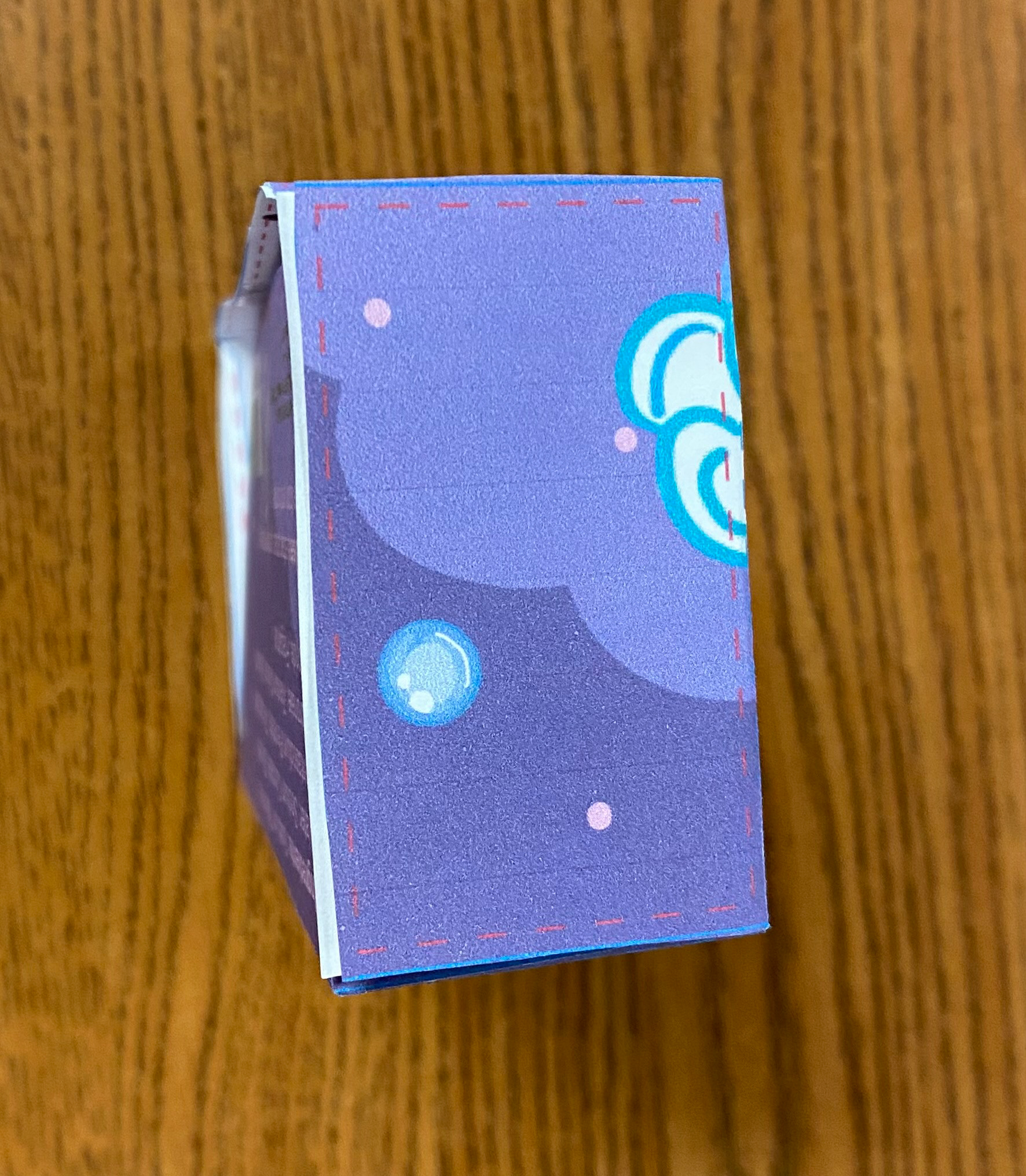
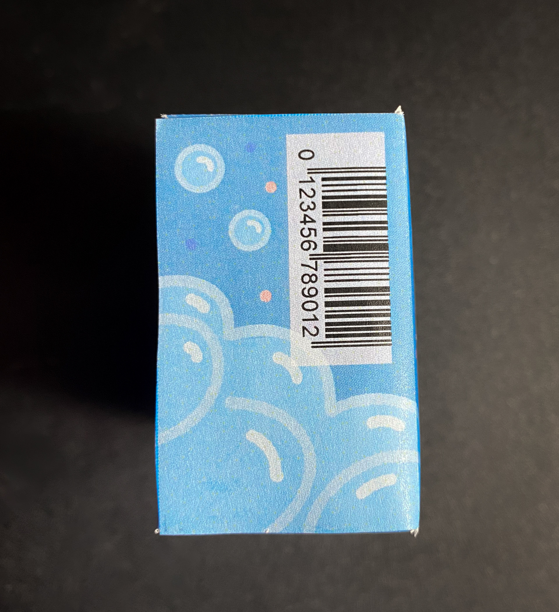
This is the final version, with all the edits I previously mentioned. I believe the design is now much cleaner, and the layout feels significantly stronger. The main challenge I faced was finding a satisfying spot for the "3.2 oz" label. For this project, we were given the option to place it on the side panels, which is where it ended up. However, I do wish I had found a placement on the front that I was happy with.
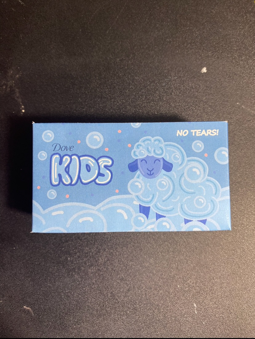
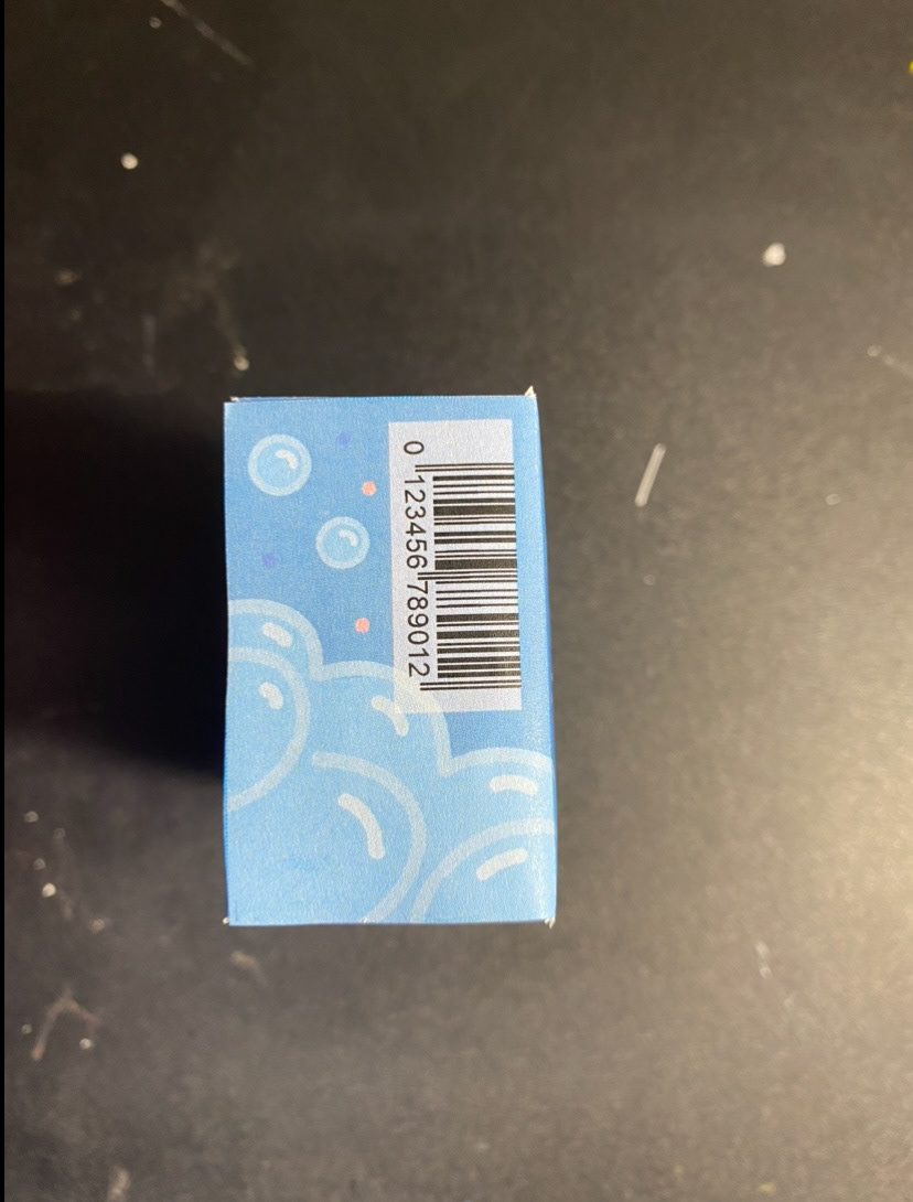
Packaging Prototype
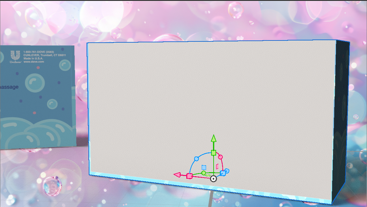
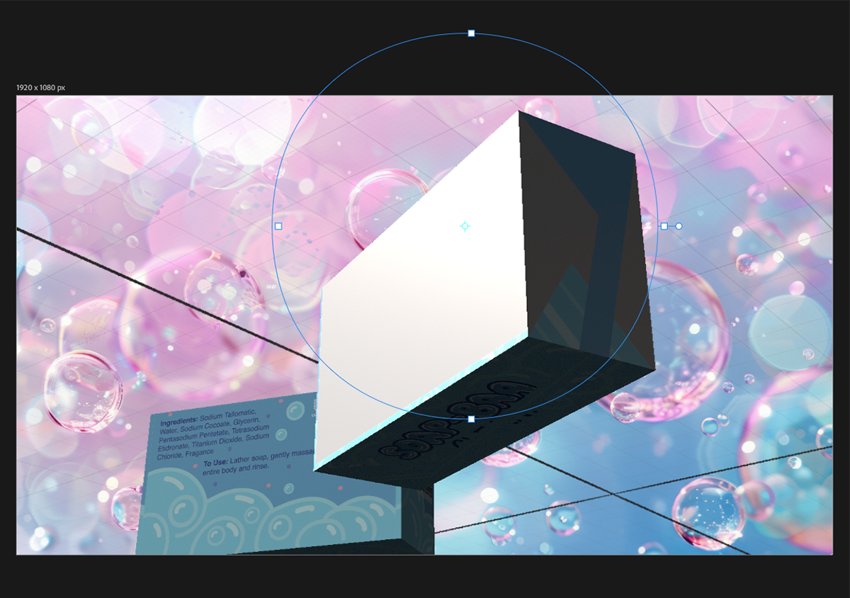
I worked with Adobe Dimension for the first time on this project, and while the result isn’t exactly what I envisioned, I’m glad I tried something new. For the background of my mockup, I aimed to complement the subtle pink accents in my design and enhance the contrast of the blue on the box. I selected a soft pink and blue bubble image from Adobe Stock to elevate the overall presentation.
Final Work
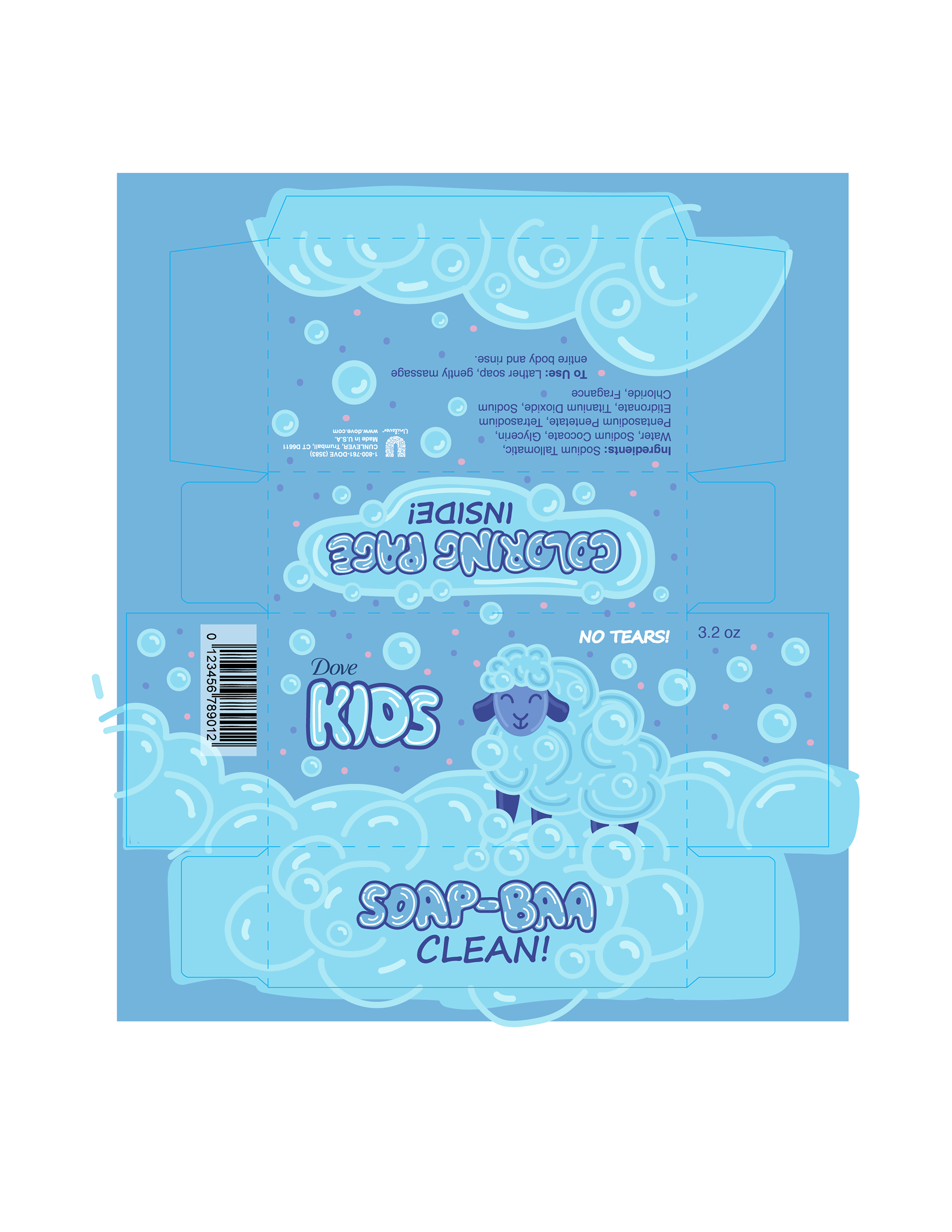
Flat Artwork

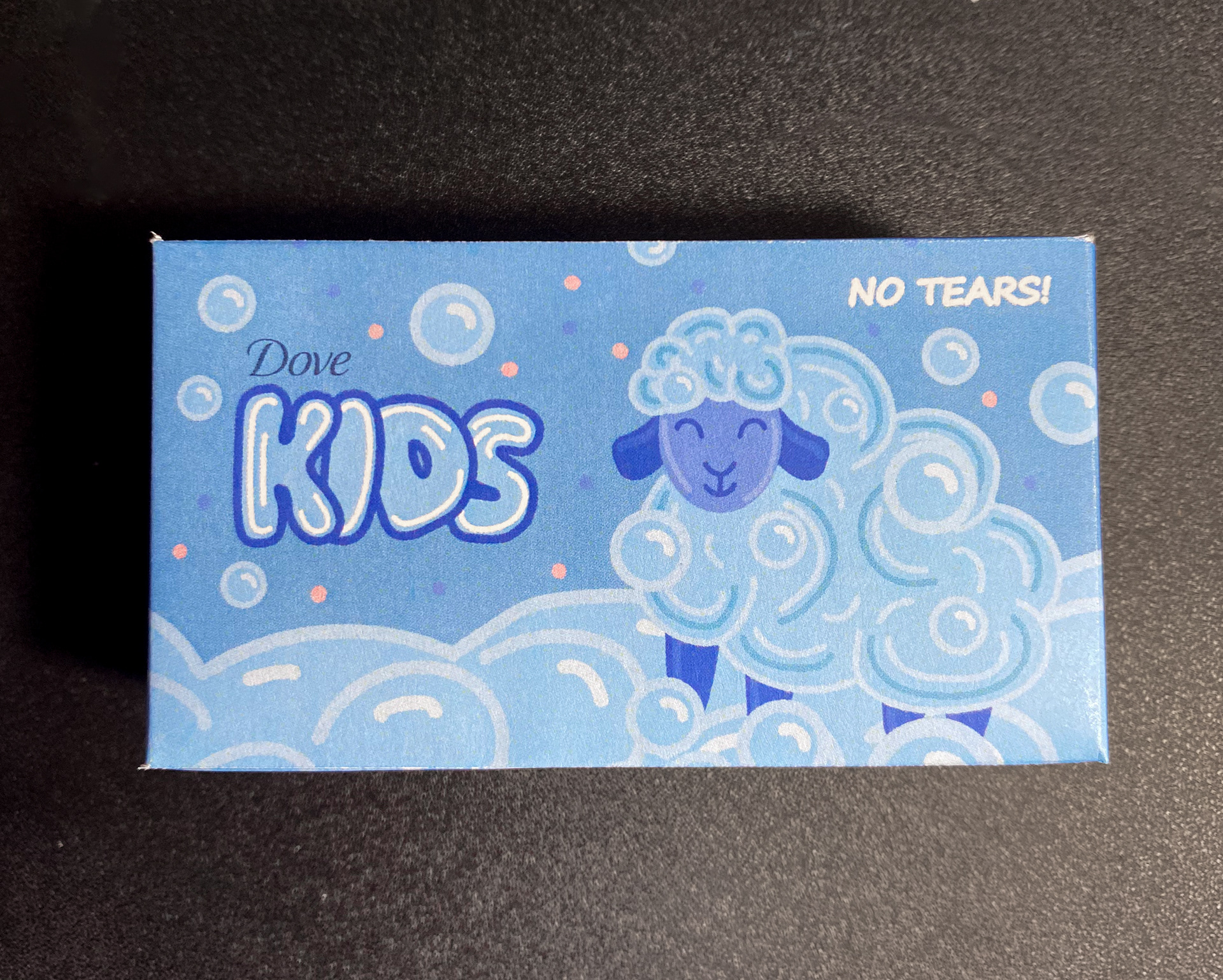
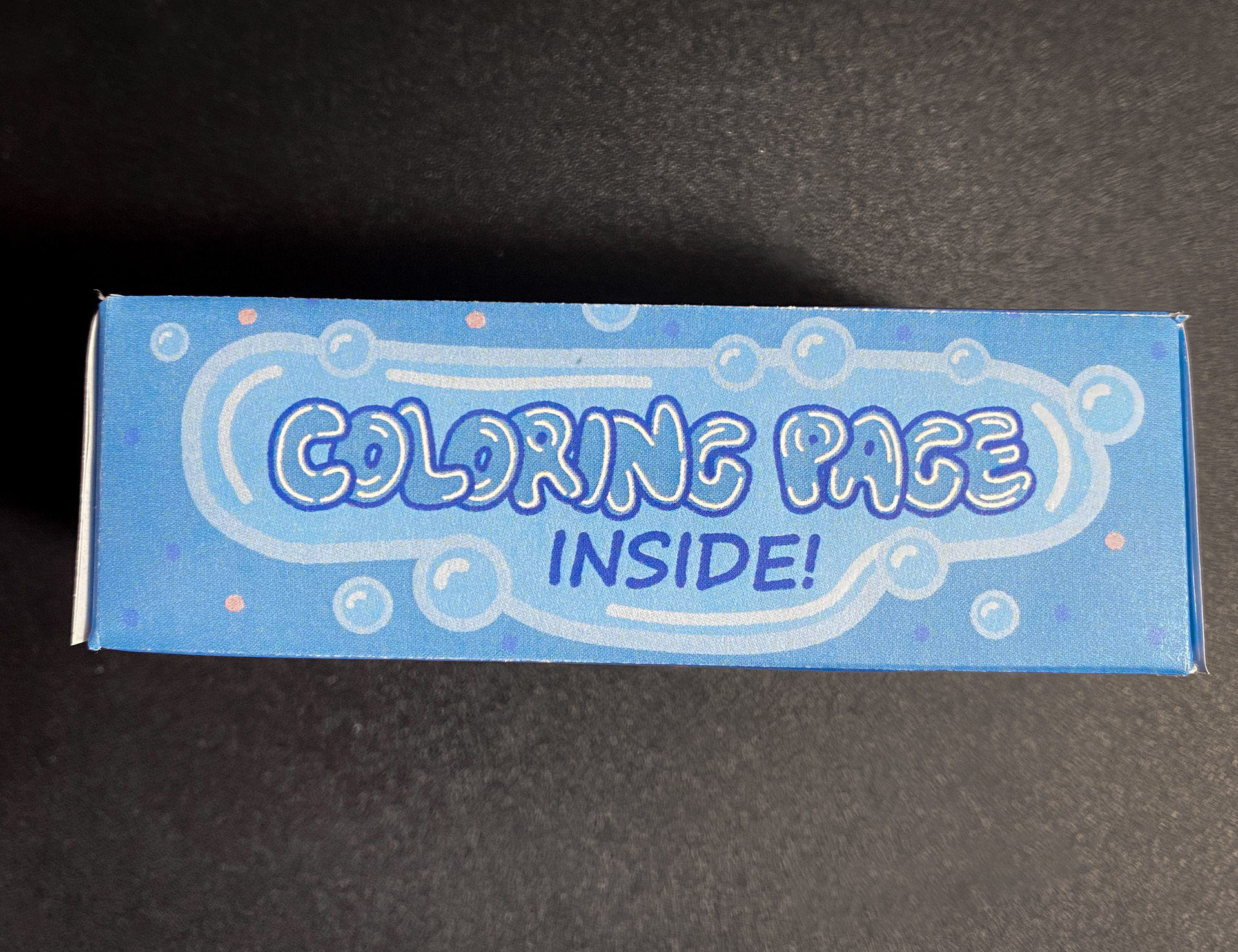
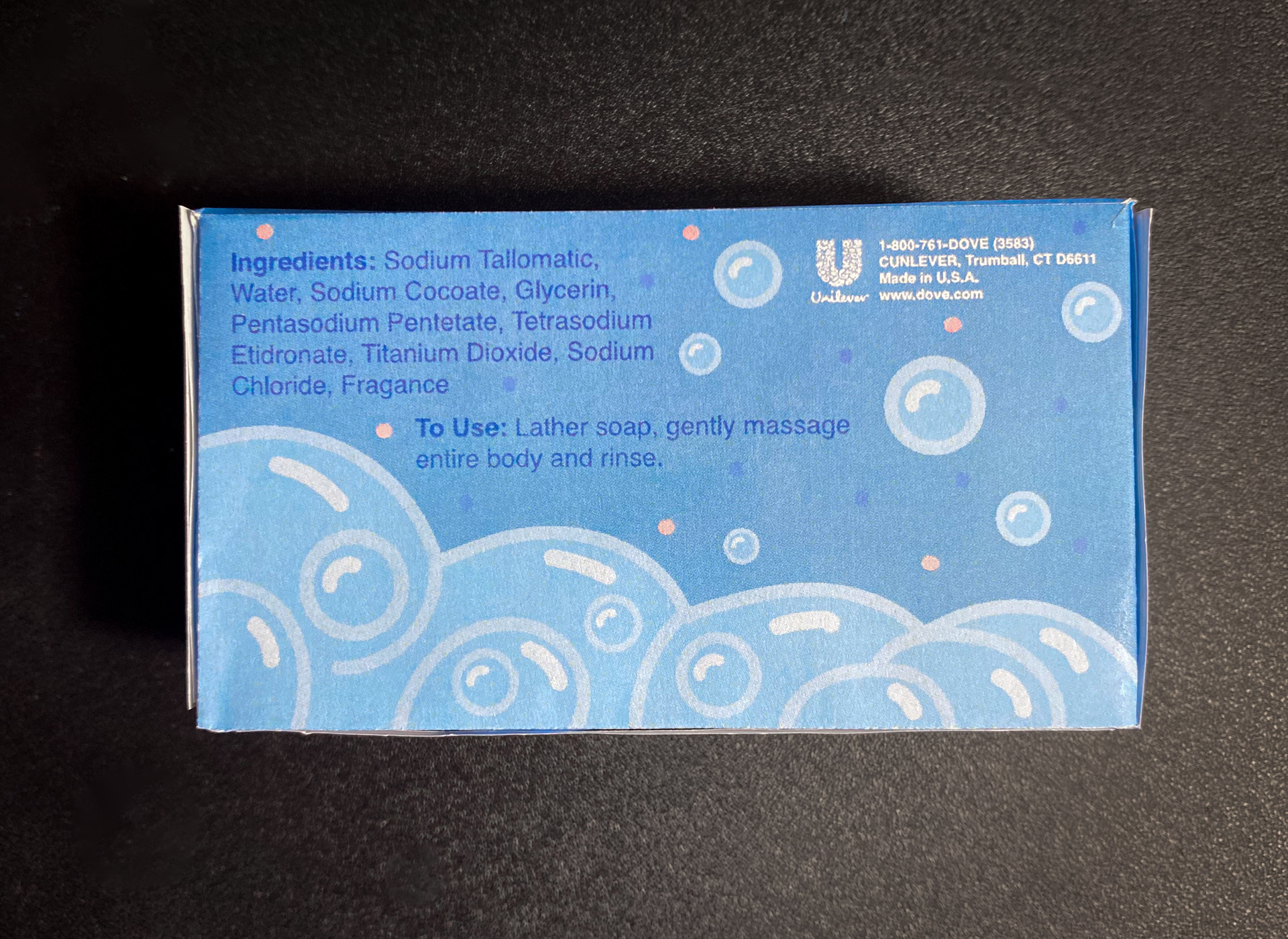
Tangible Mock-up
Video
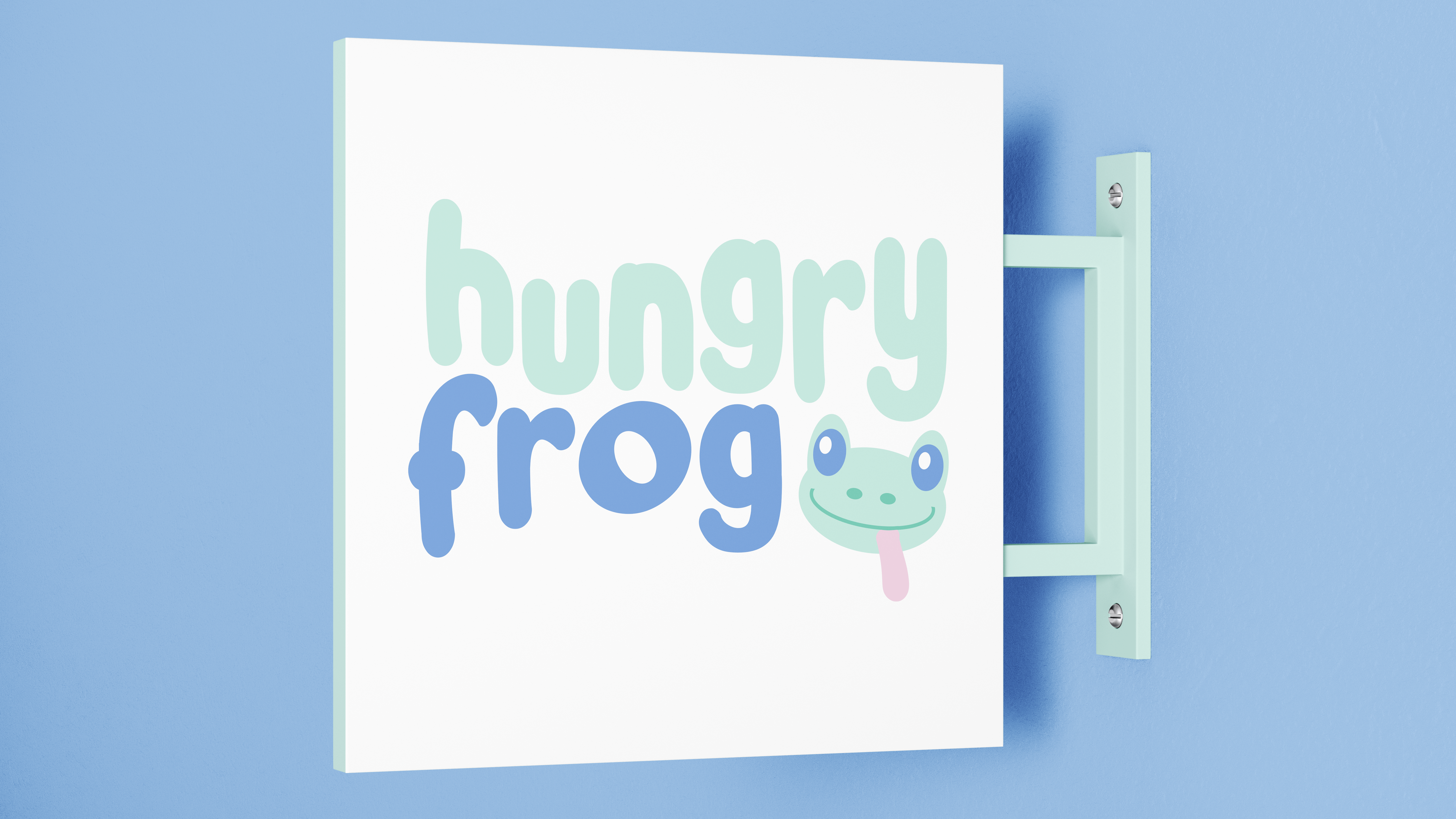
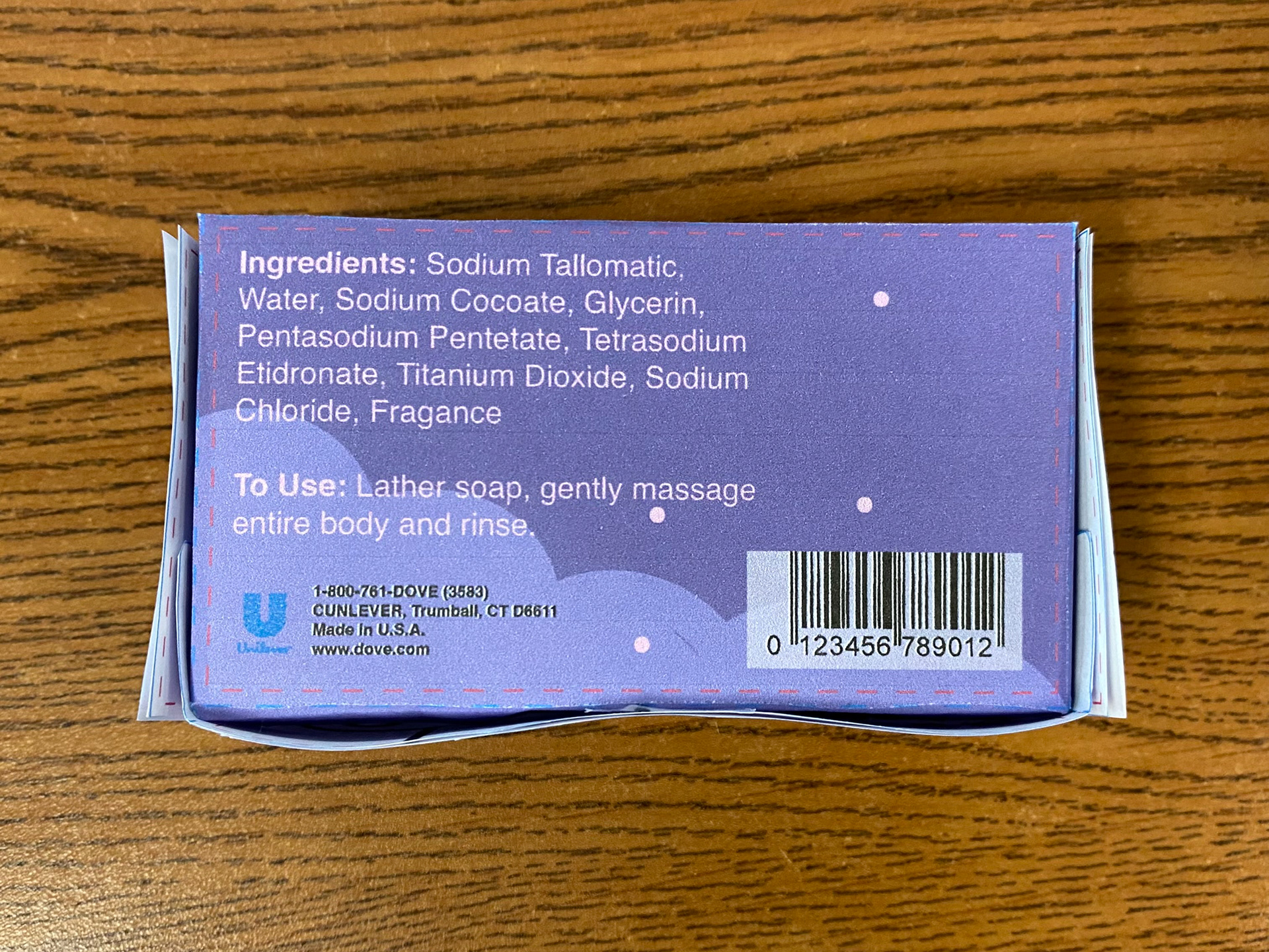
For the final design of my Dove Kids "Soap-Baa Clean!" packaging, I chose to focus on a playful yet gentle aesthetic that would appeal to both children and parents. The soft blue color palette combined with subtle pink accents creates a welcoming and clean look, which ties into the gentle nature of Dove's brand. The central character, a sheep made entirely of bubbles, was designed to reinforce the concepts of softness and care, while still keeping it fun and engaging for children. The inclusion of the "coloring page inside" adds an interactive element that both entertains kids and encourages parents to choose the product. The playful typography, particularly with the pun "Soap-Baa Clean!", adds a touch of humor that parents can share with their children, making the product experience more enjoyable. Overall, the design balances Dove's brand identity with a child-friendly appeal, making it a thoughtful and visually engaging solution.
Knowledge Gained
Throughout this project, I gained valuable technical skills, particularly in Adobe Dimension, as I worked with 3D mockups for the first time. Learning how to translate my 2D designs into a 3D physical form helped me better understand the importance of spatial awareness and how packaging works in real-world applications. I also learned that design is not just about aesthetics but about functionality and user experience, especially when creating something for a younger audience. This project shifted my mindset toward a more user-centered approach, reminding me that good design is about balancing creativity with practicality. It also helped me realize that in my future career, I will need to be adaptable and open to new tools and techniques, as the design field is constantly evolving. Overall, this project reinforced my passion for design and gave me a clearer sense of what to expect as I move forward in my college journey and career.