
Project Brief
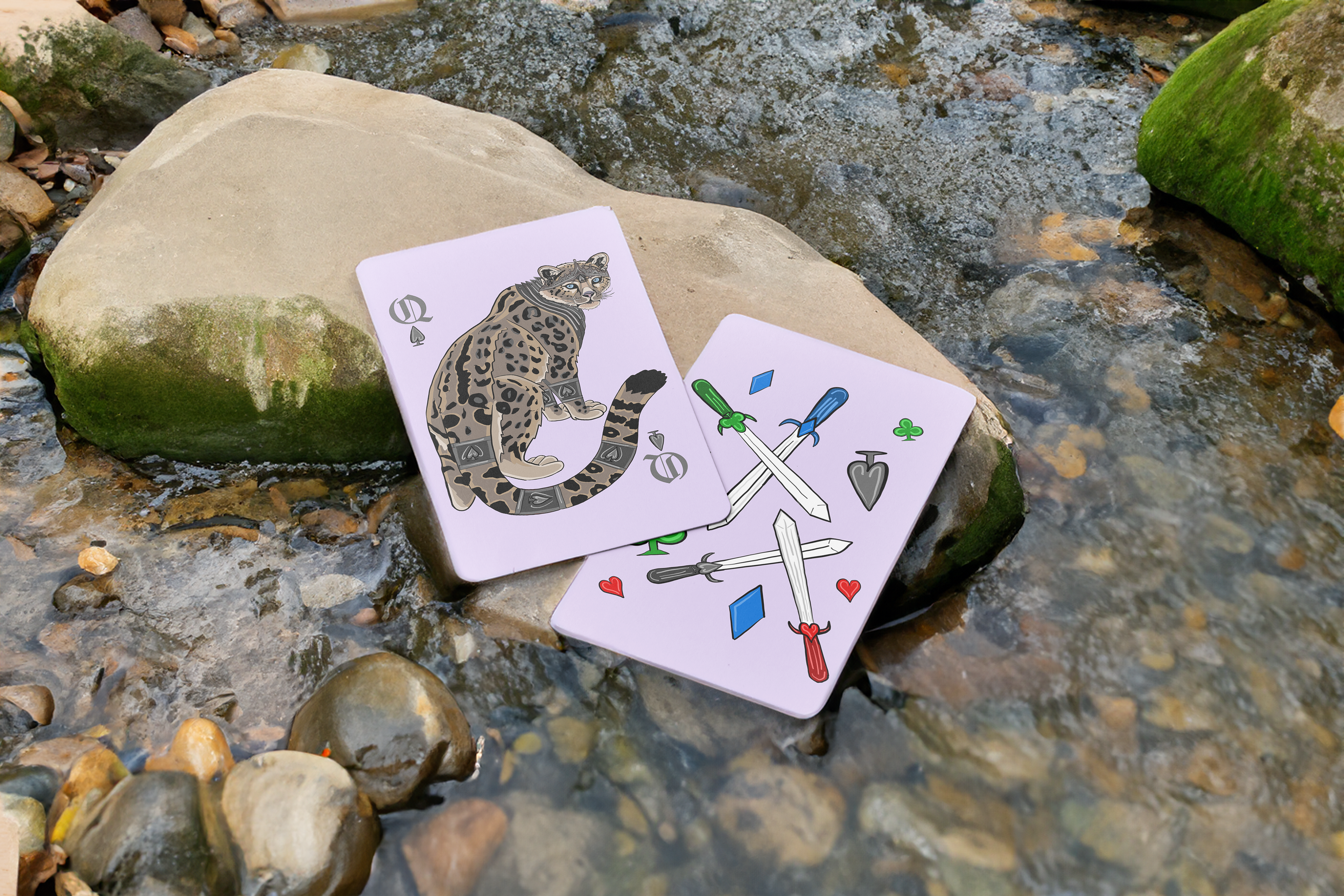
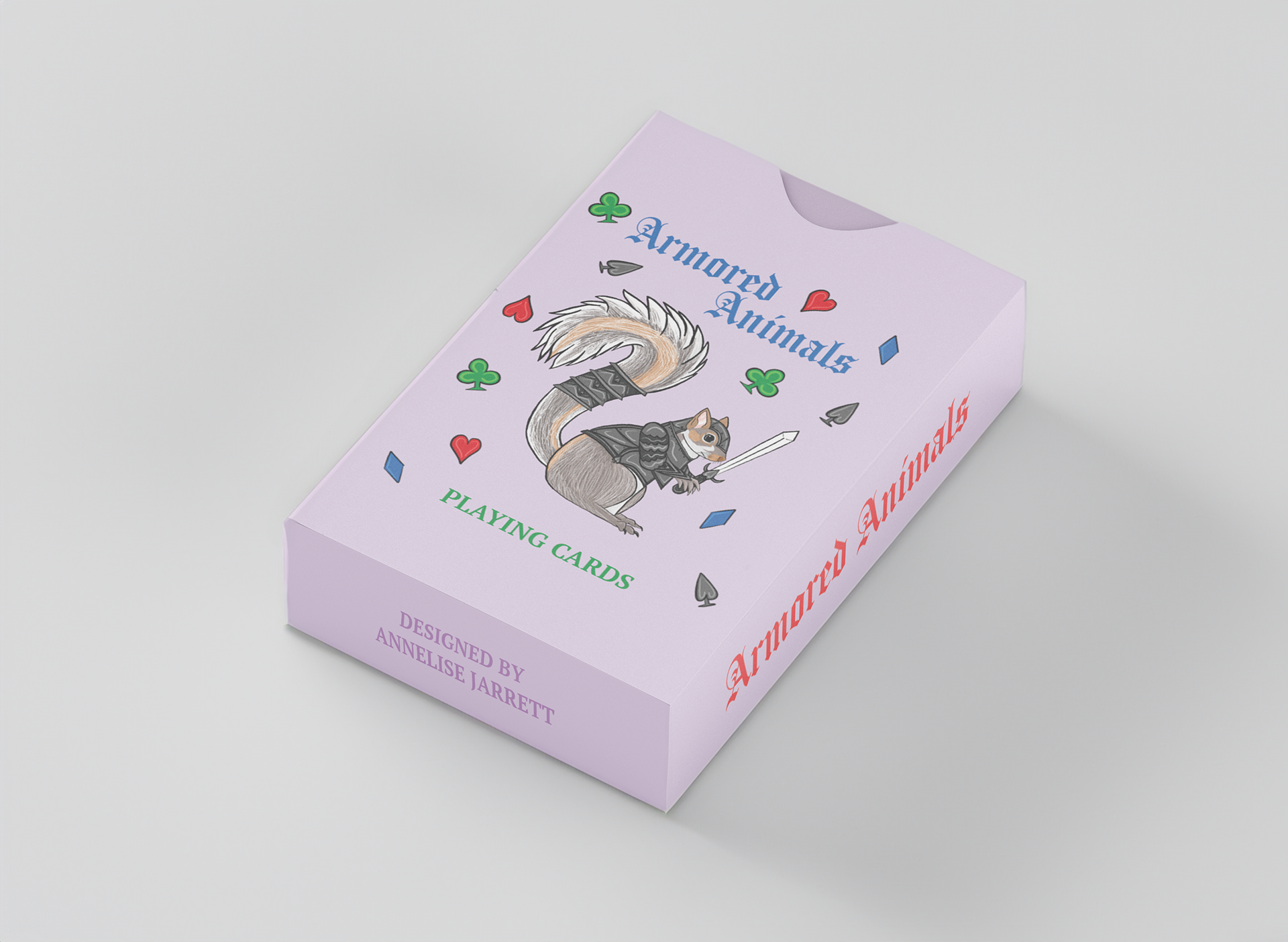
I created a detailed deck of cards with a consistent theme across 52 cards. I went for a traditional card deck with hearts, diamonds, spades, and clubs as the four suits. The back of each card is identical, while the face of each card is unique. I also designed a box to house the cards in.
Theme
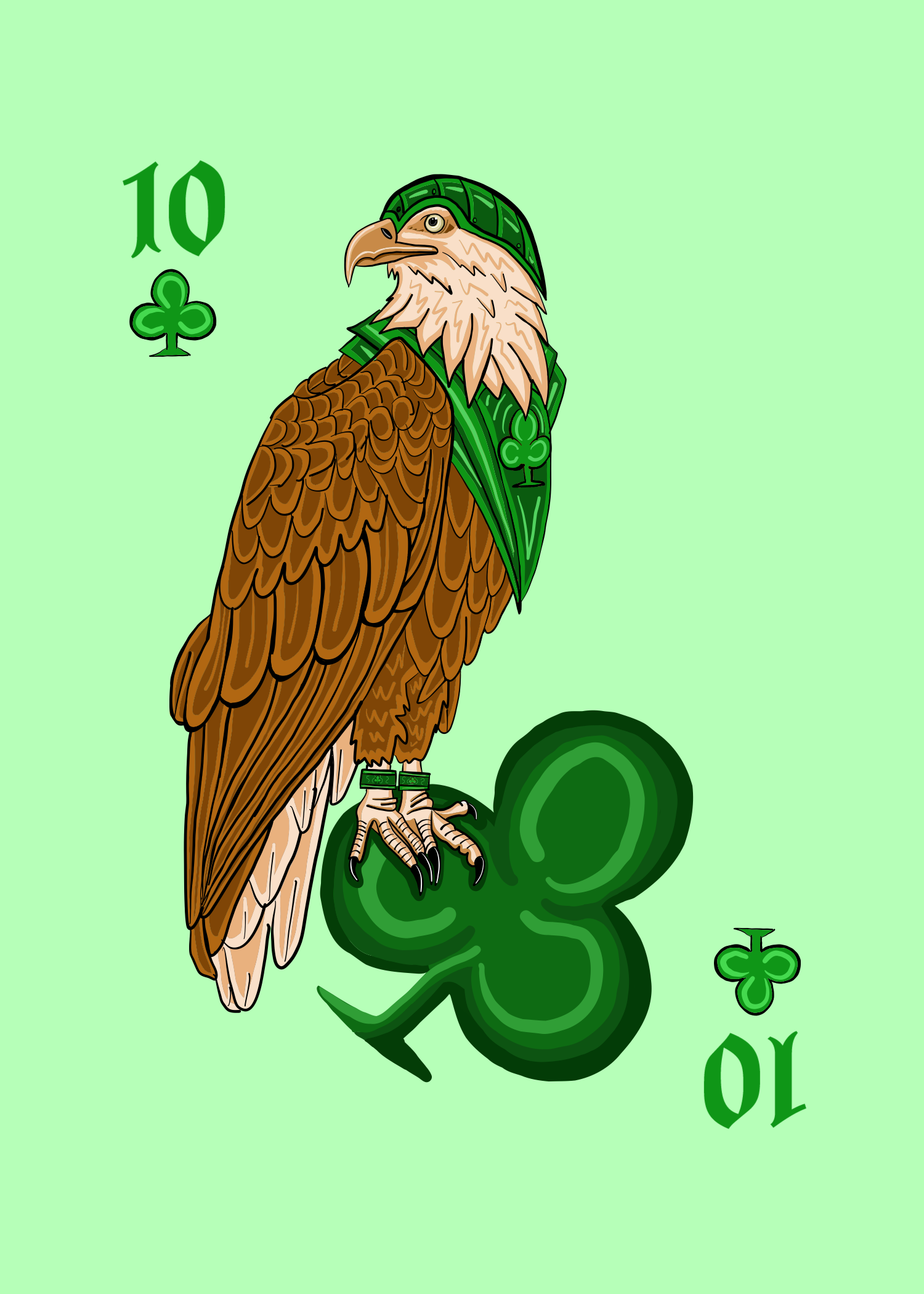
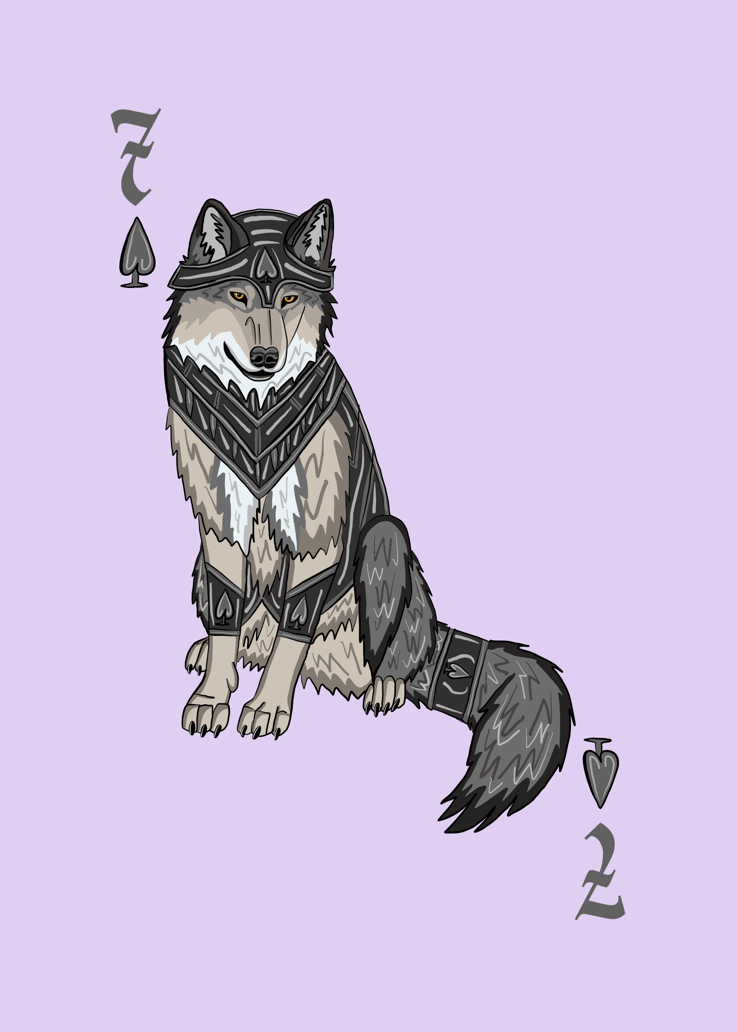
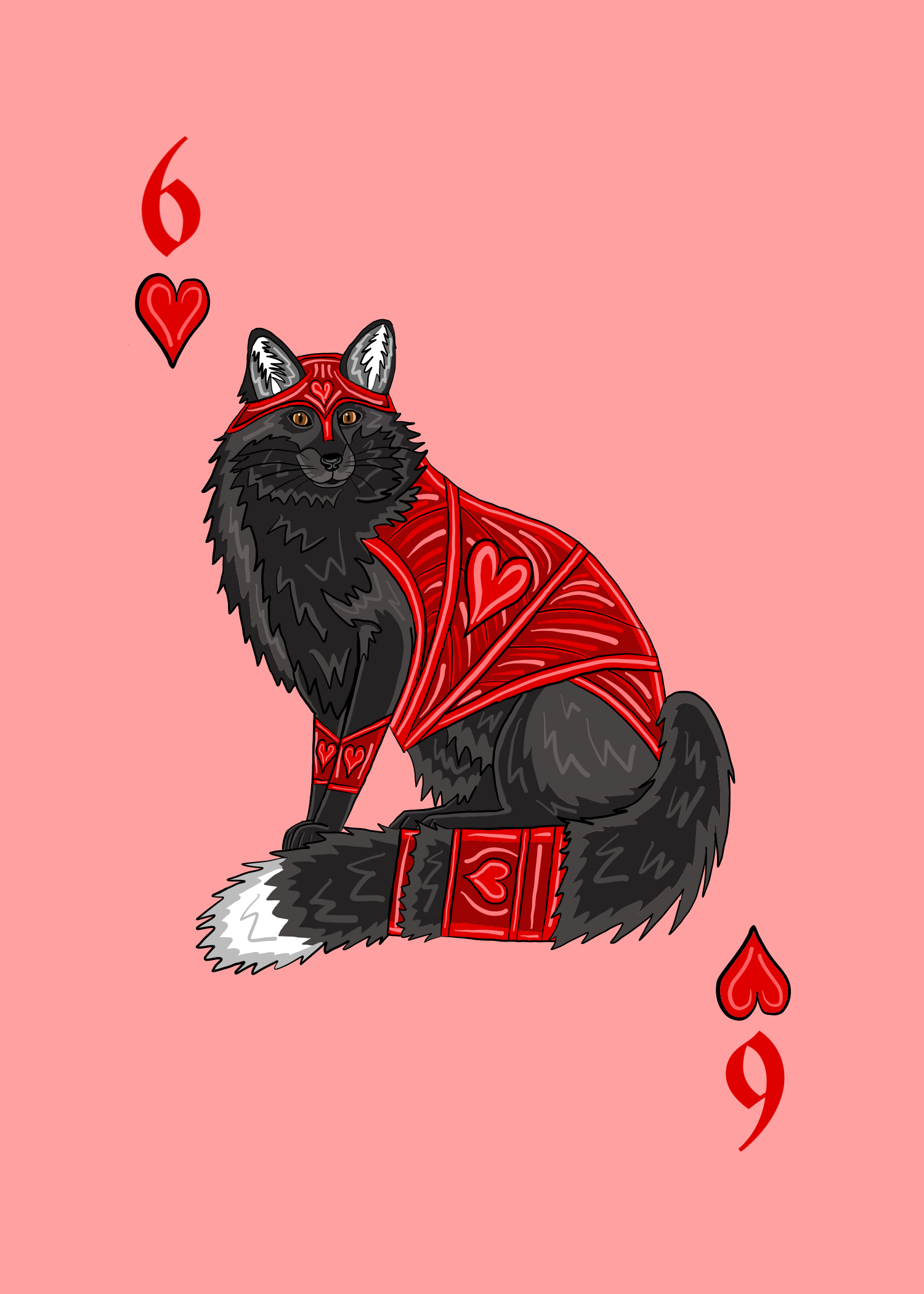
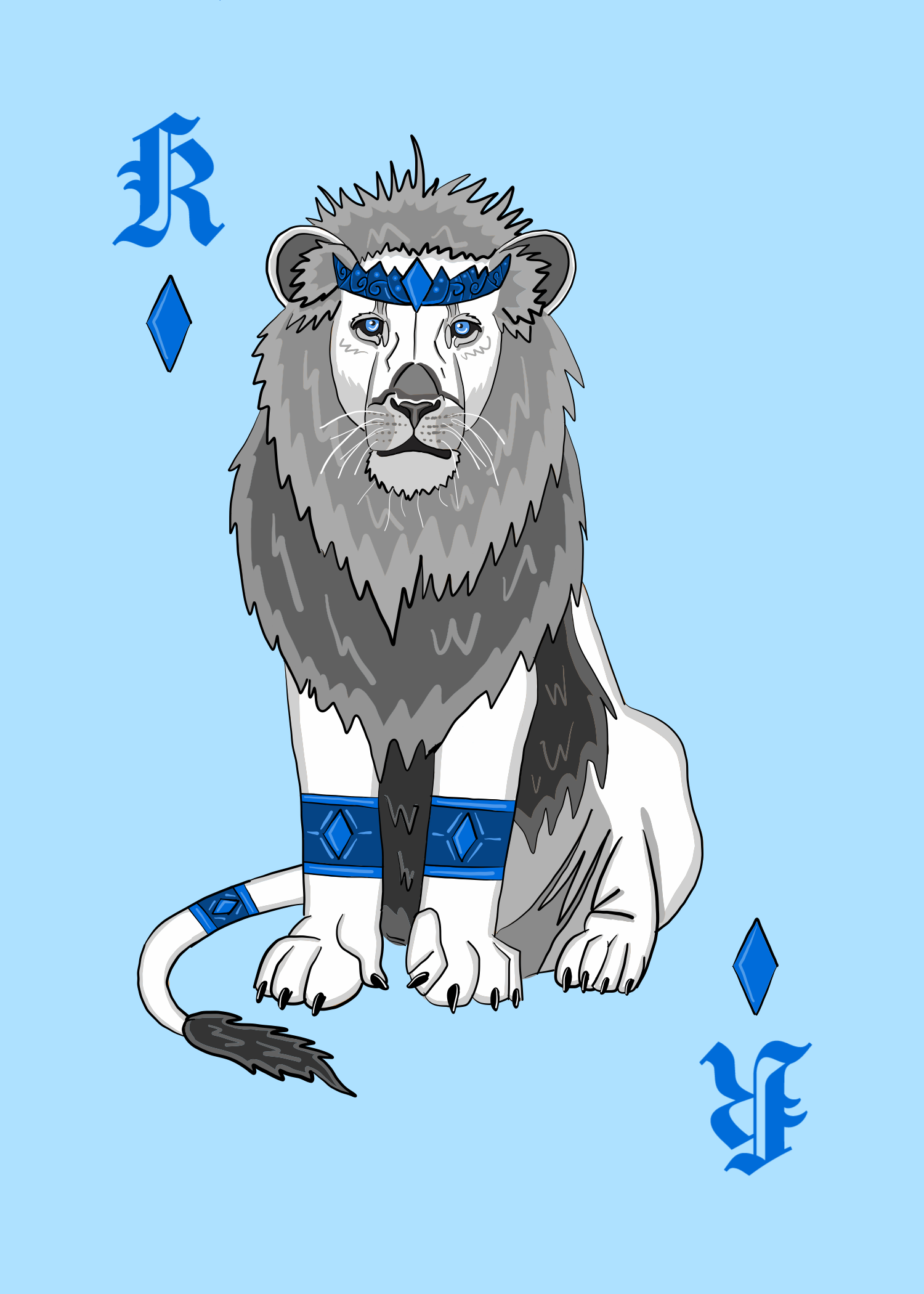
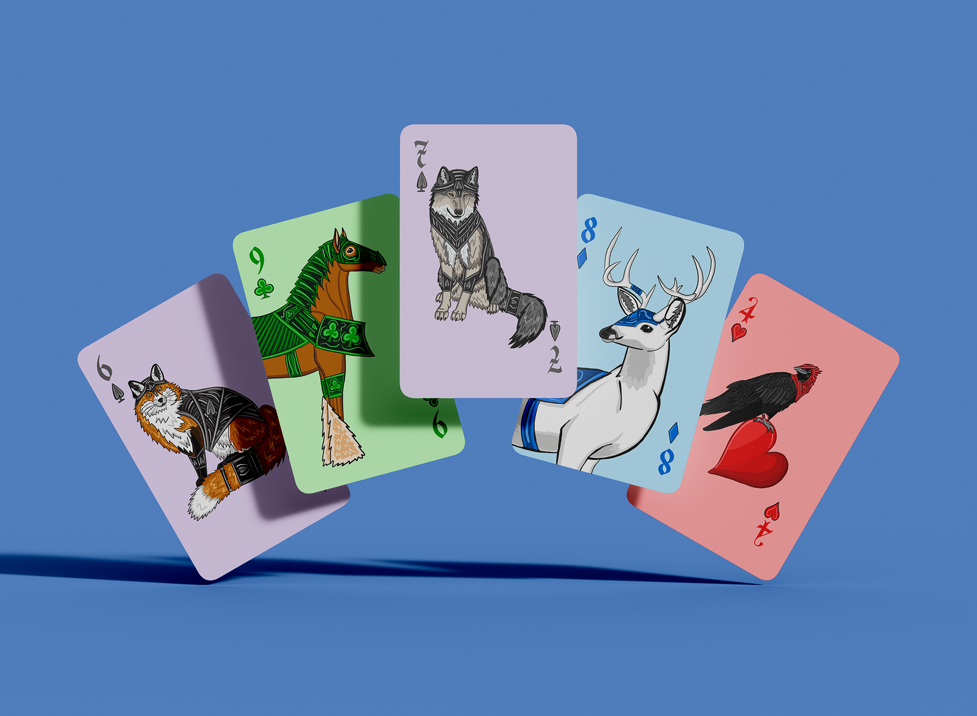
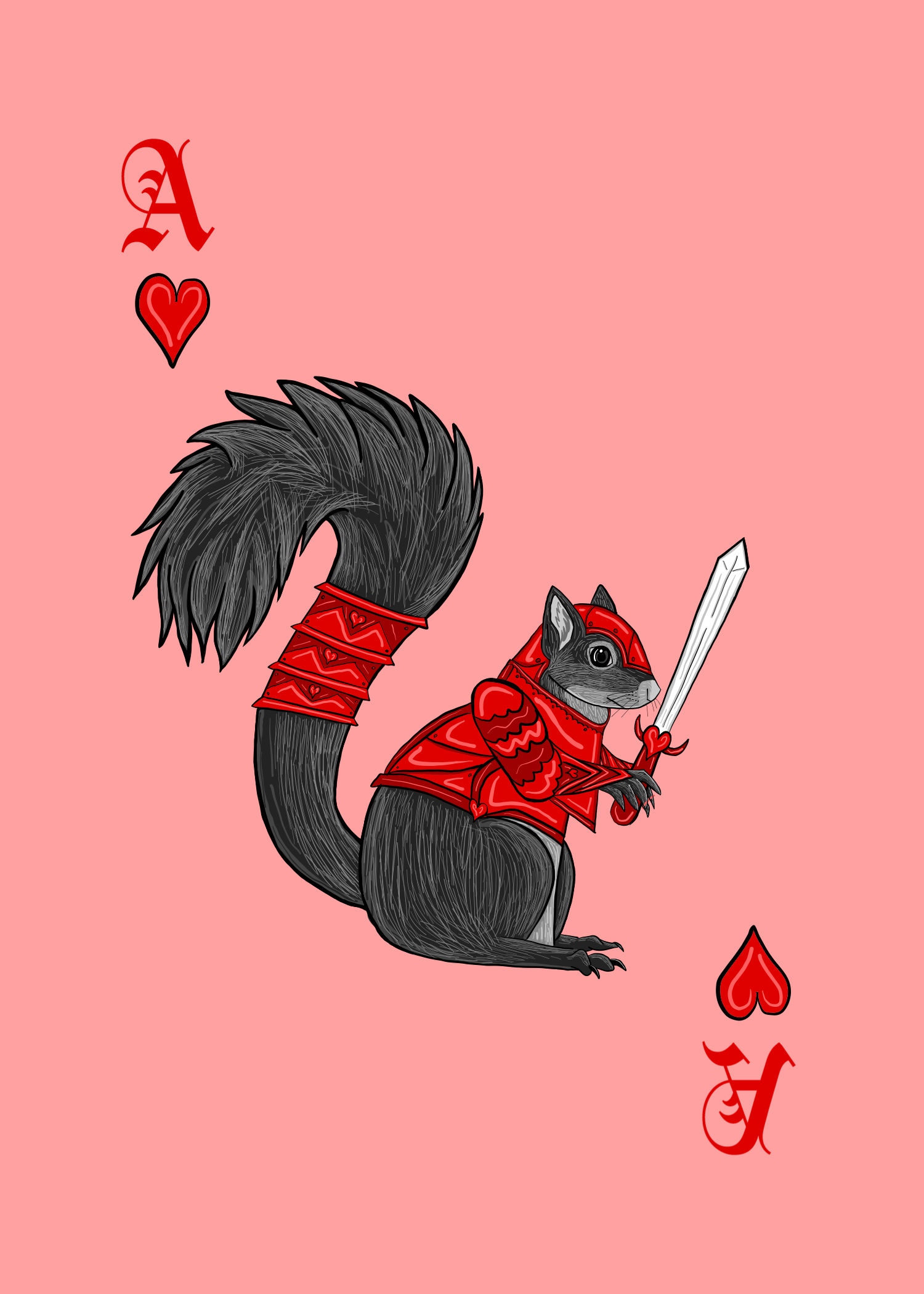
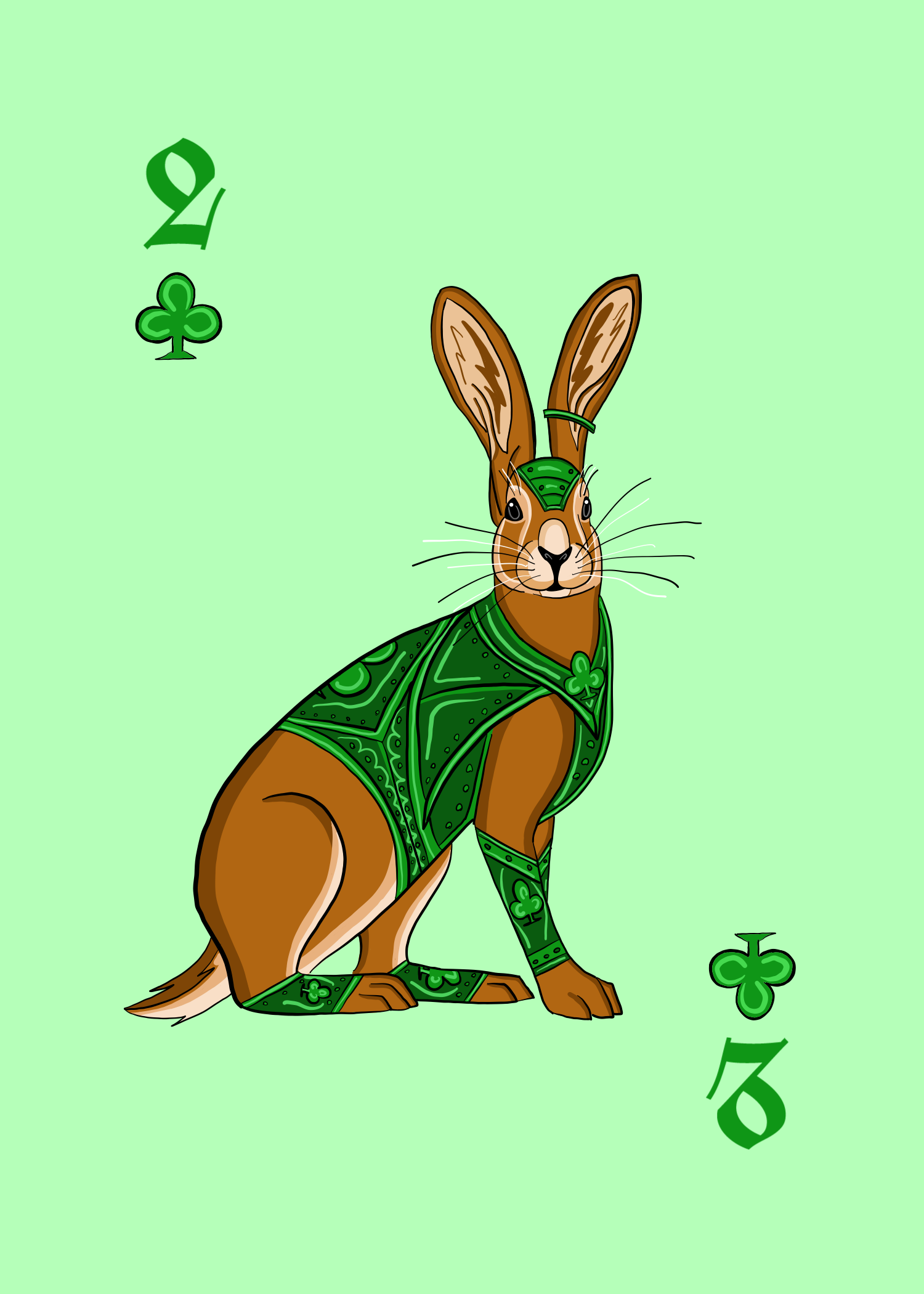
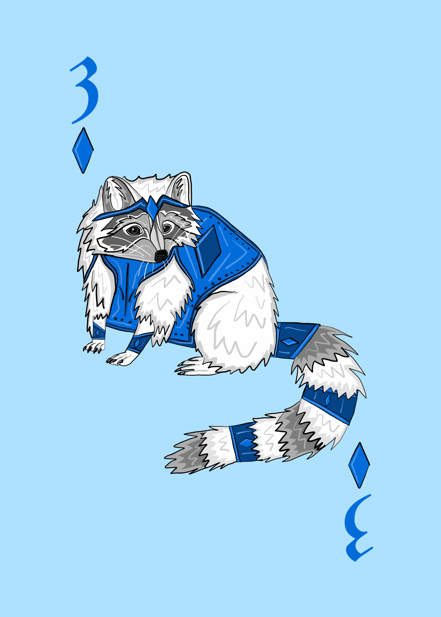
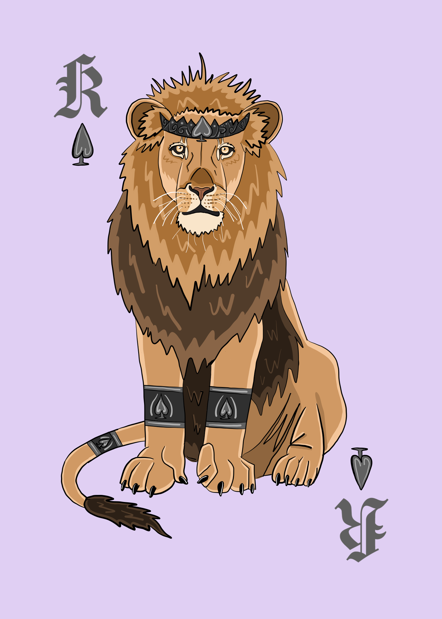
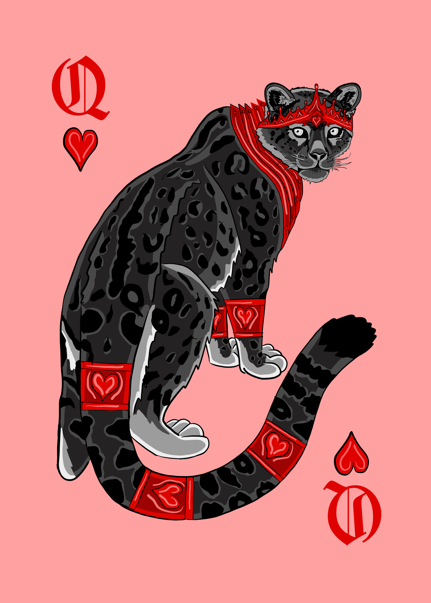
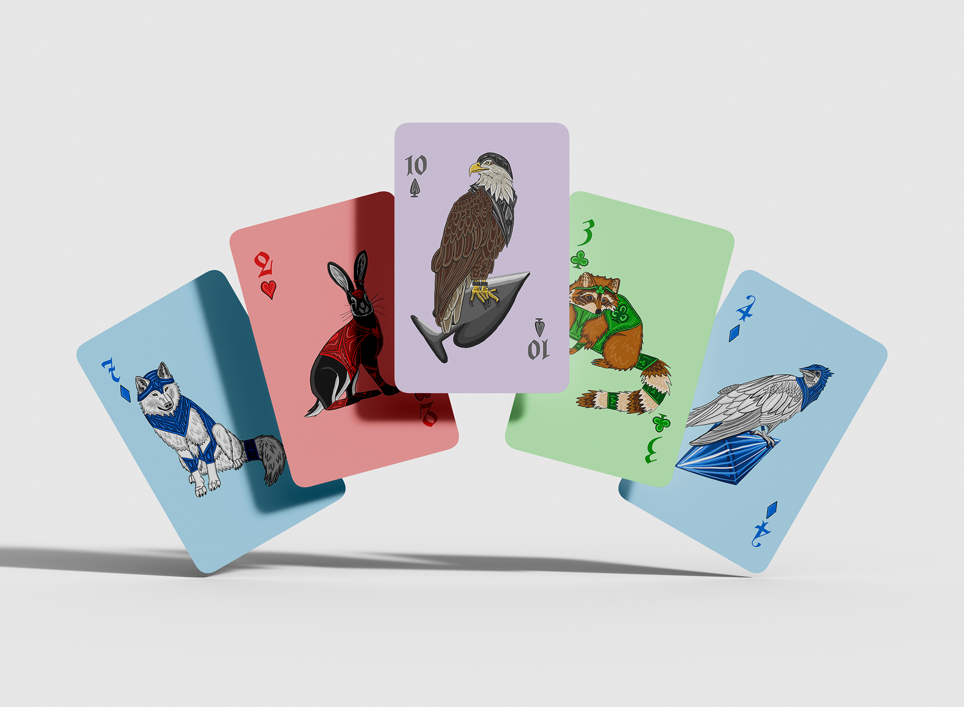
I picked the theme of armored animals for my project, aiming to blend a touch of fantasy with my love for animals. The idea was to make each suit look like a group of soldiers loyal to their respective king and queen. The hearts, for example, wear red armor with heart symbols engraved on it. Their fur or feathers are black, creating a vivid contrast that makes the red armor stand out. This unique color scheme is specific to the hearts suite, and I applied a similar approach to each suite, ensuring quick identification of the card's suite with just a glance.
The Back Of The Cards
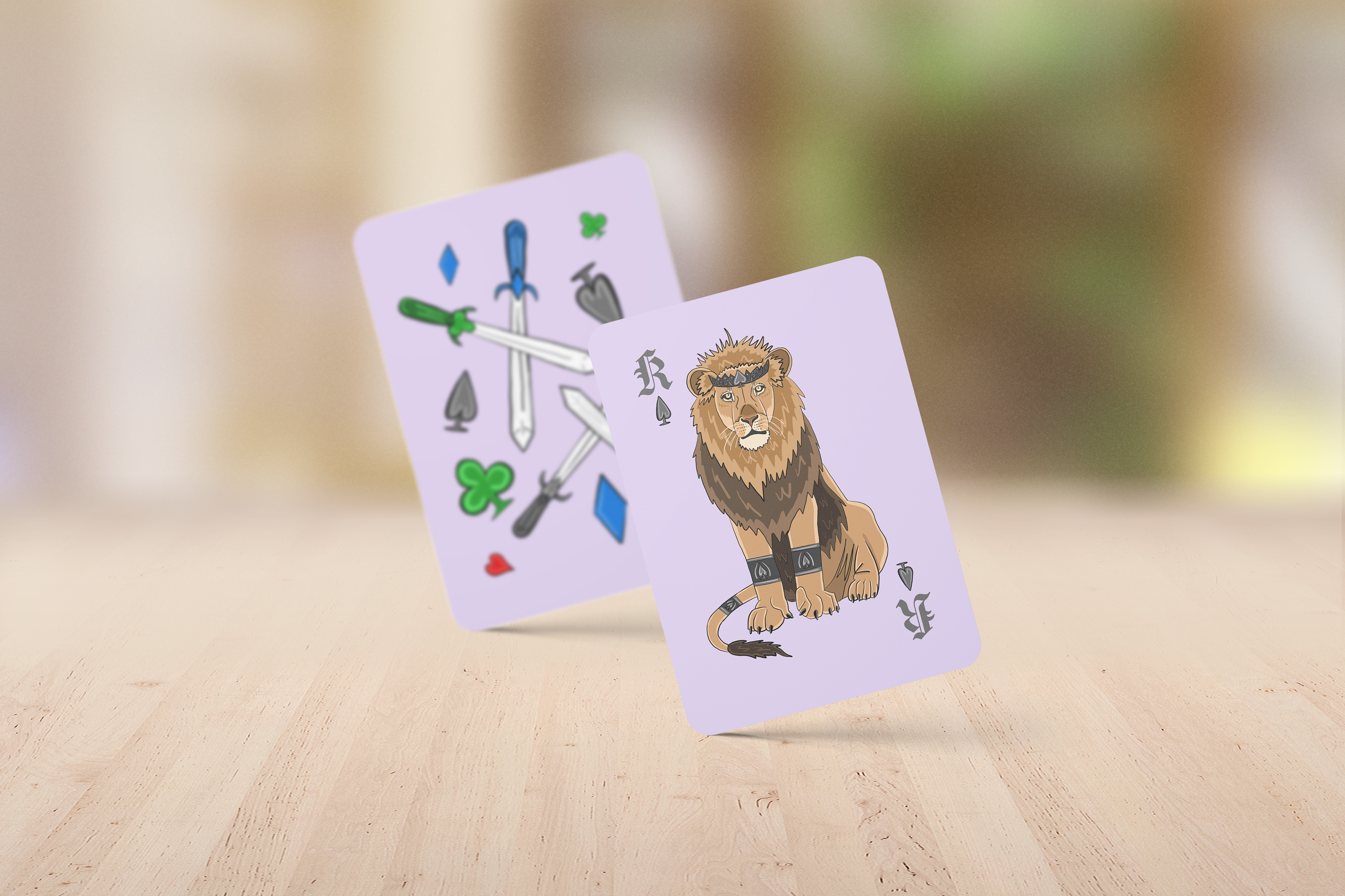
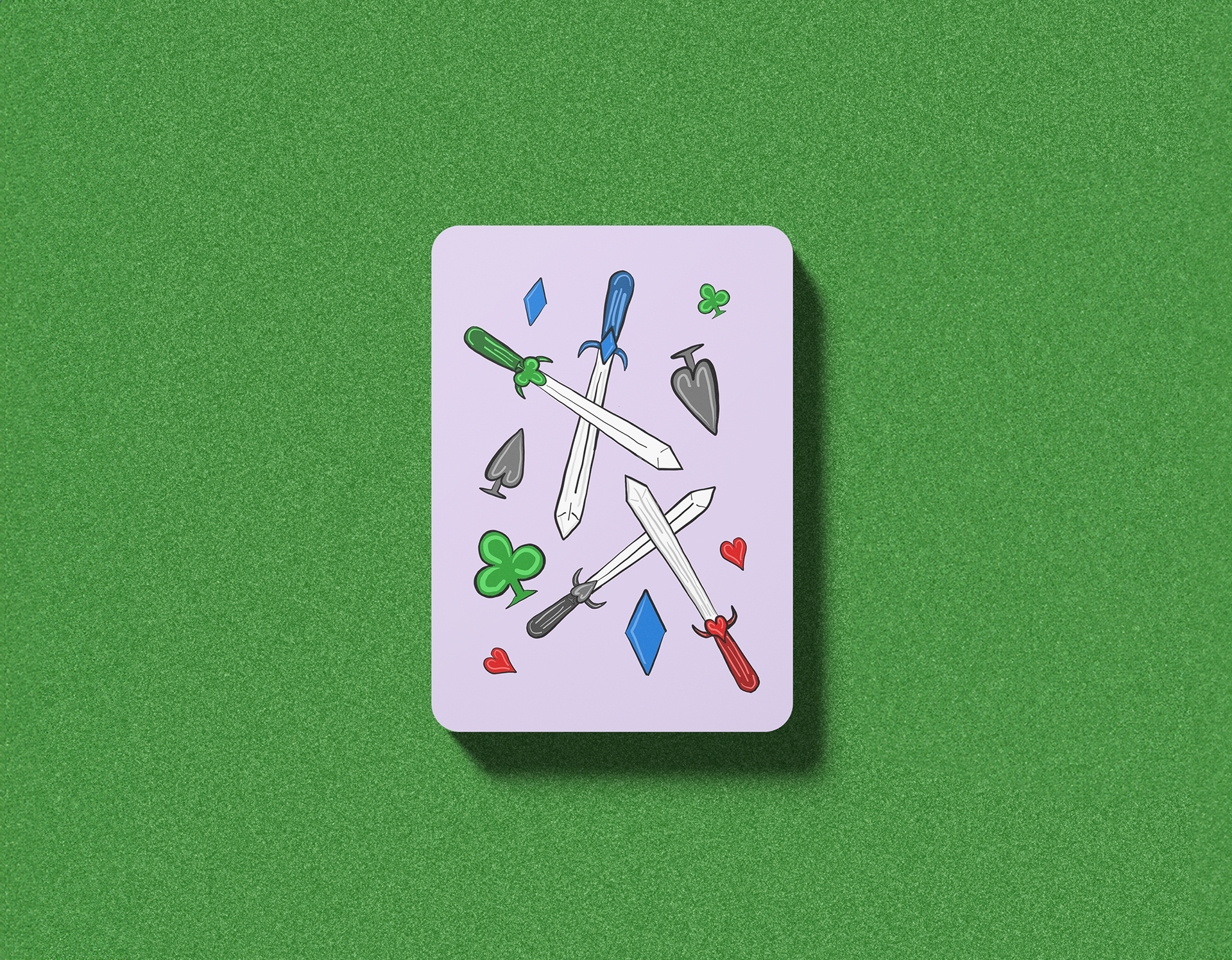
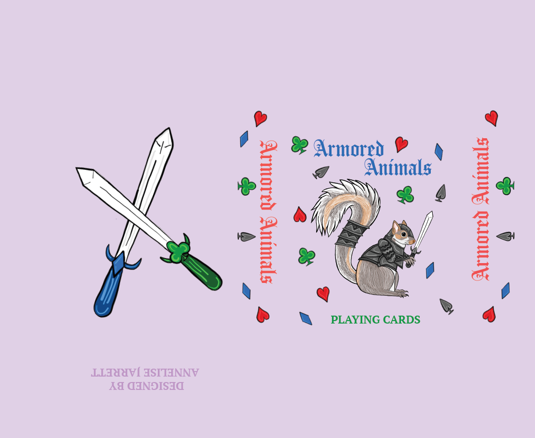
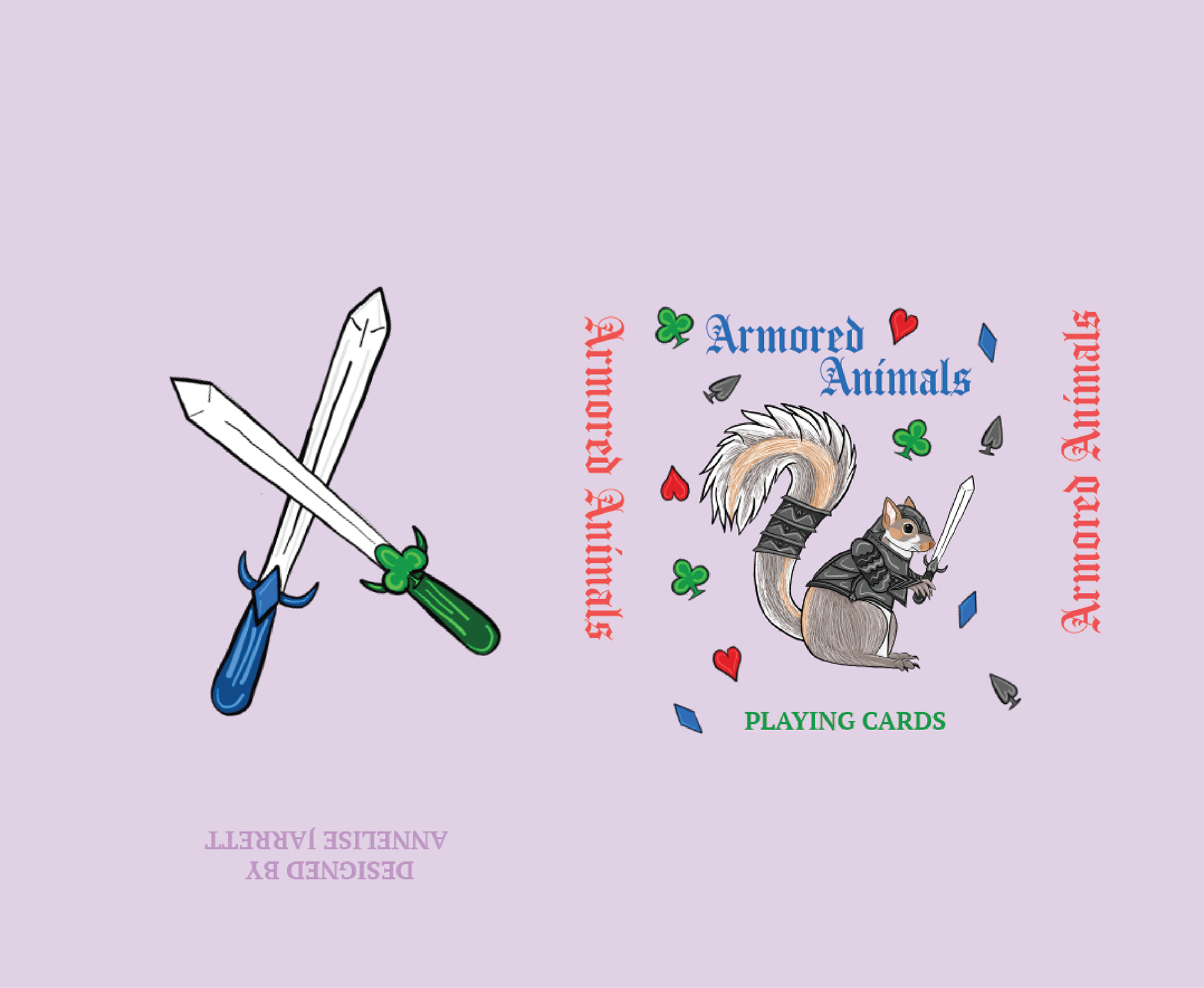
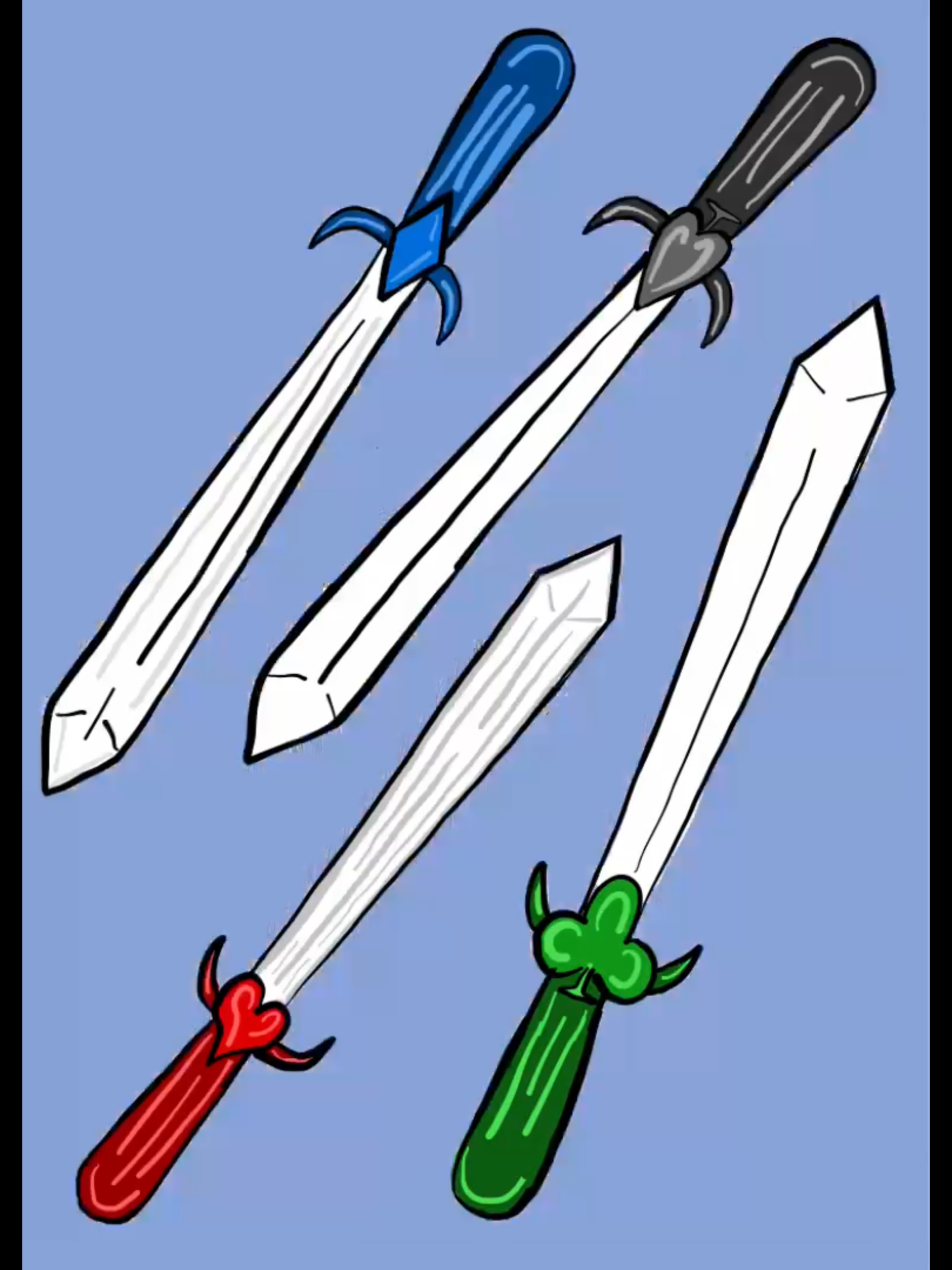
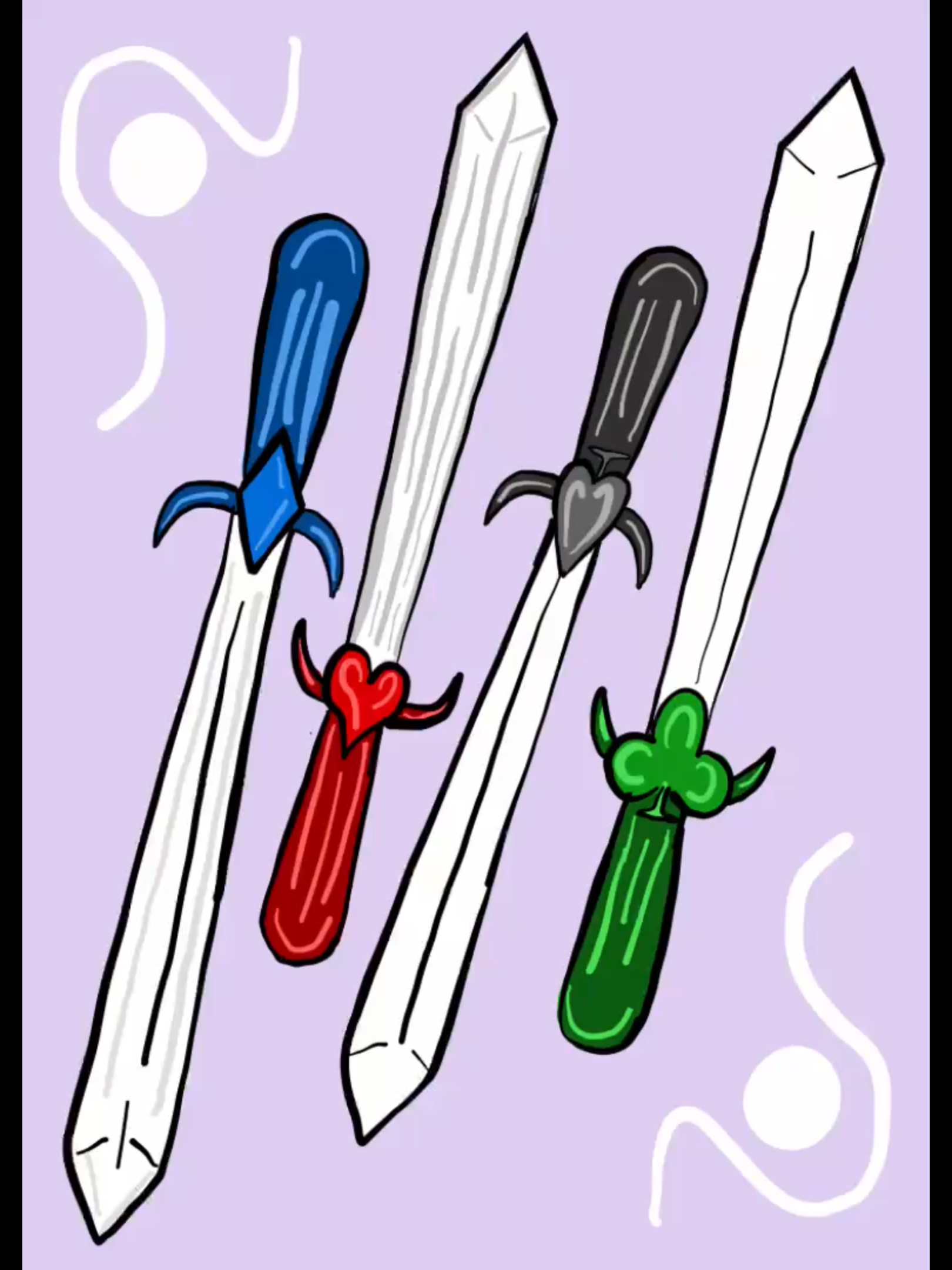
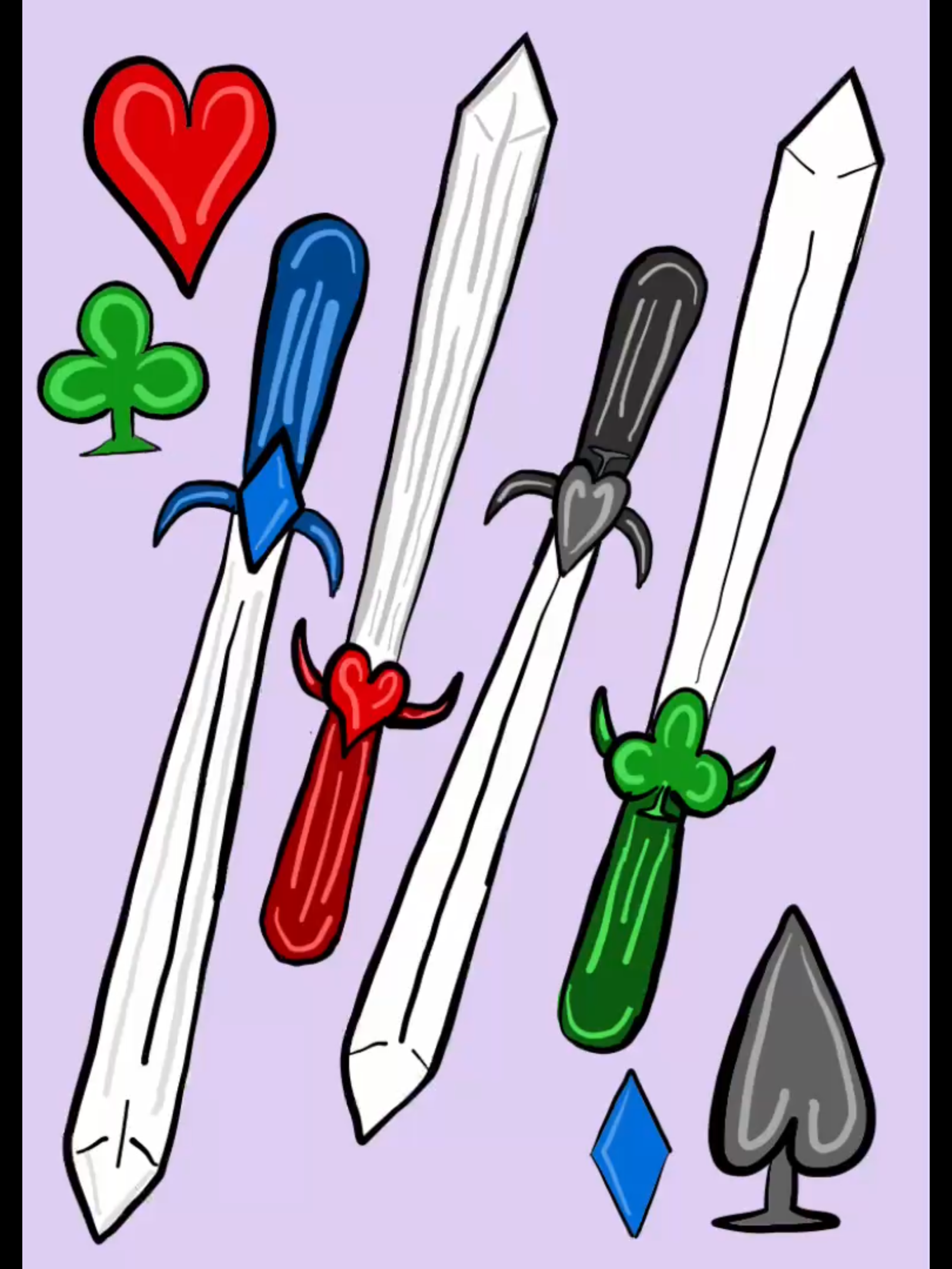
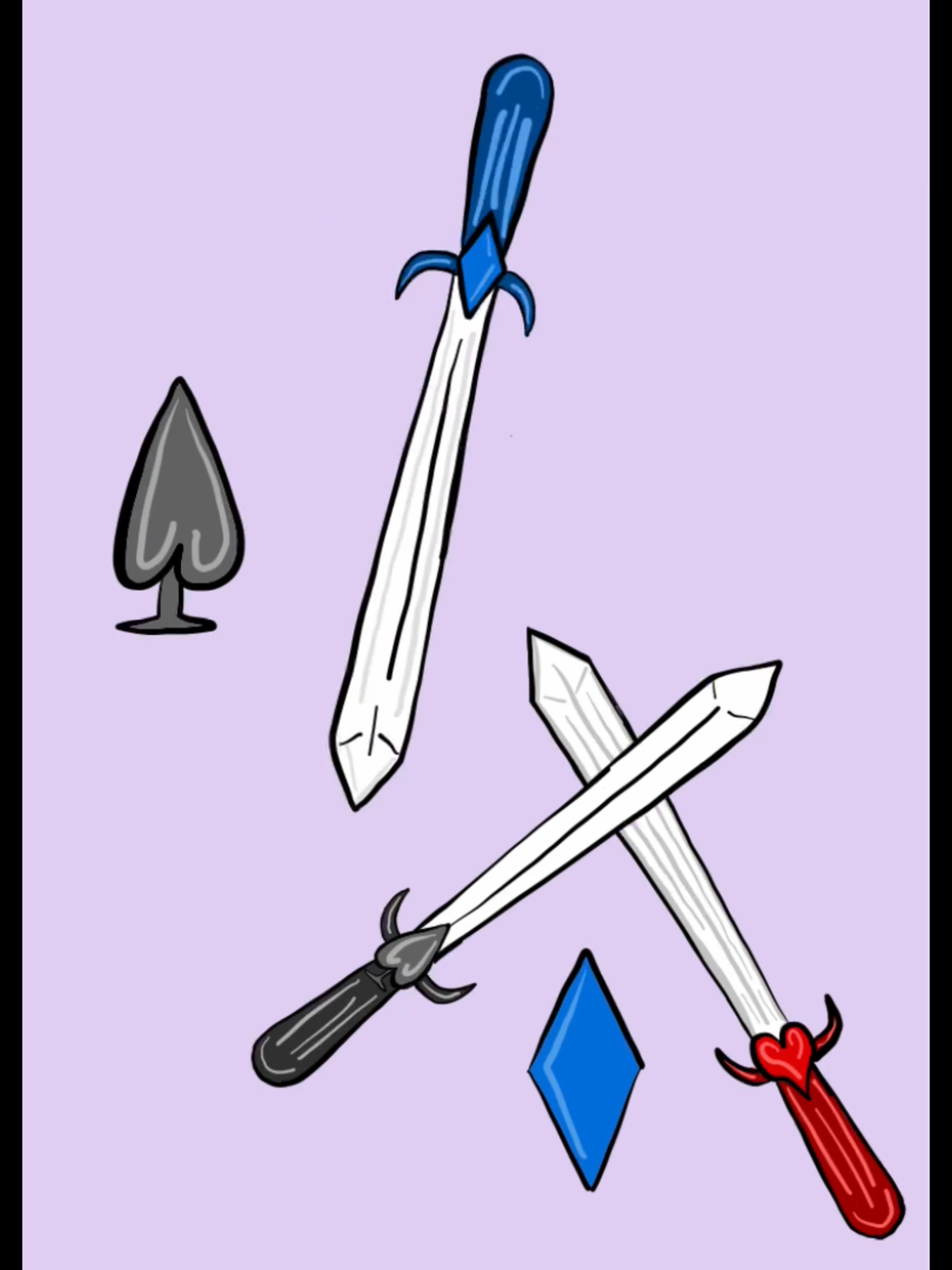
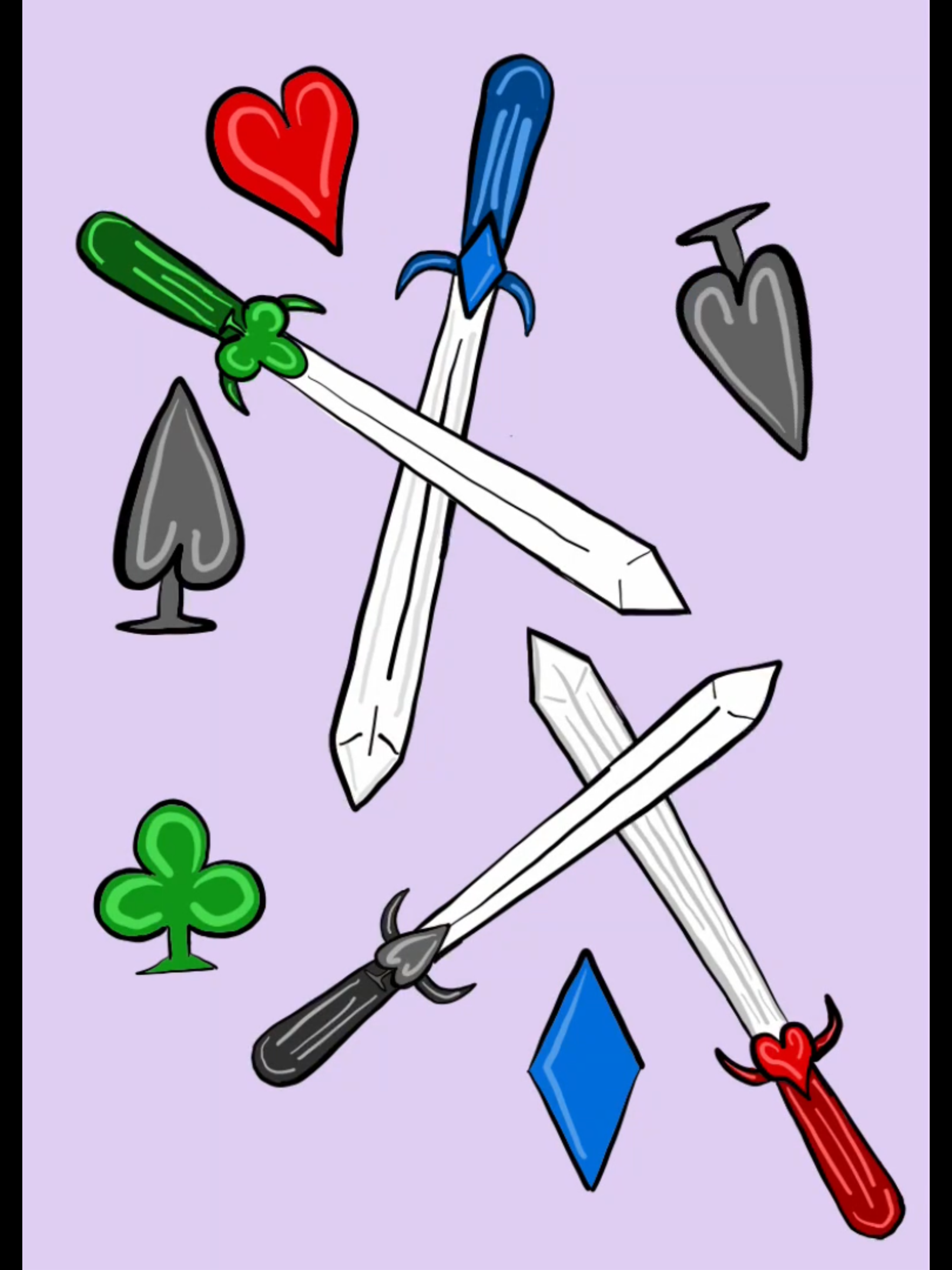
The back of the cards feature two sets of swords in the midst of clashing against one another. Each sword represents a suite. For example, the club and diamond swords are clashing against one another as the heart and spade do the same. In the empty space around the swords, the symbols of the diamonds, clubs, hearts, and spades fill the area. I opted not to introduce a new color to my existing red, blue, green, and purple scheme. Since the armor for the spade suite is gray, I chose the background color for the card backs to be purple. This way all the suite symbols would stand out against the background. I then extended this color to be used for the box as well.
The Box Design
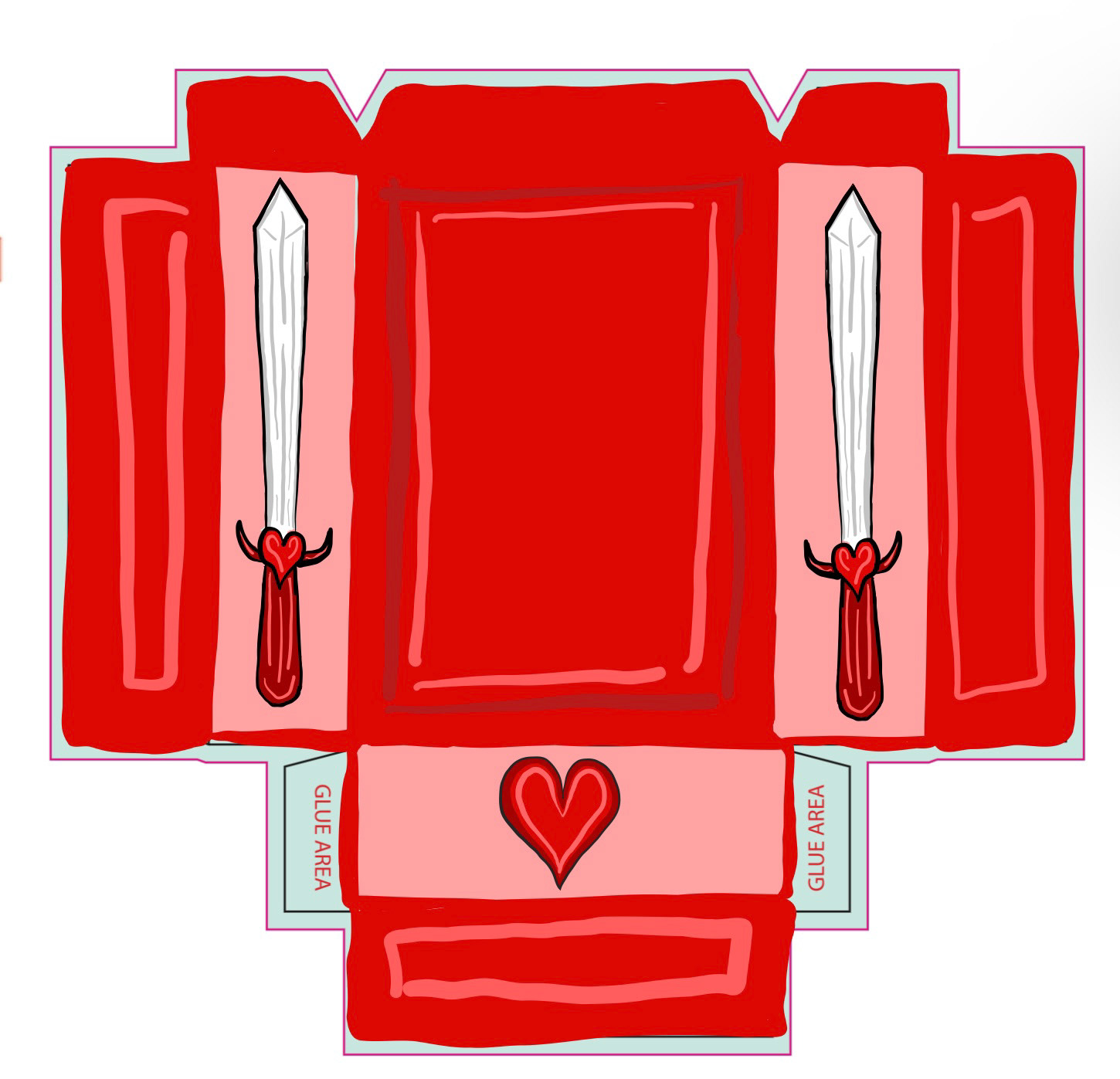
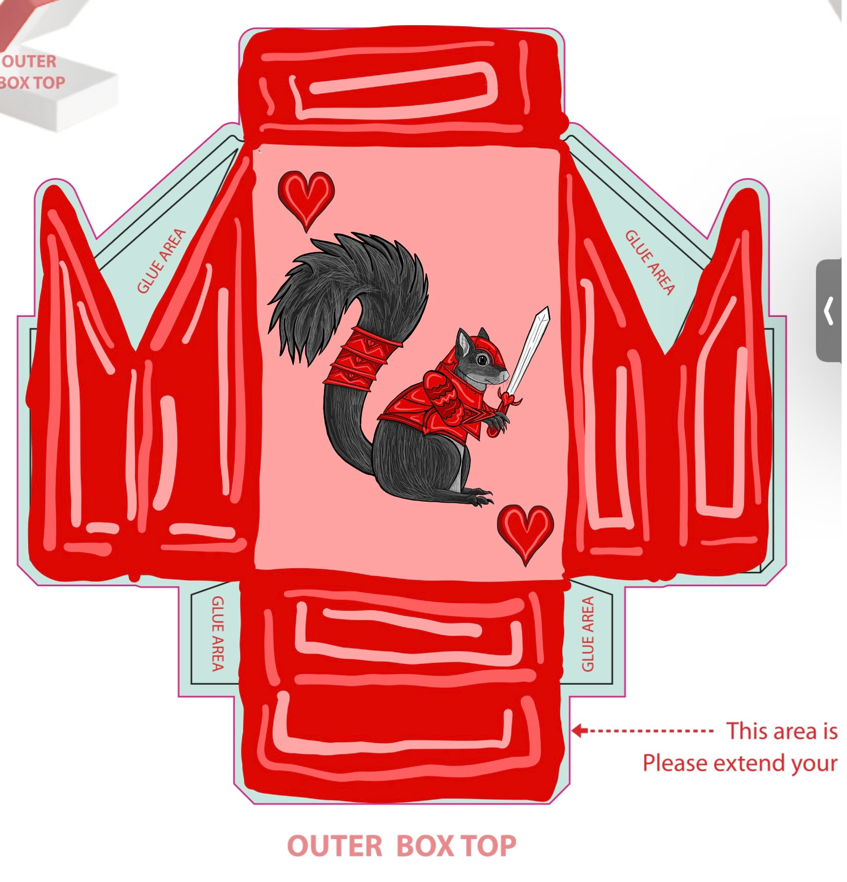
In the box design, I featured the squirrel from the ace of spades on the cover, along with the title "Armored Animals" and a subtitle specifying "playing cards." Symbols representing each suite adorned the front and sides of the box, while the back once again showcased swords clashing against each other. Overall, my goal was to create a cohesive and visually appealing design that captured the theme of armored animals.
Initial Sketches
My Process
In the initial stages of this project, I began by listing 13 animals that I found elegant, arranging them in order from the least powerful (squirrel) to the most powerful (lion). Next, I delved into each suit, pondering which colors would best represent their symbols. The choice of red for hearts was an obvious choice to me, and for diamonds, I settled on blue as cartoon diamonds are often depicted in this hue. Considering that clubs are shaped like clovers, I opted for green. Lastly, I thought that spades resemble arrowheads, so I went with gray.
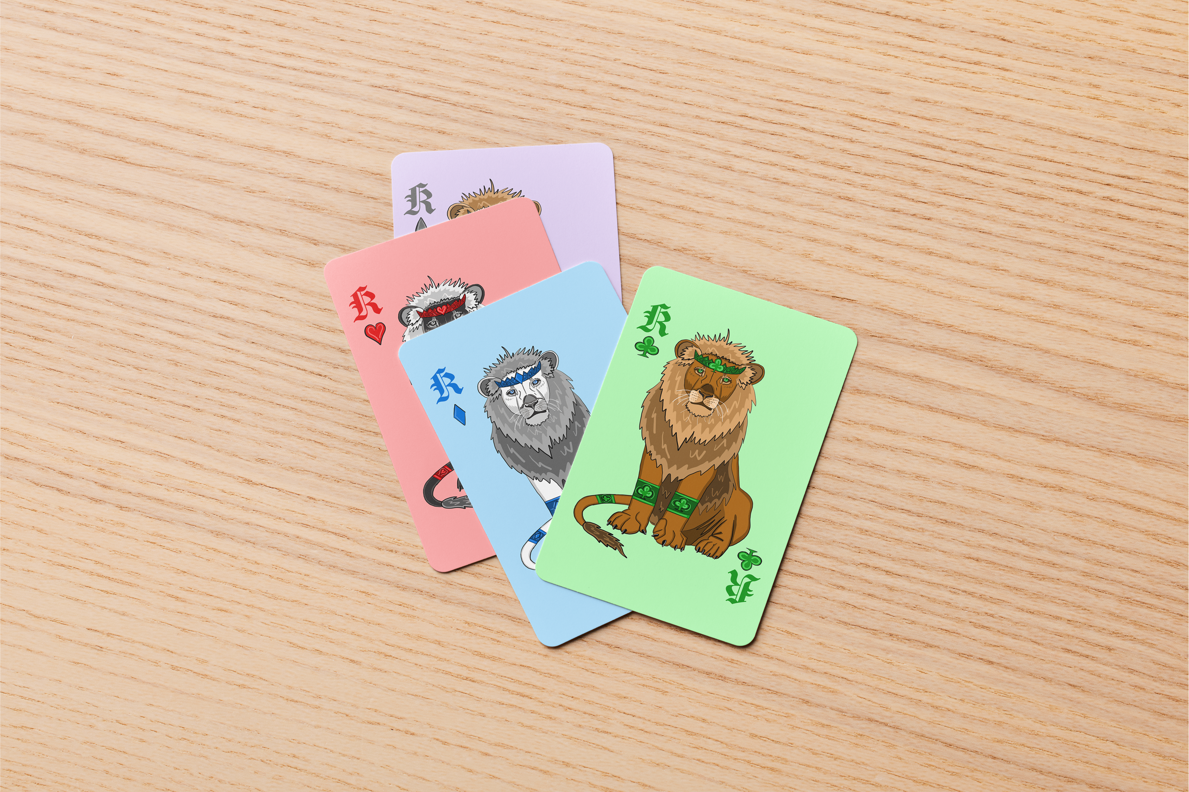
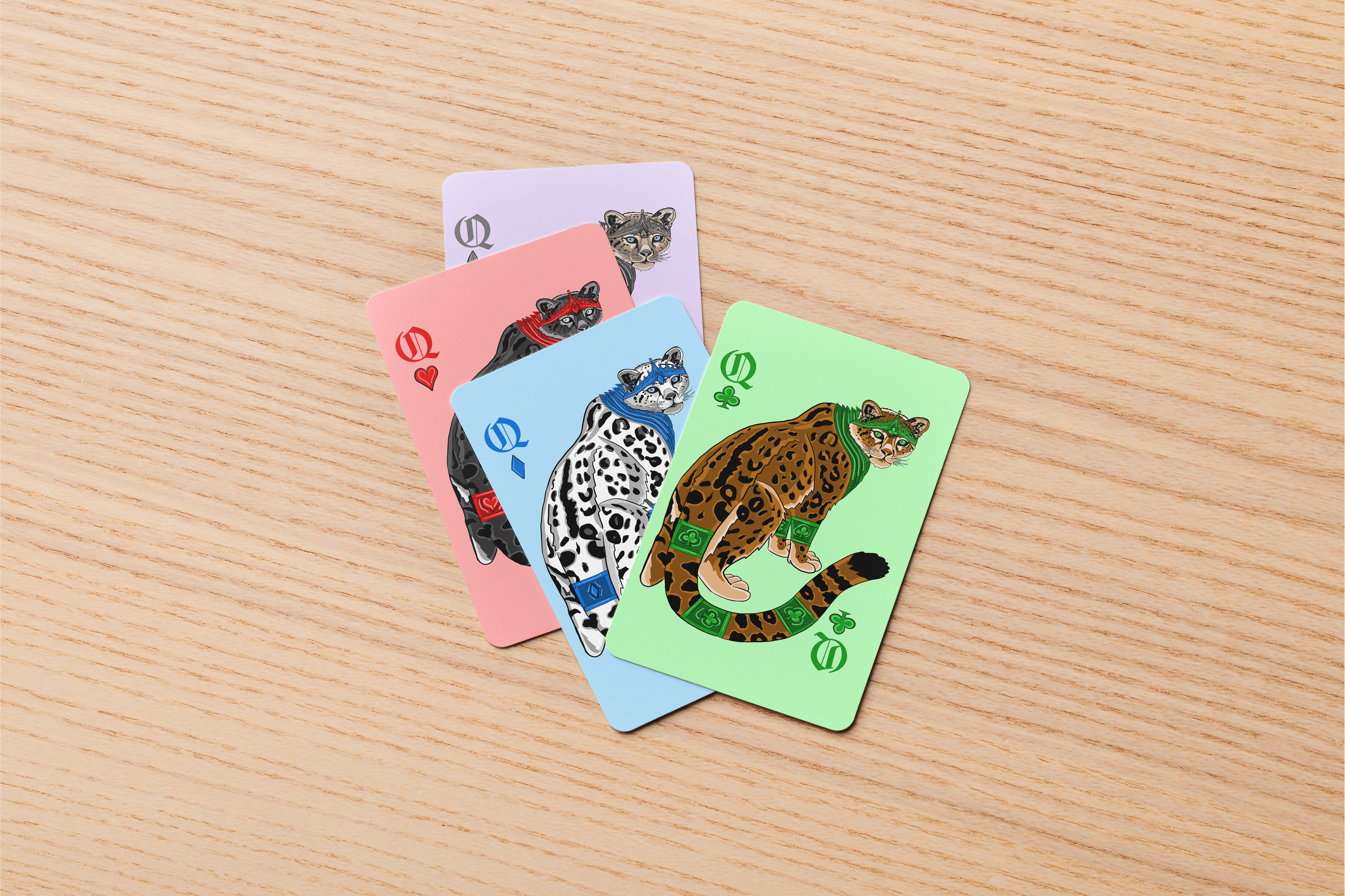
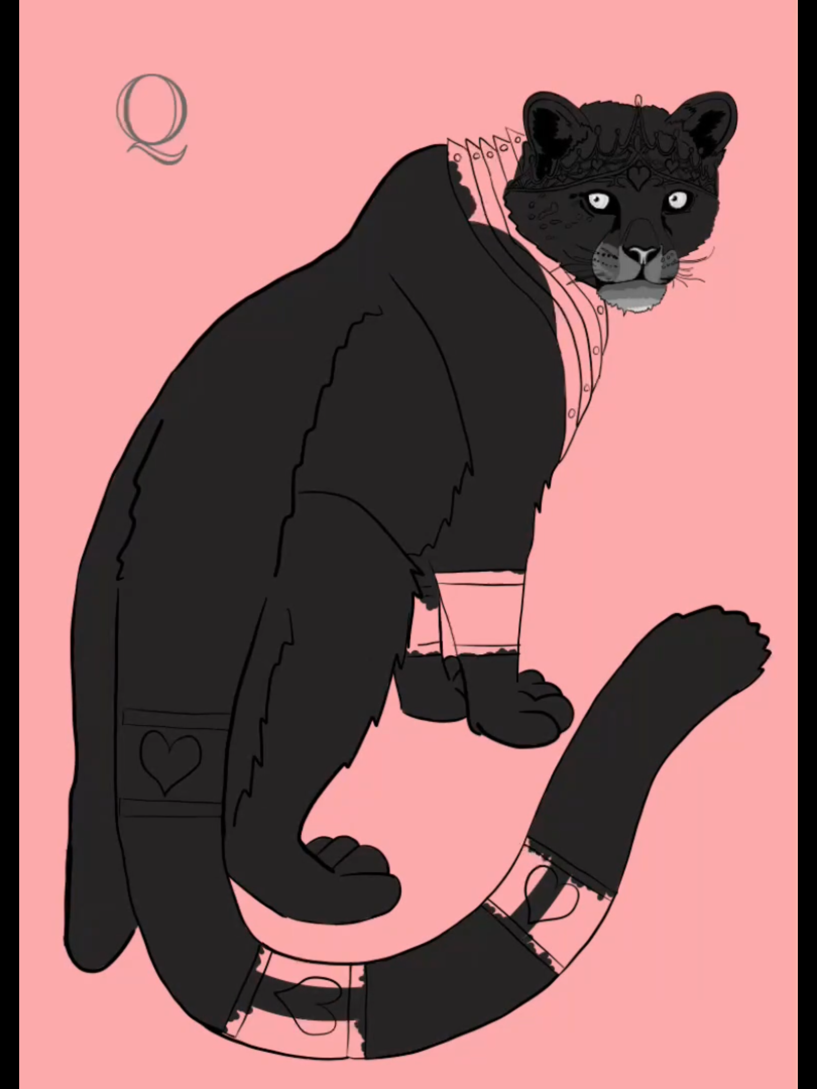
Once I finalized these colors for the armor, I wanted each animal to complement the color of their armor. For hearts, I chose black fur and feathers to make the red armor stand out. Diamonds, on the other hand, I envisioned with a softer and more fragile look, so I selected white and gray. Knowing that browns and tans complemented green, I selected these hues for the clubs. Lastly, I wanted at least one suit to have naturally colored animals, so for spades, since armor is typically gray, I kept the animals in their natural colors.
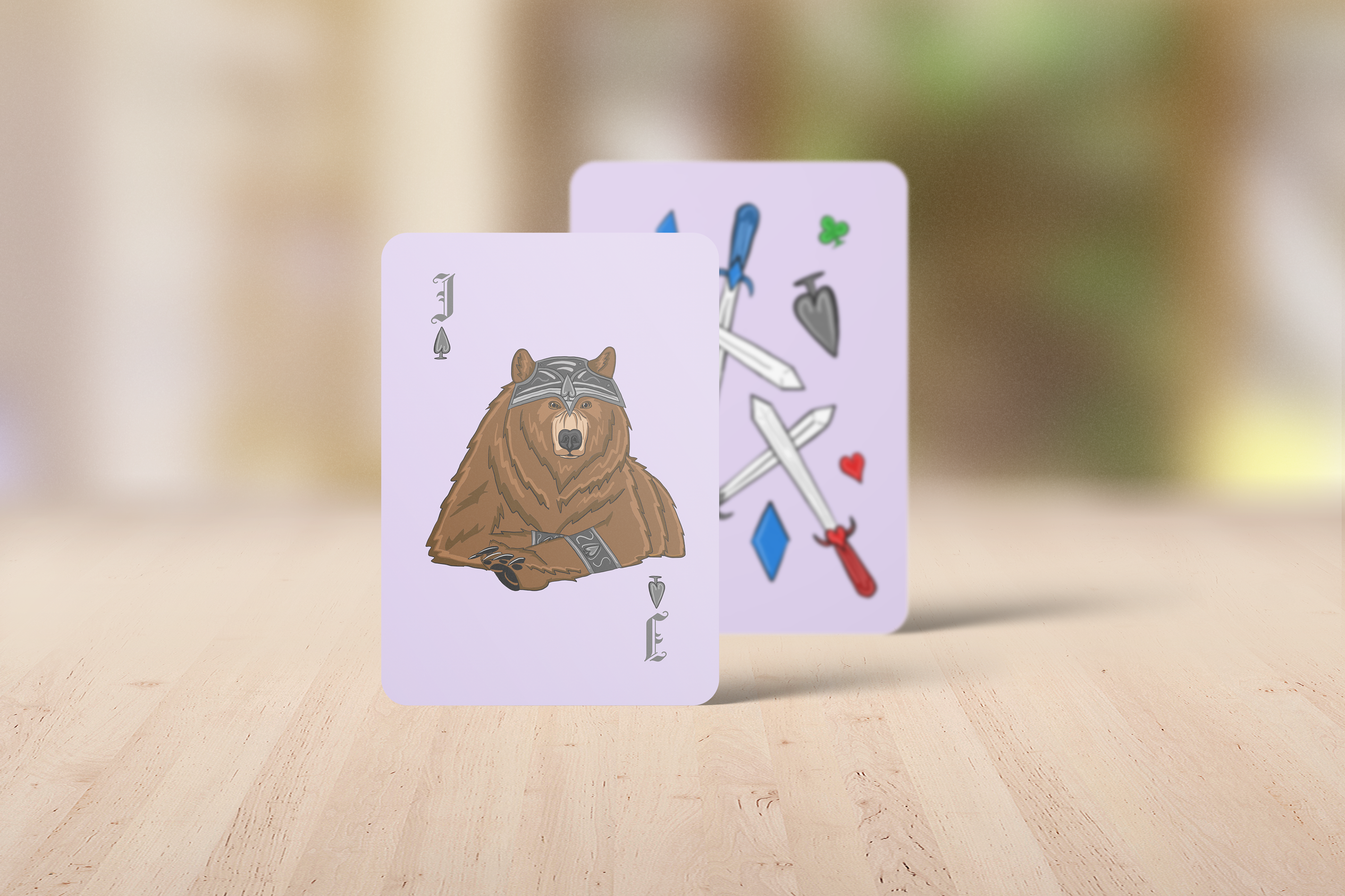
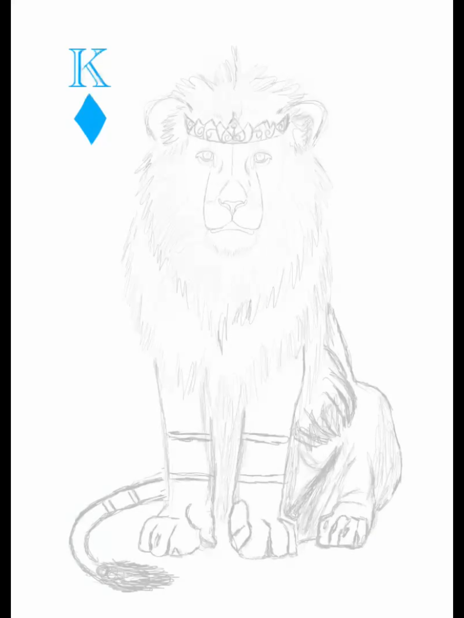
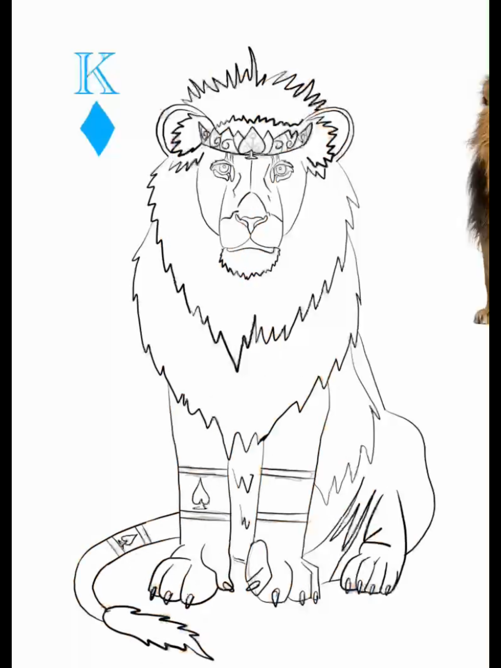
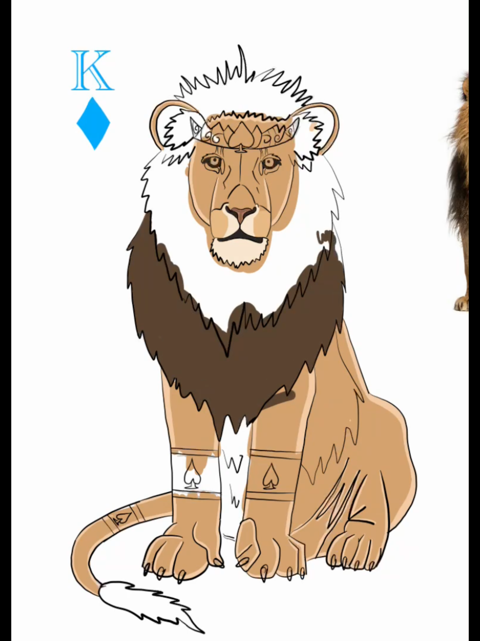
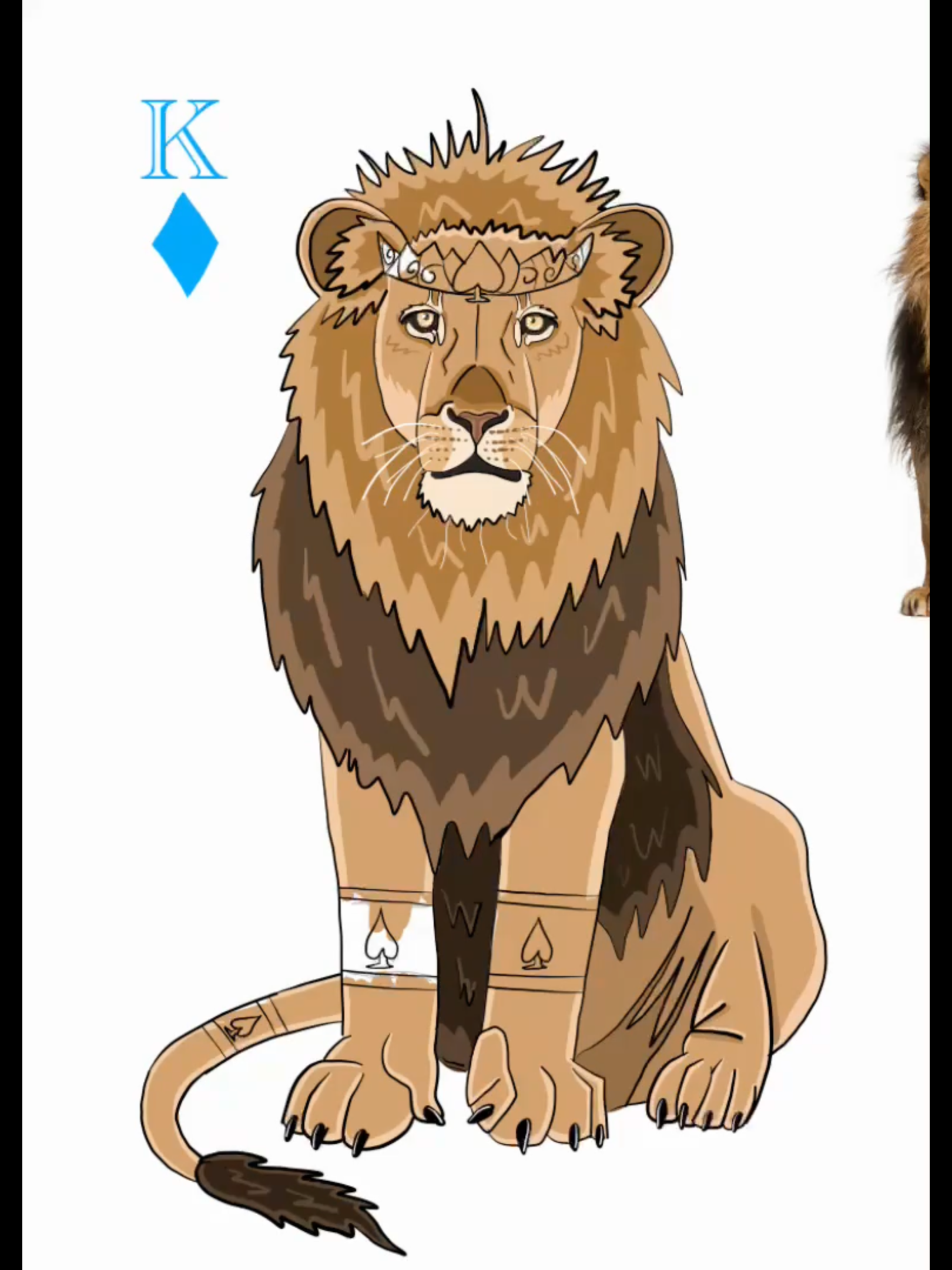
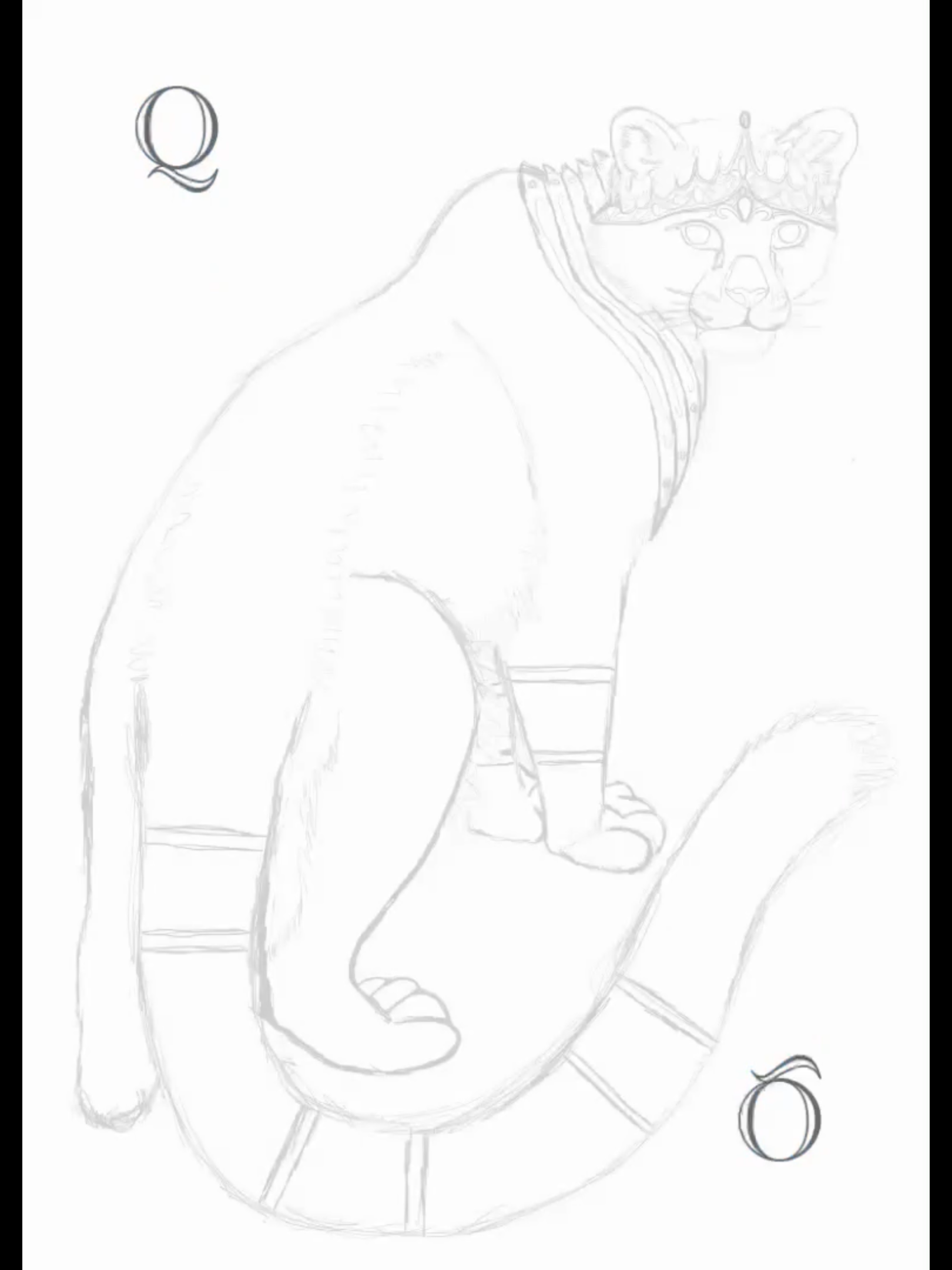
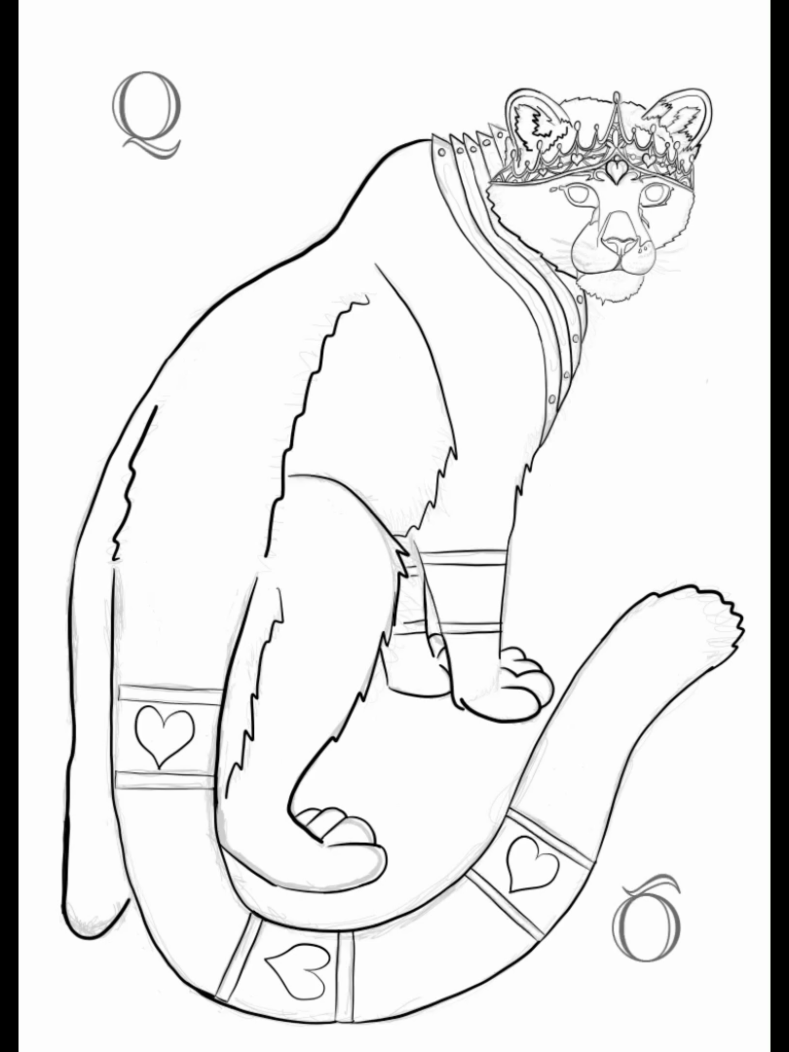
After settling on my color schemes, I started sketching each animal along with their armor. I had to work out how the armor would fit the unique anatomy of each animal. Once I had the sketches, I refined the outlines, added color, and incorporated details. Eventually, I added the font for the card numbers and the king, queen, and jack cards, along with the appropriate symbol for each suit.
King Card Process
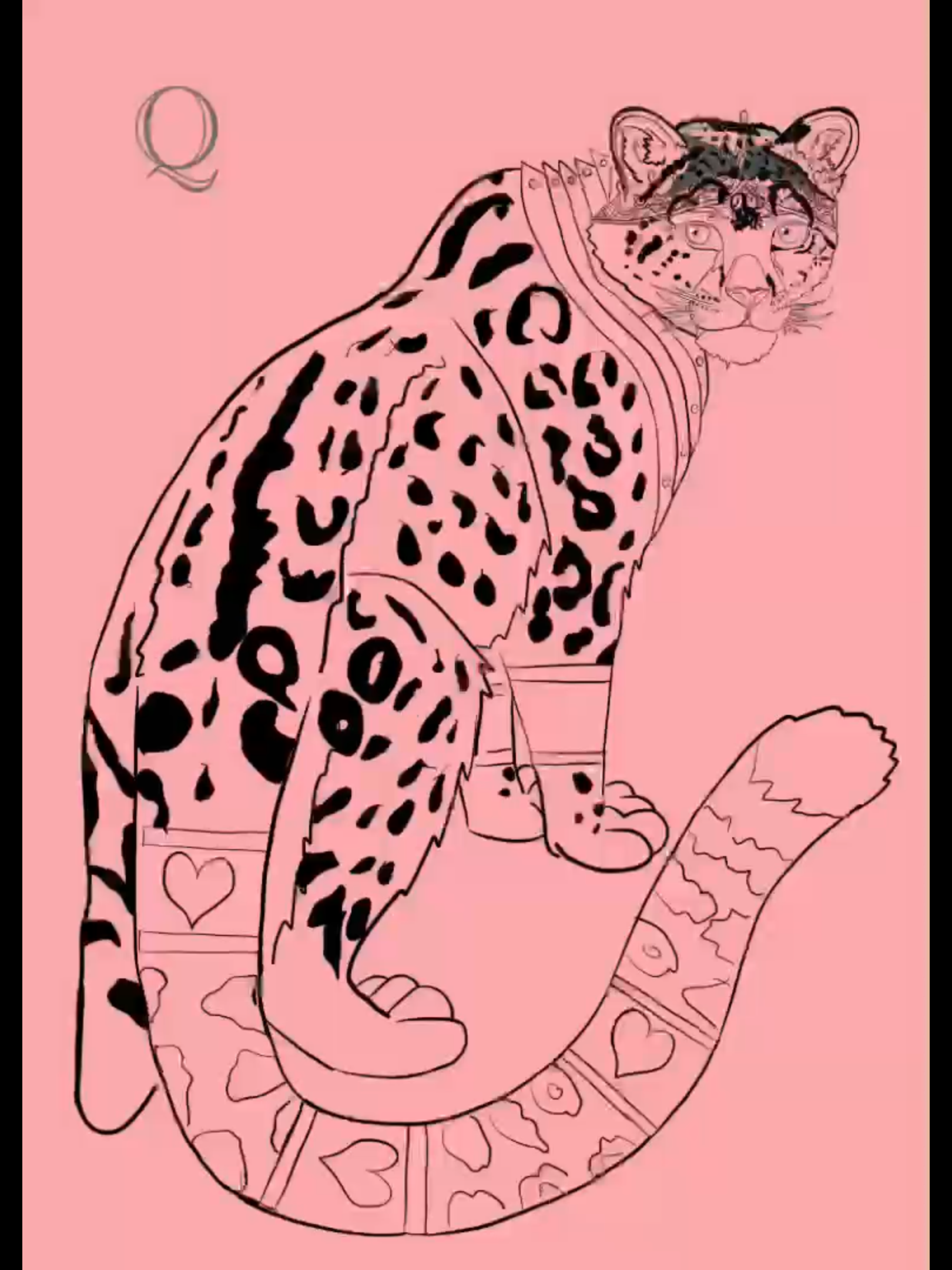
Queen Card Process
Box Design Process
Back Of Cards Process
Work-In-Progress
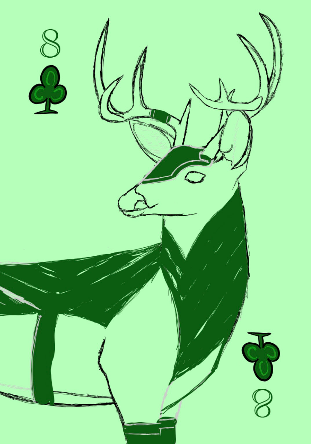
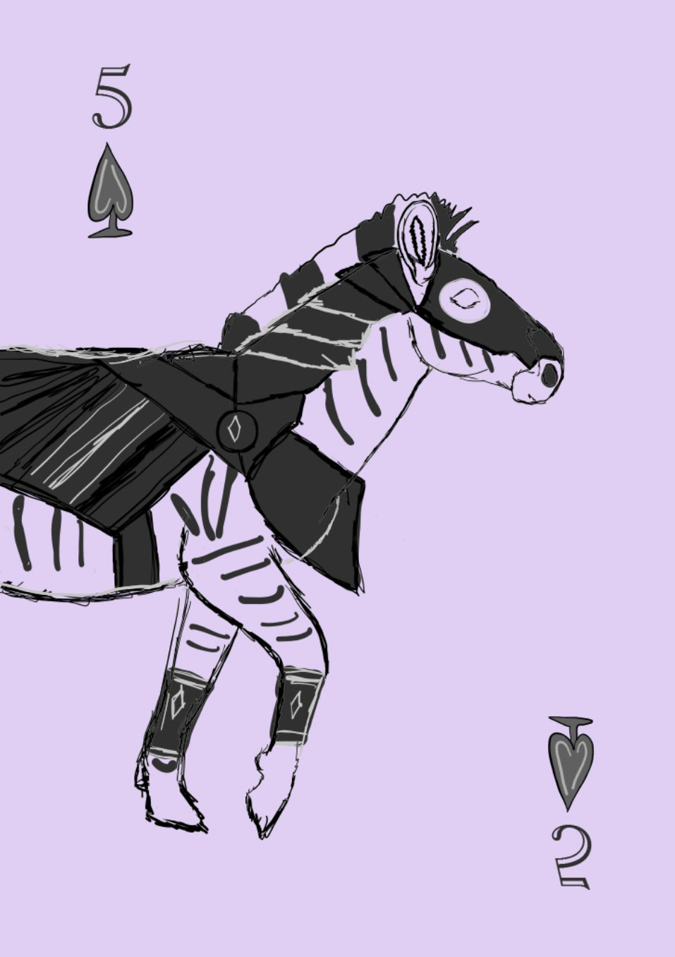
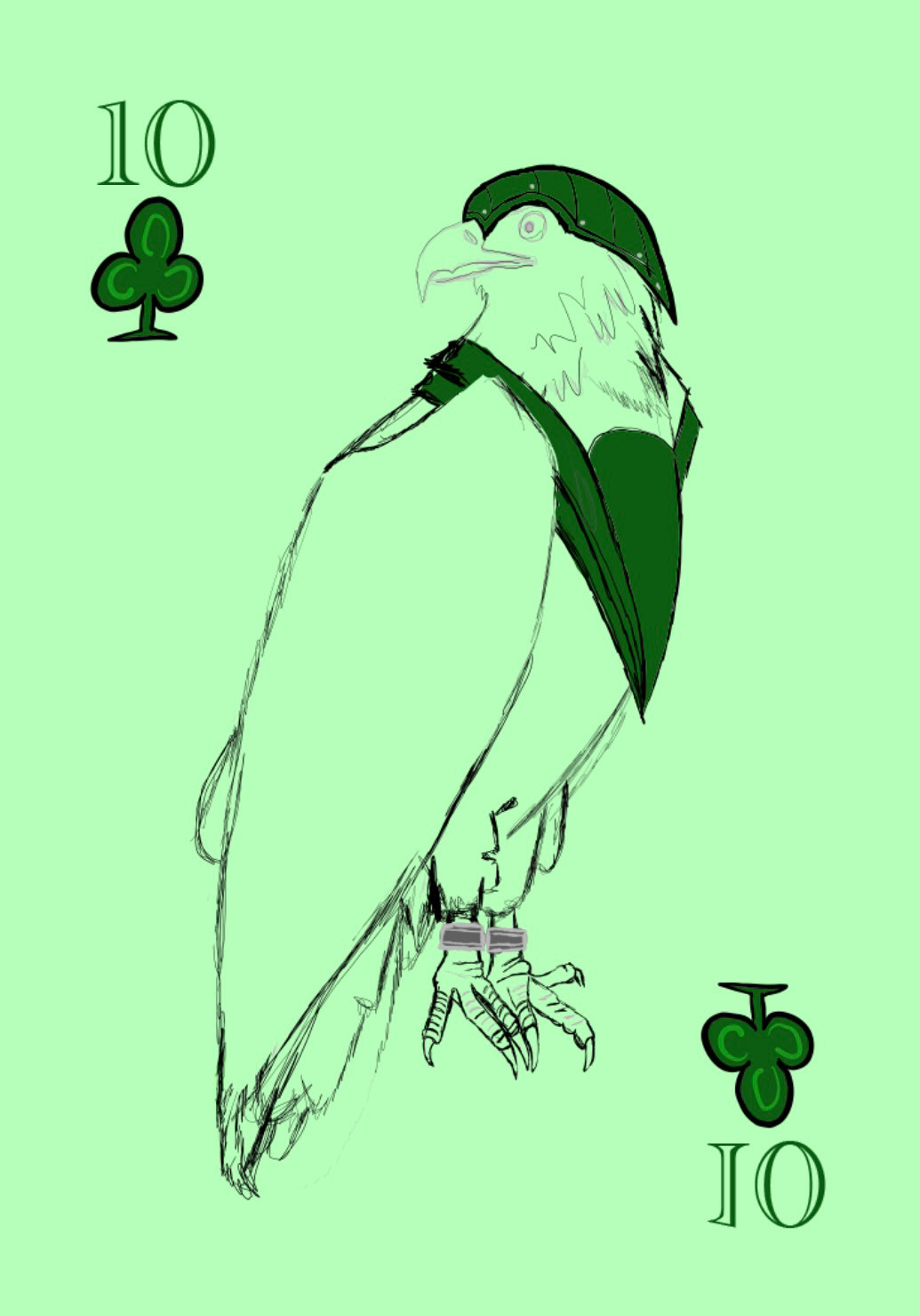
My initial works in progress were quite messy! They mostly consisted of rough outlines from my sketches, hastily filled in with solid colors for the armor and animals. This messiness was a result of the extended time it took to reach a point where I was satisfied with the animal sketches. I aimed for anatomical accuracy, leading to multiple erasures and redraws. However, the end result is now clean and detailed, and I feel satisfied with the outcome, glad that I persevered to get it right.
Final Thoughts
This project was a valuable learning experience for me. It provided ample practice in drawing various elements within a limited timeframe. Typically, I prefer taking a few days for my creative work, but with these cards, I managed to complete each card, including all color variations, in a single day, for a week straight! The continuous effort paid off. Additionally, I gained insights into creating a cohesive theme across different cards. While this project demanded a significant amount of work and time, I found enjoyment at every step. Designing my own personalized set of playing cards was a truly rewarding opportunity.
