Project Brief
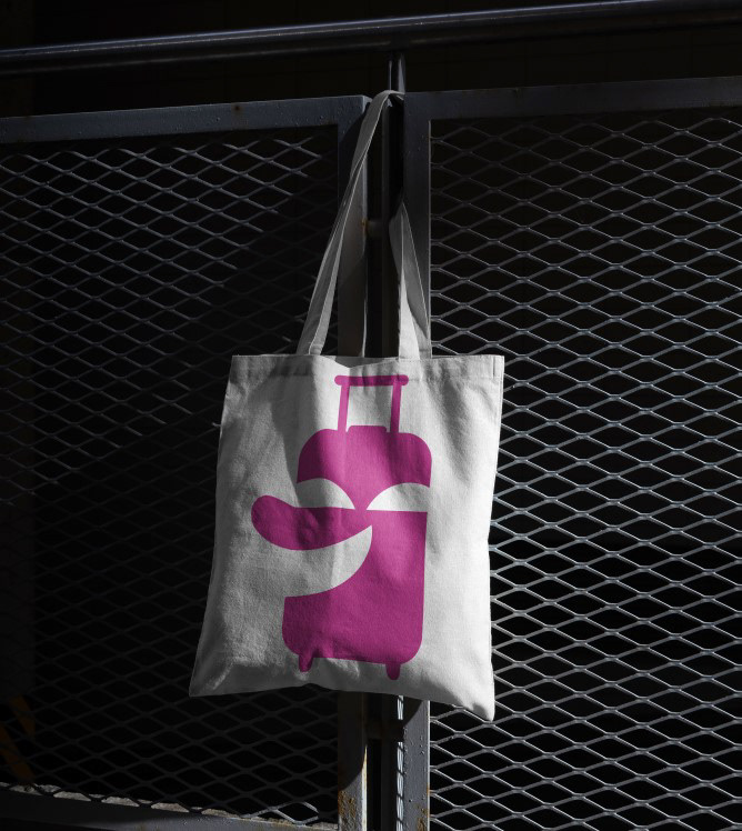
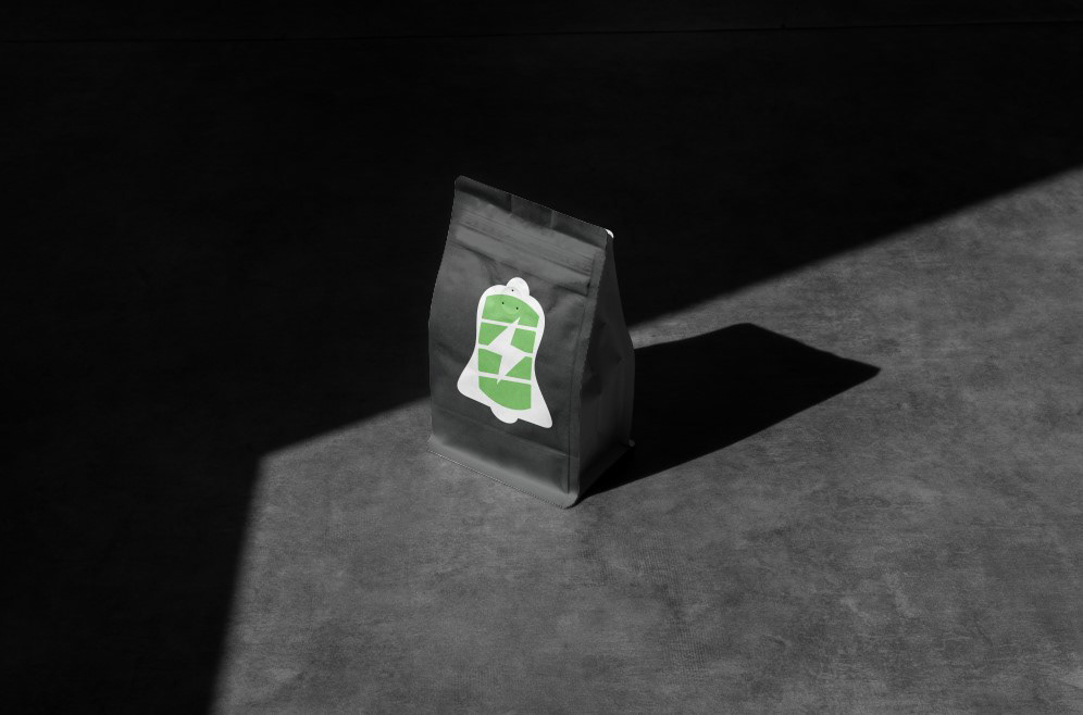
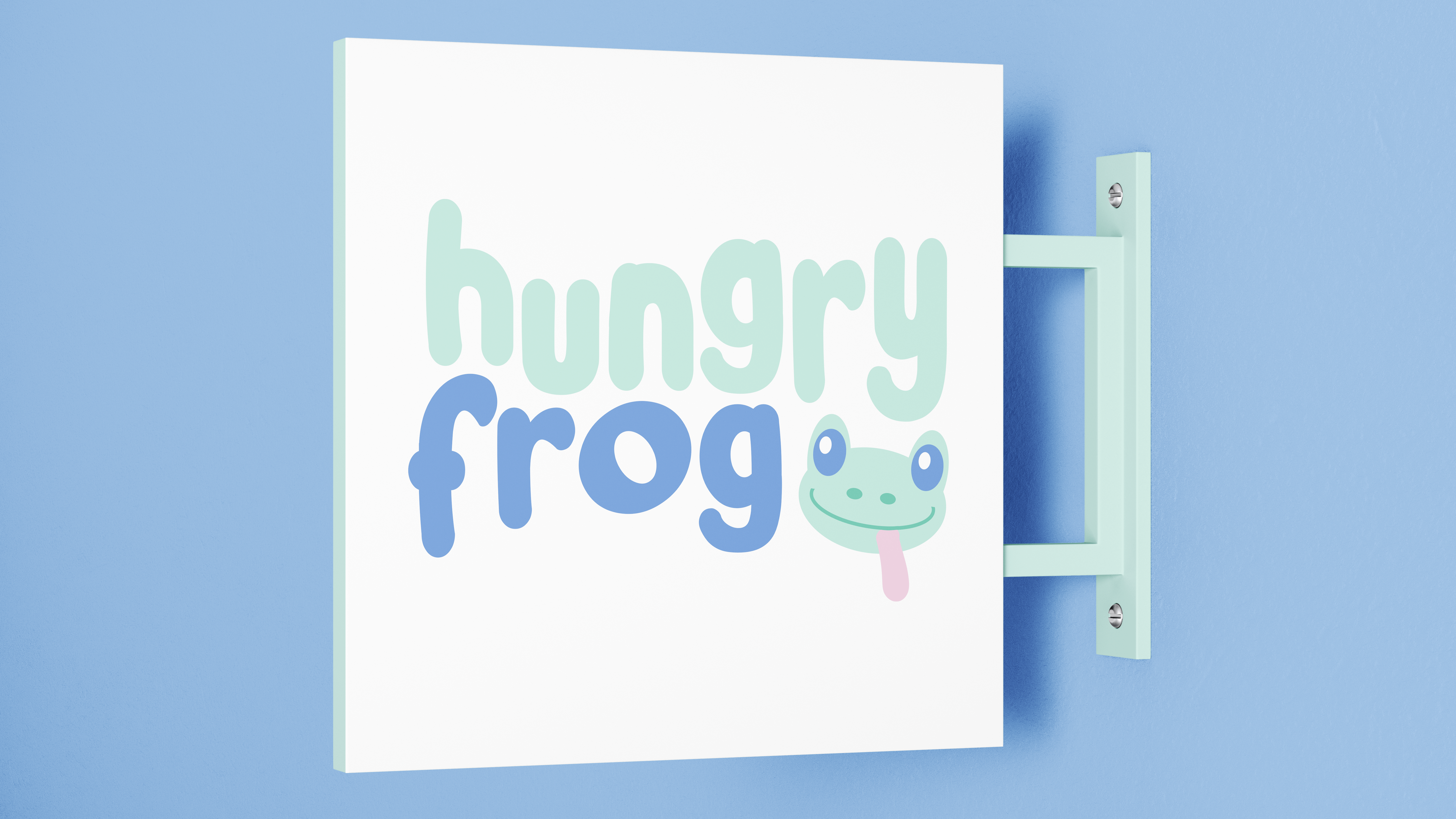
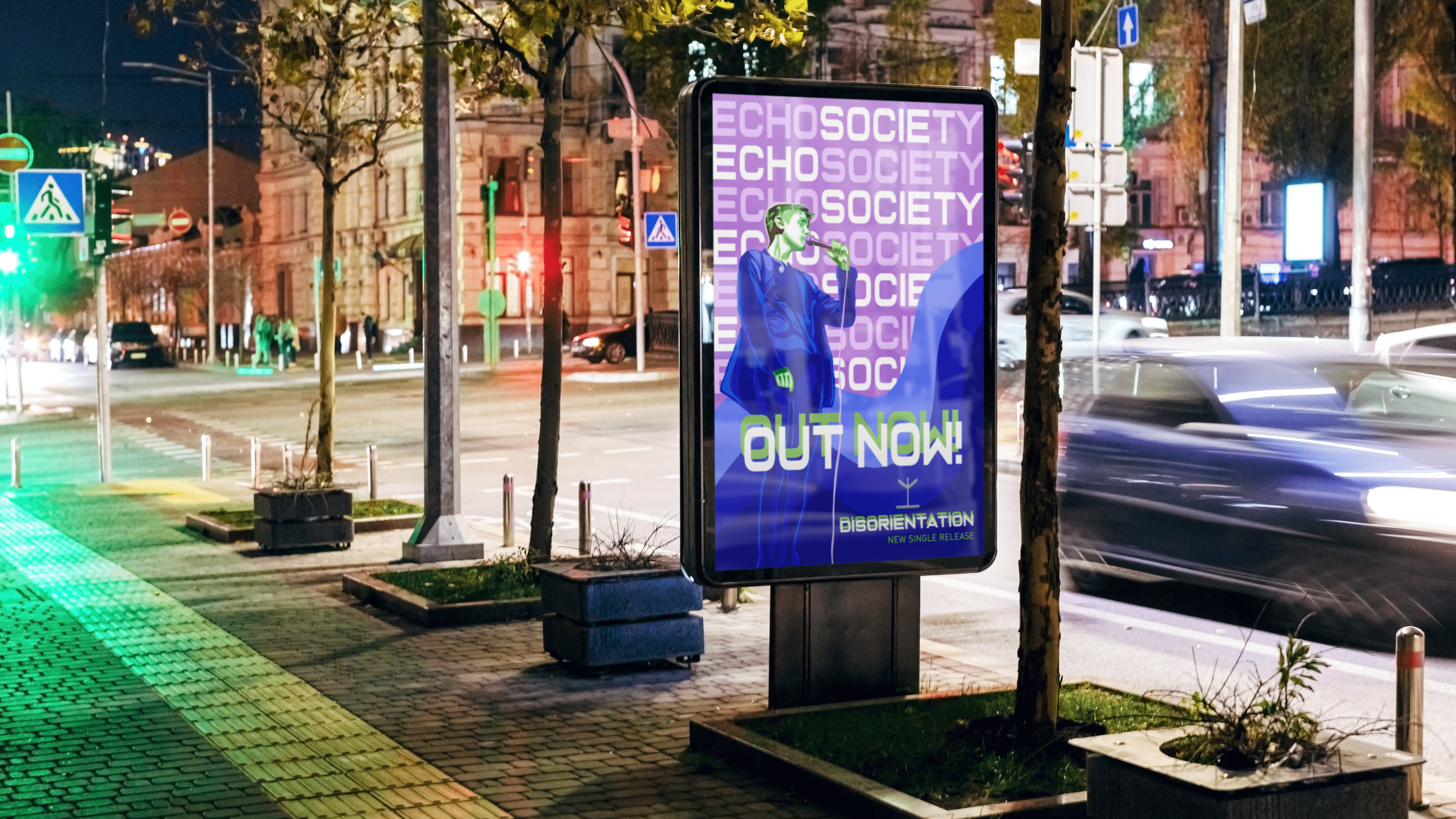
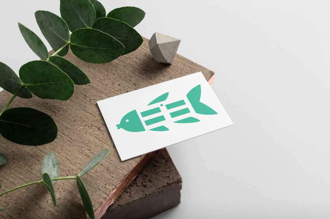
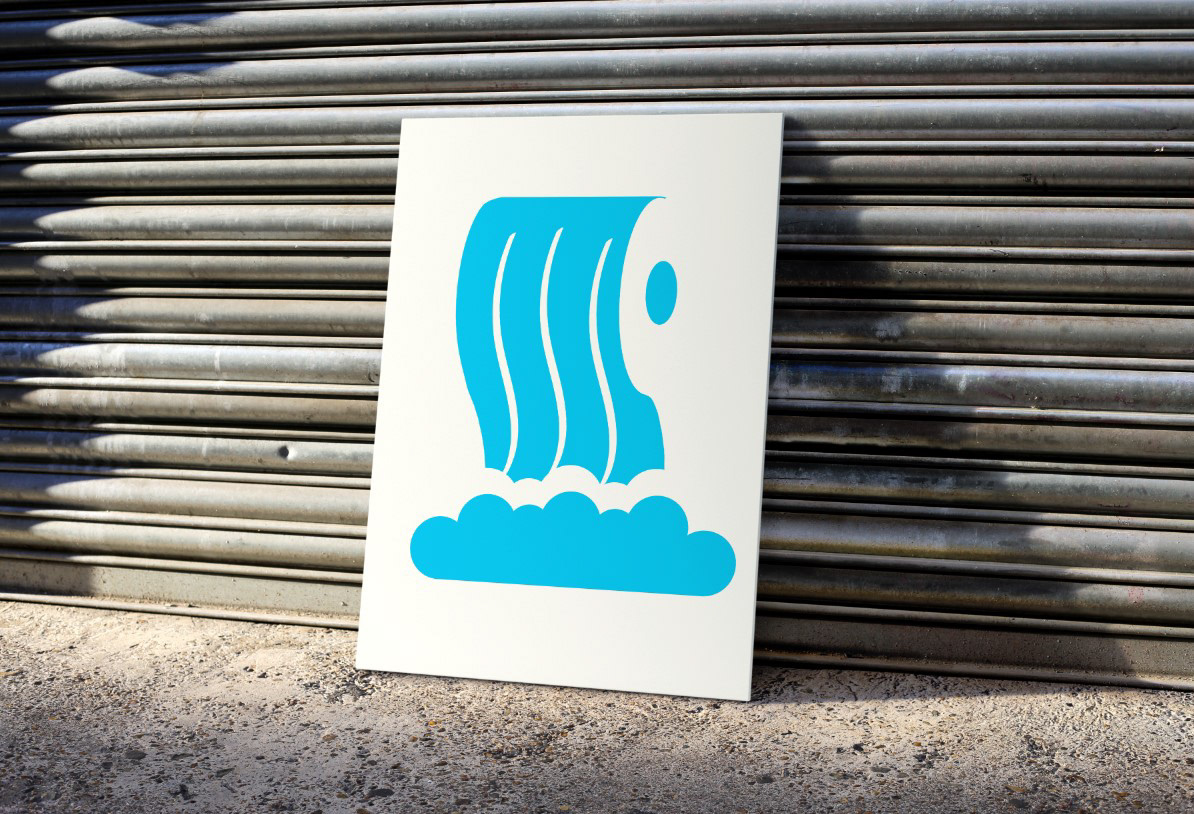
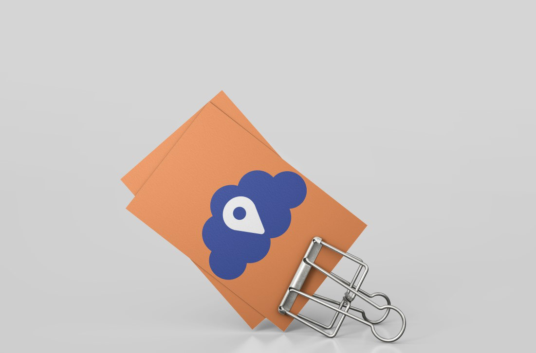
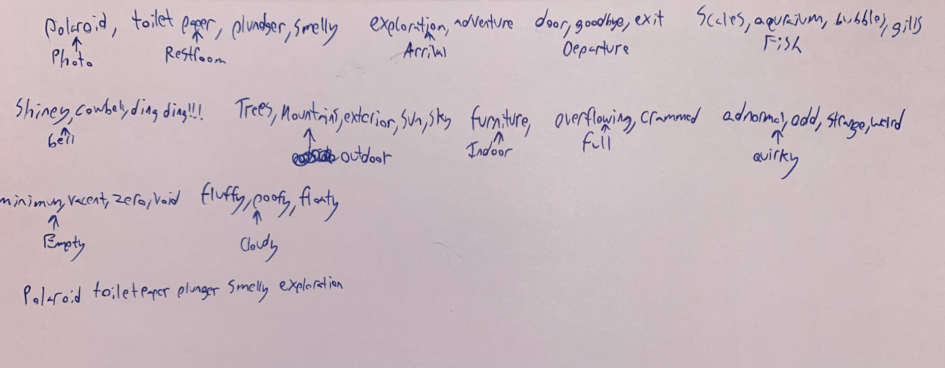
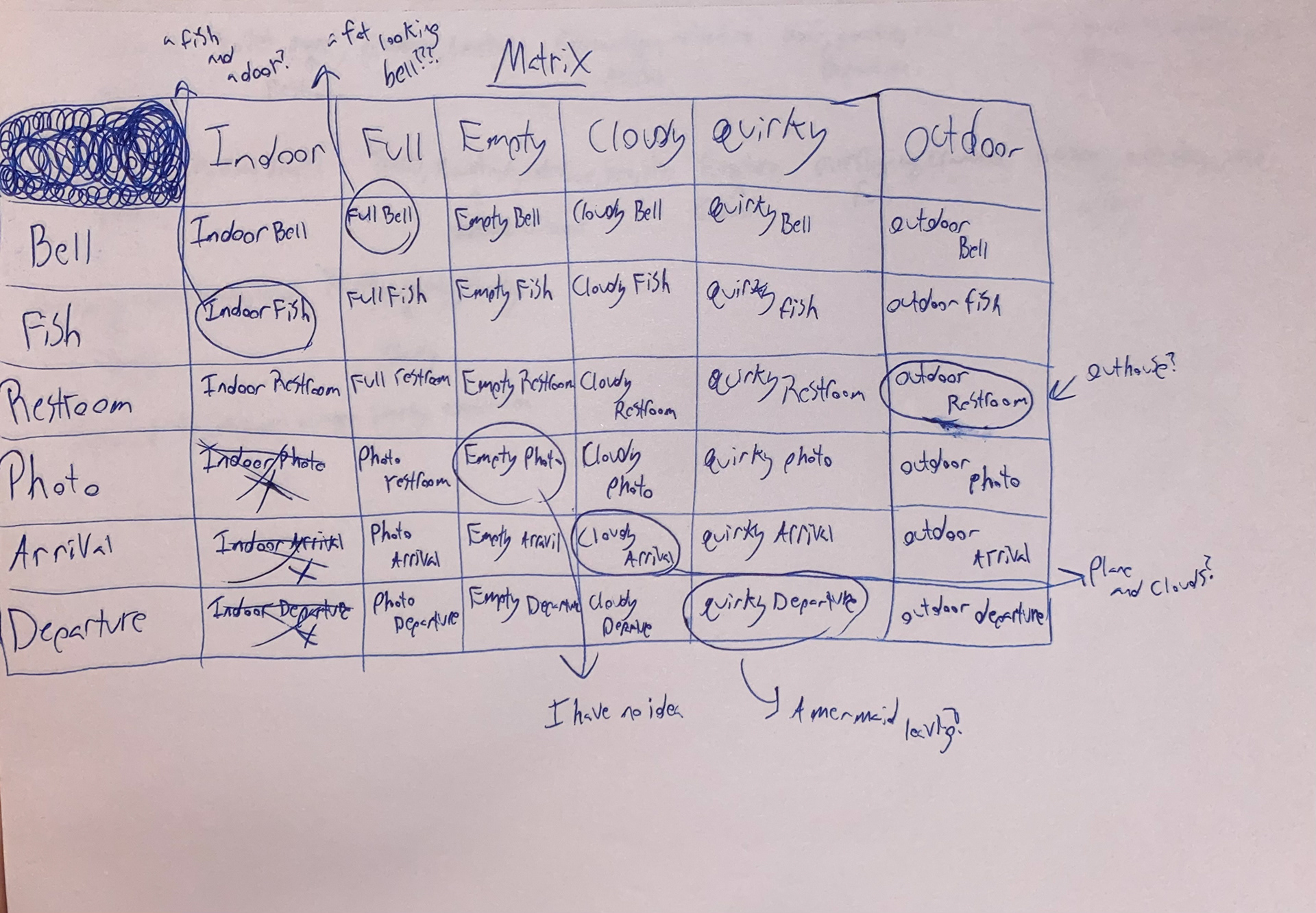
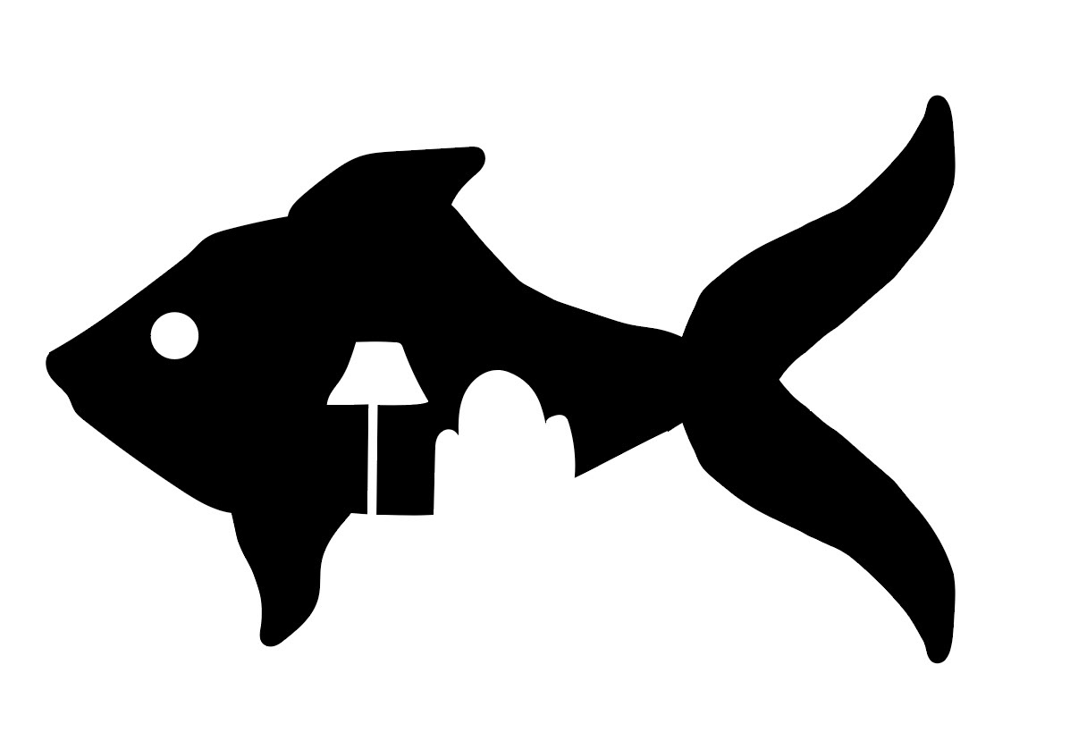
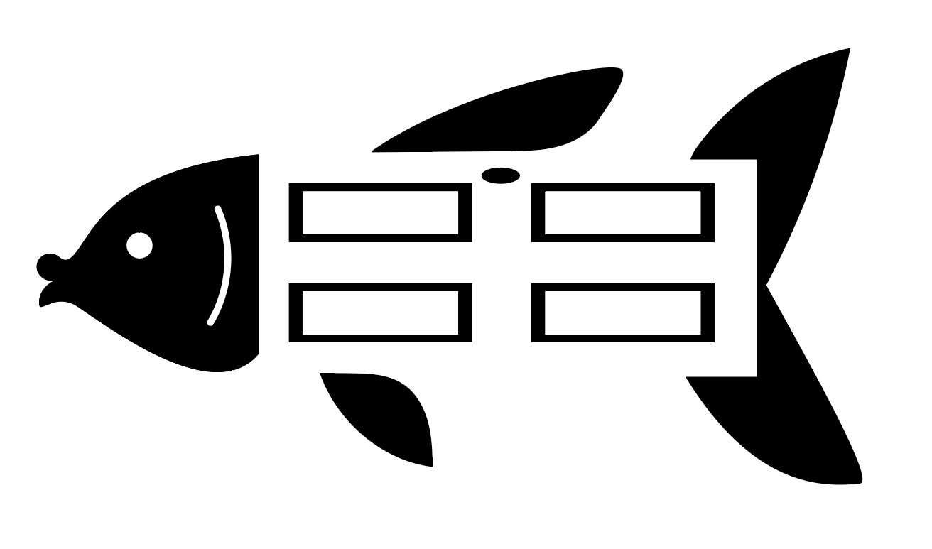
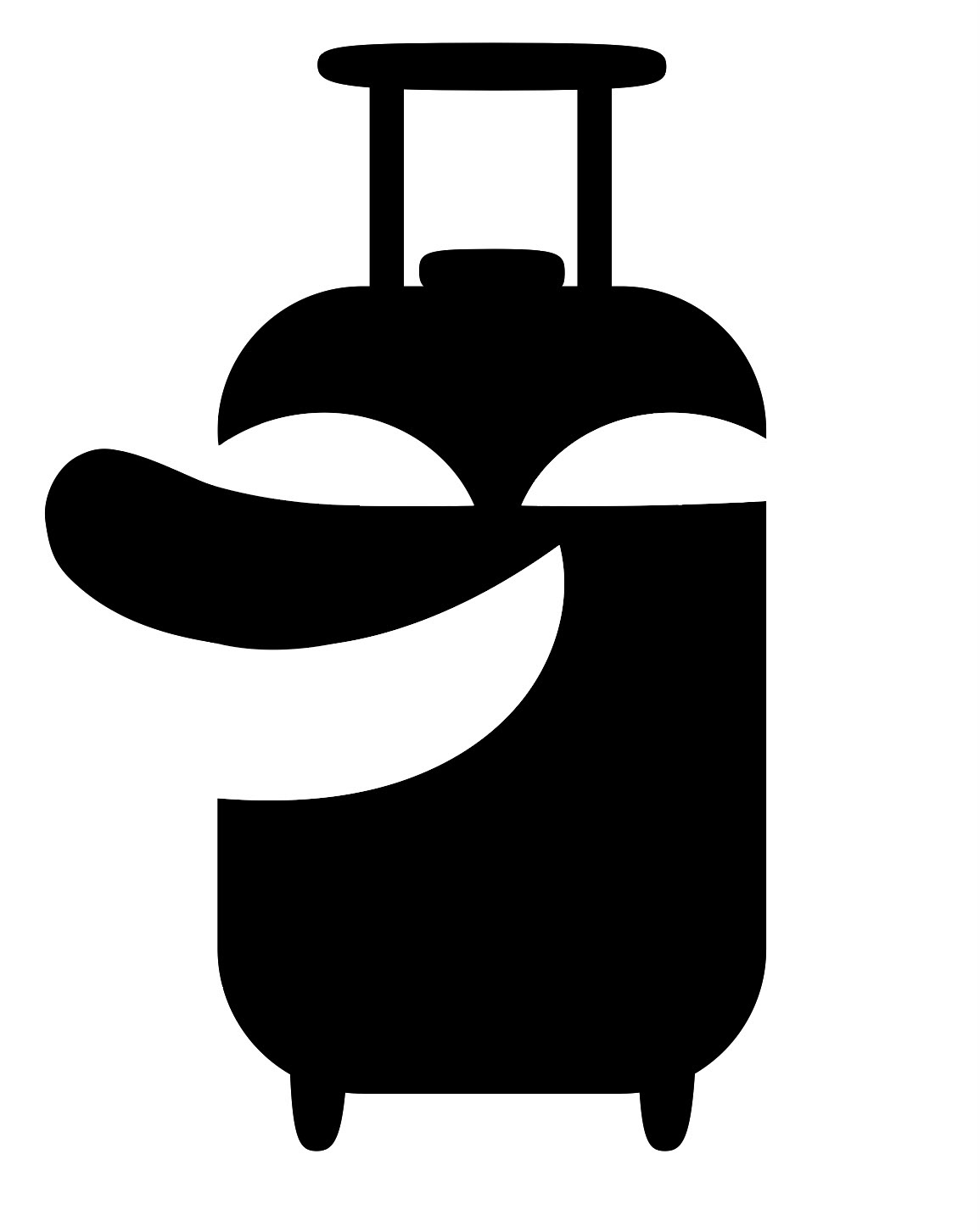
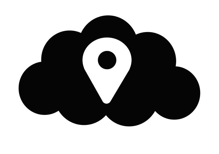
The goal of this project was to create forced connections in an icon by using positive and negative space. I was assigned a word list that contained 12 words. These 12 words were split into two lists. Word list one contained the words outdoor, cloudy, full, empty, and quirky. While word list 2 contained restroom, arrival, bell, photo, and departure. These words were then combined to create a single icon that represented both words.
Beginning Process
Brainstorming
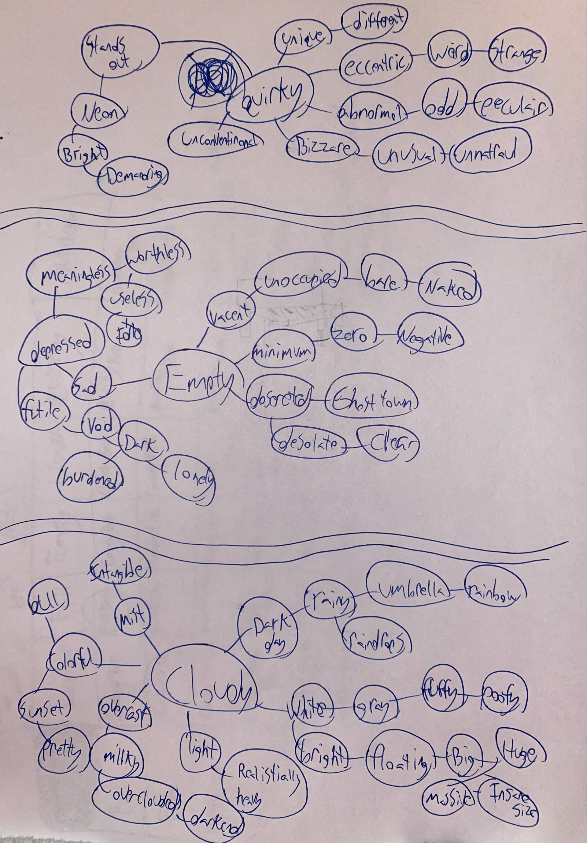
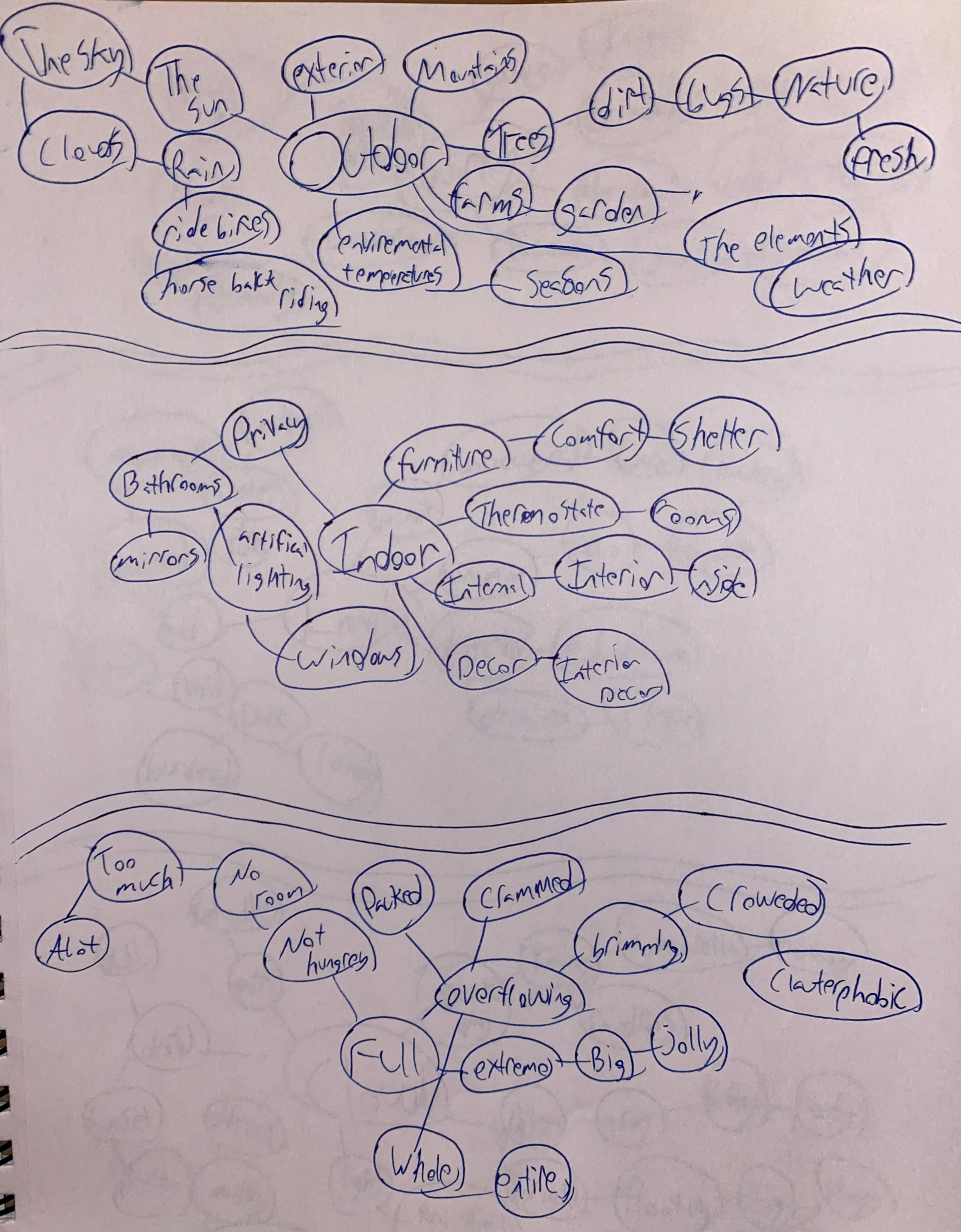
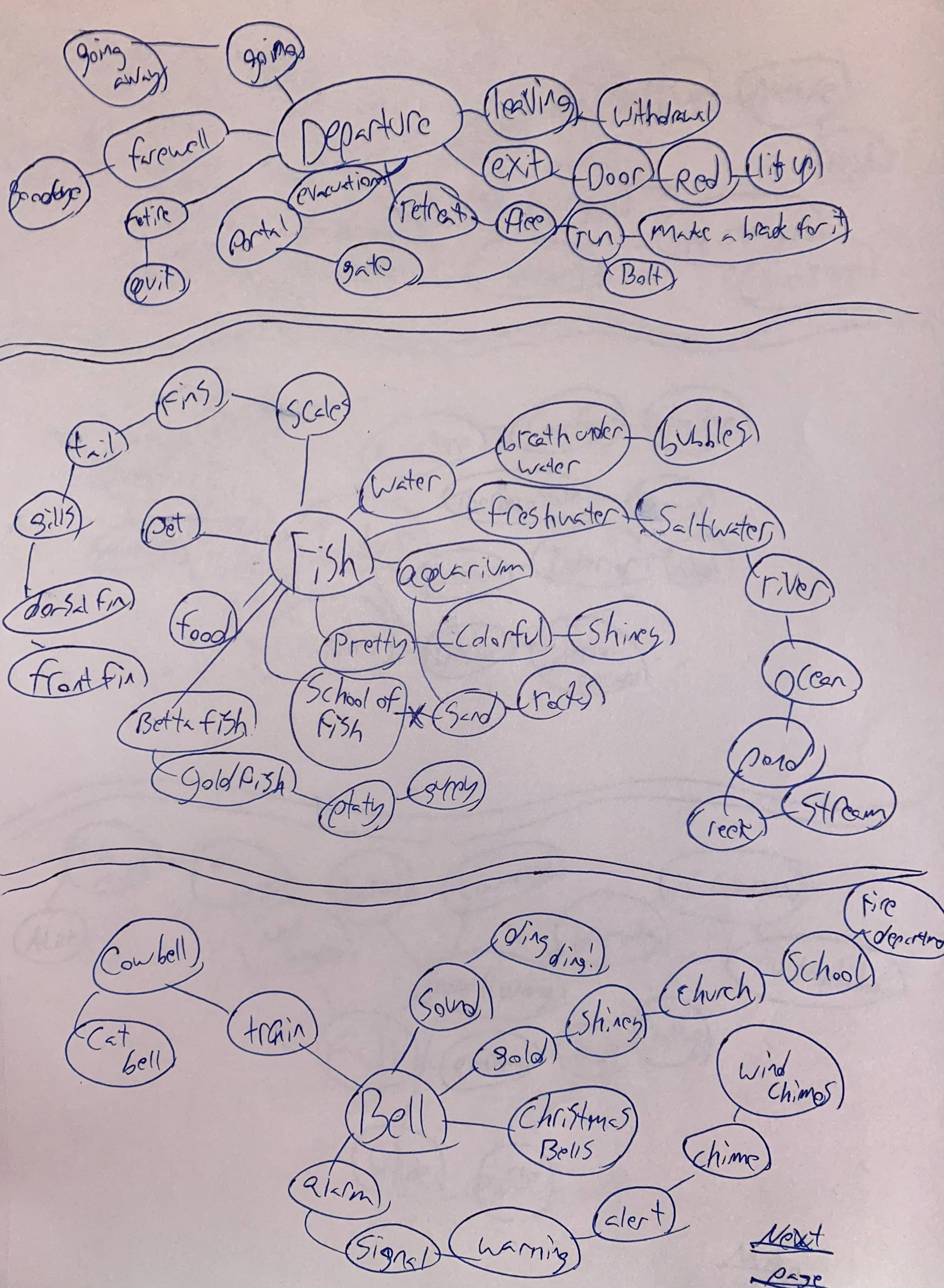
When I began this project, I wrote out and sketched the first things that came to mind.
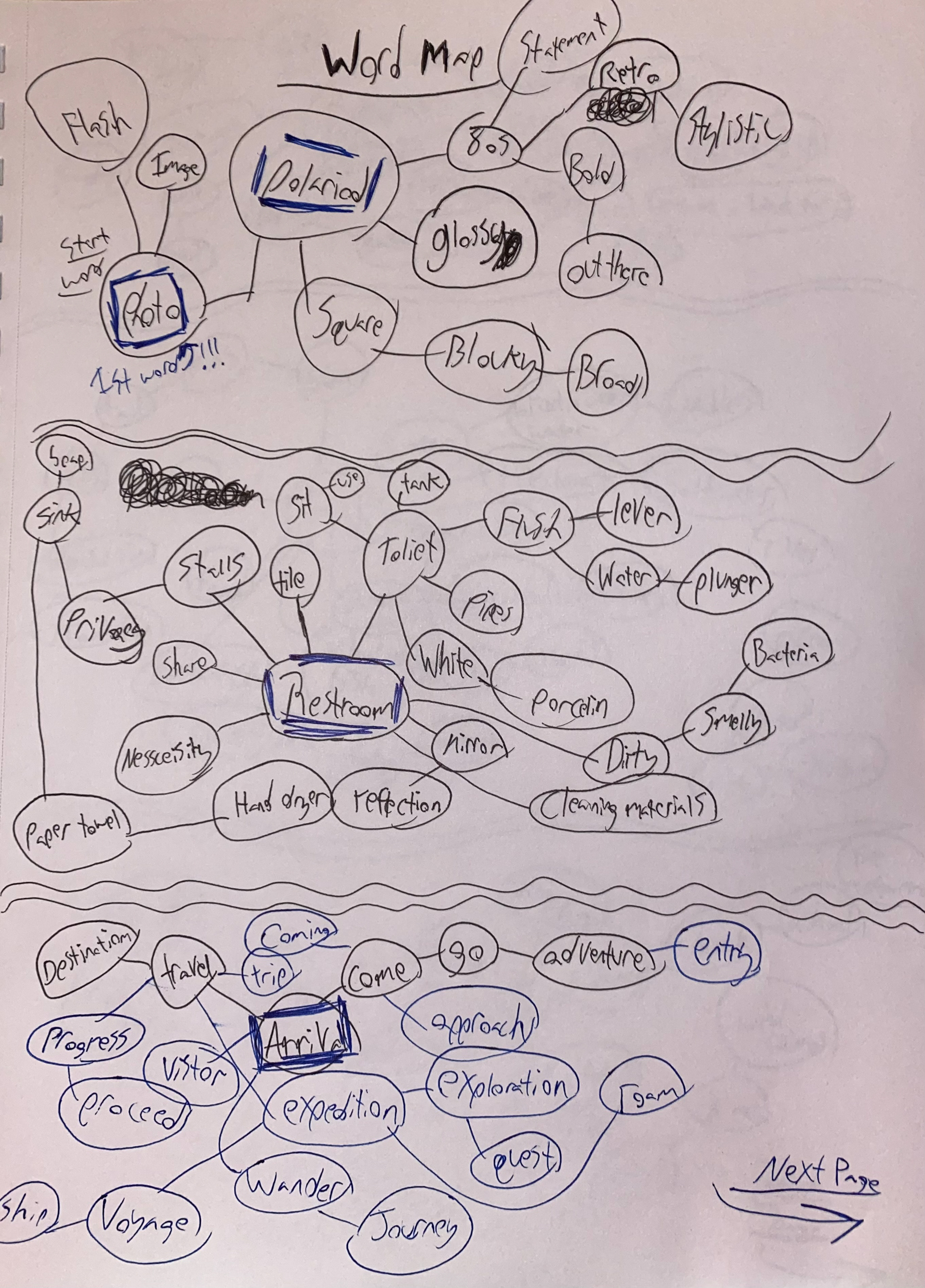
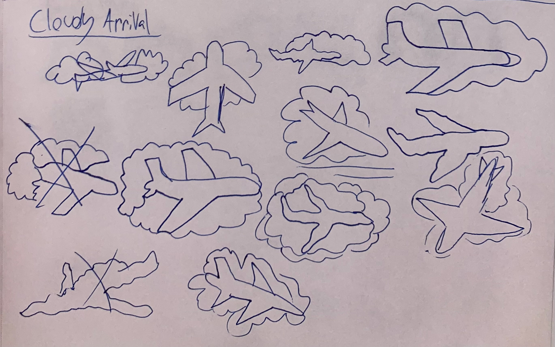
Sketches
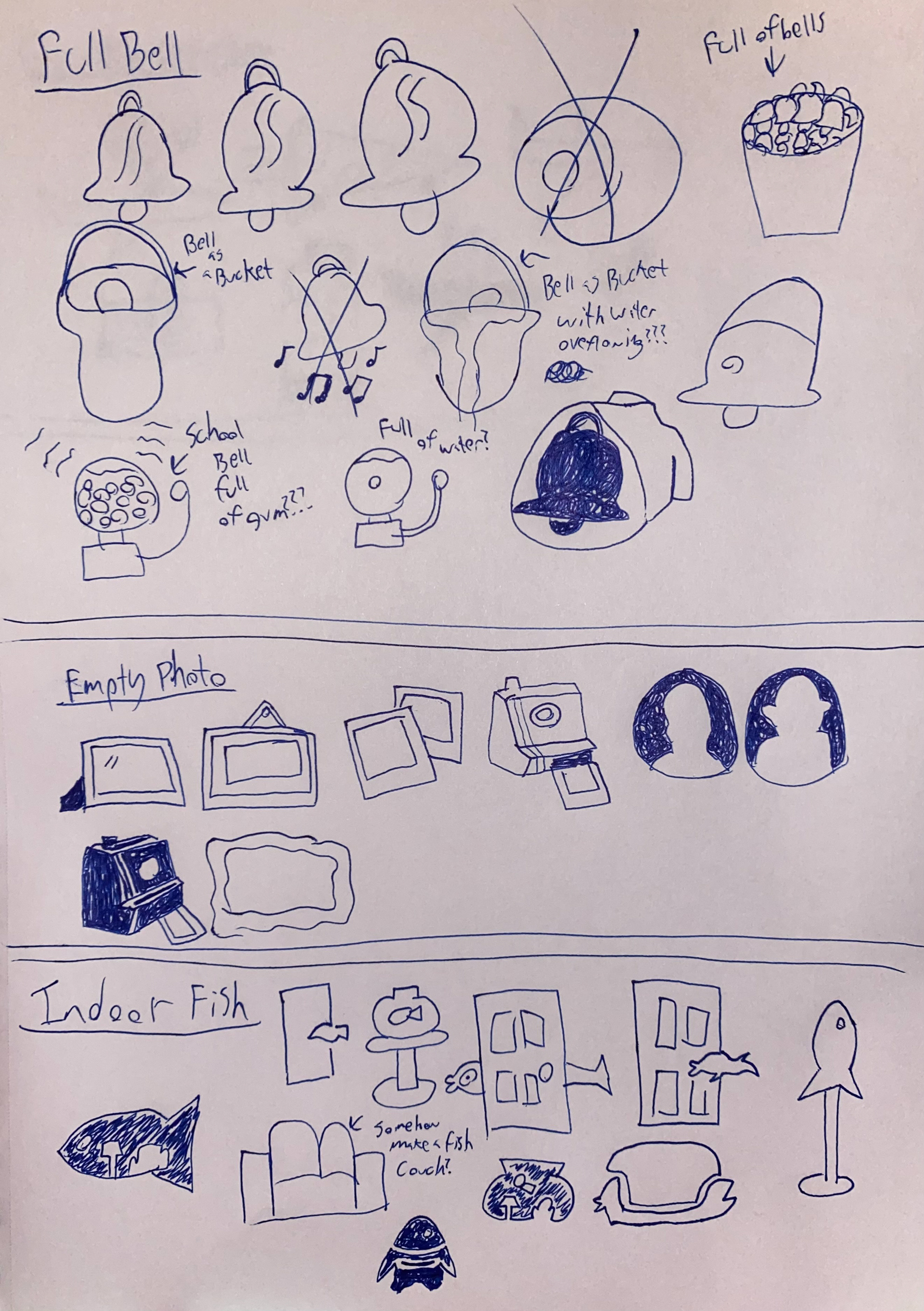
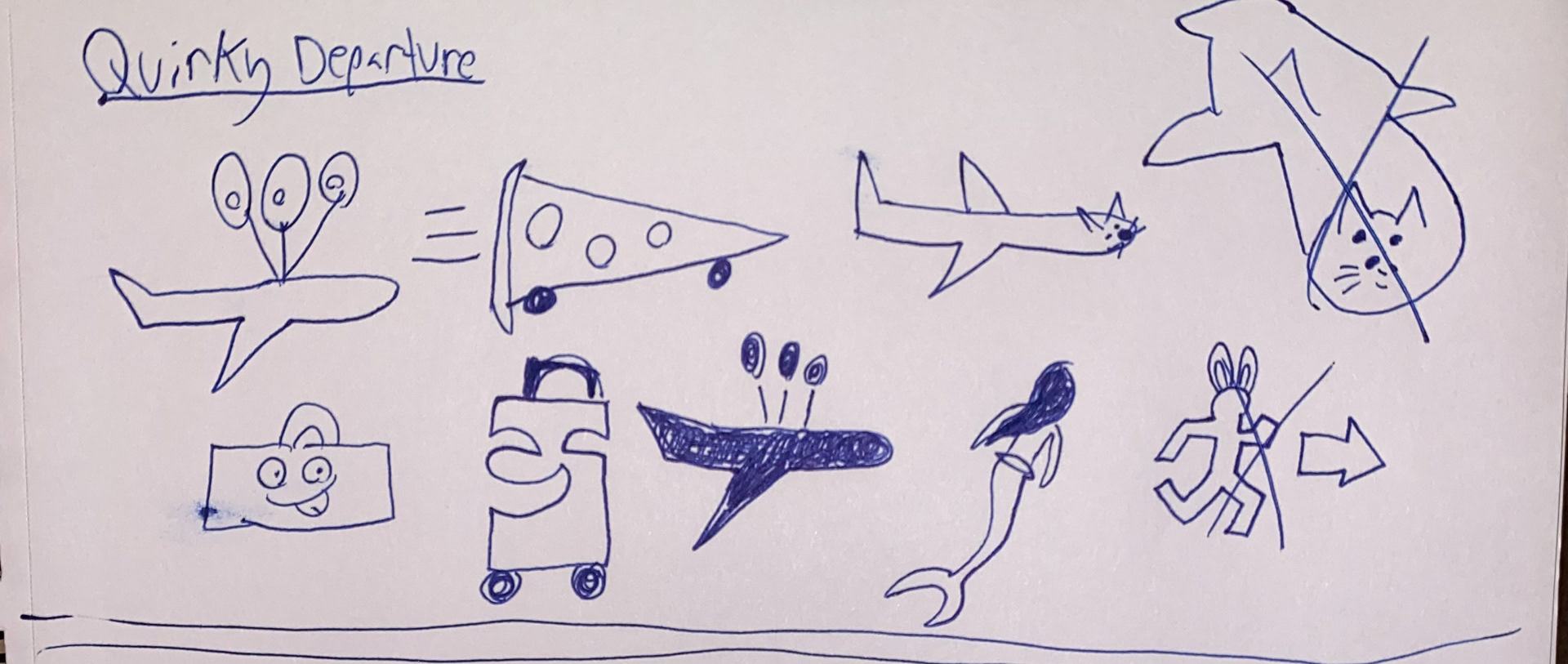
Work In Progress 1
These renditions did not meet the requirements of the project. They were too complex and they didn’t use positive and negative space creatively. So they were revised.
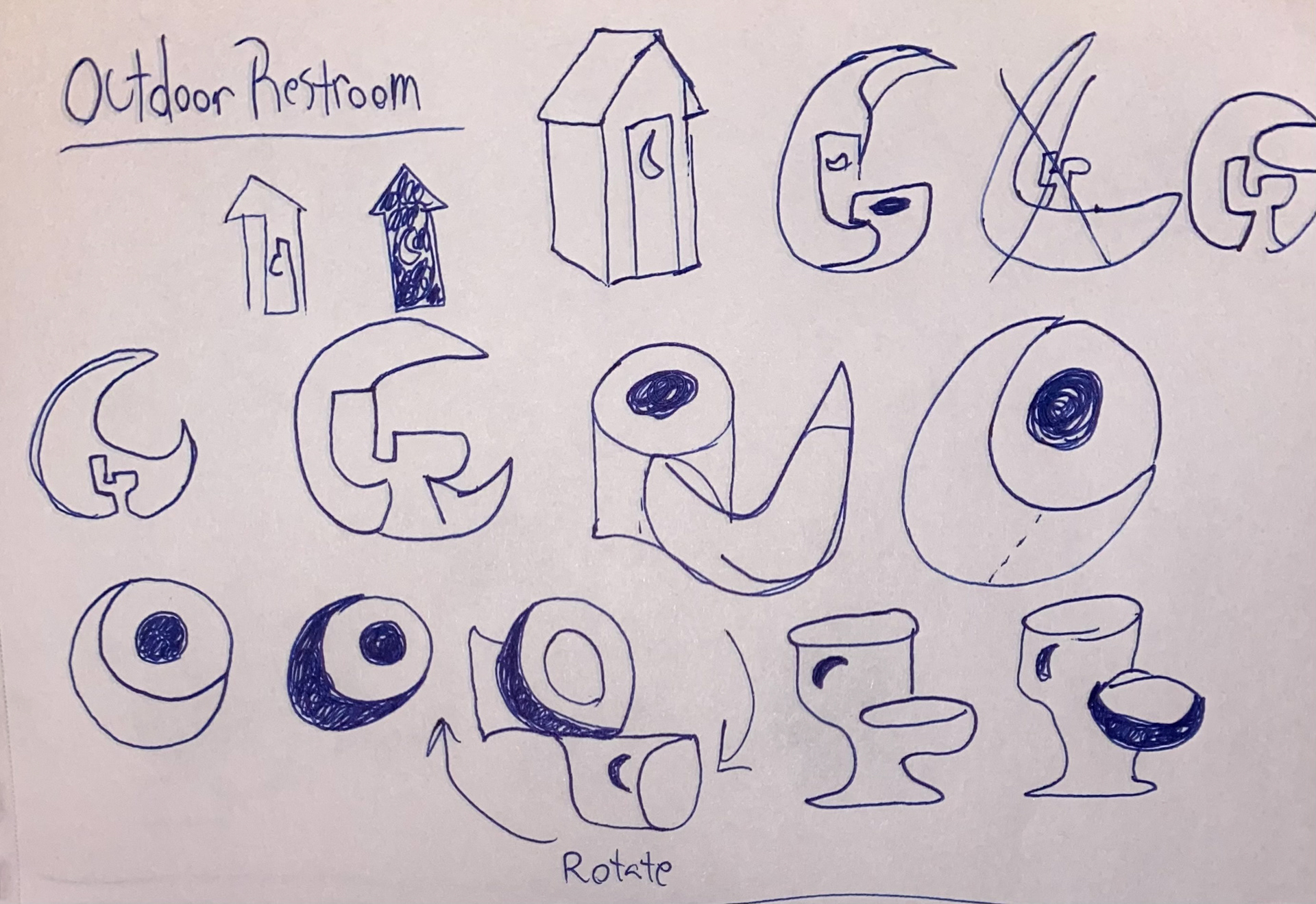
A noticeable evolution is observed in my process. From the beginning, my sketches were either rough or they didn’t capture the meaning of the word pairs. For example, the outdoor restroom icon was too complex. It didn’t use positive and negative space to represent two things, and the meaning was lost in the complexity.


Work In Progress 2
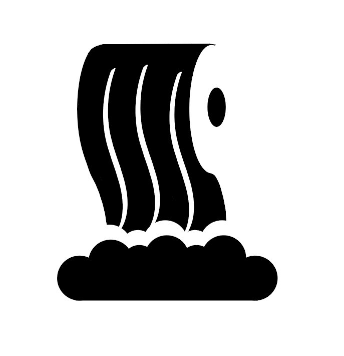
So for my second revision, I chose a simpler object, which was toilet paper. Though that only solved half of the problem. I still needed to combine an element that represented the outdoors. An element that the restroom and outdoors shared was water. This led me to wonder where we see water outdoors, and I thought of a waterfall. By using a waterfall, the toilet paper could cascade from the roll while also falling as water. Once I combined these elements, the icon was almost complete.

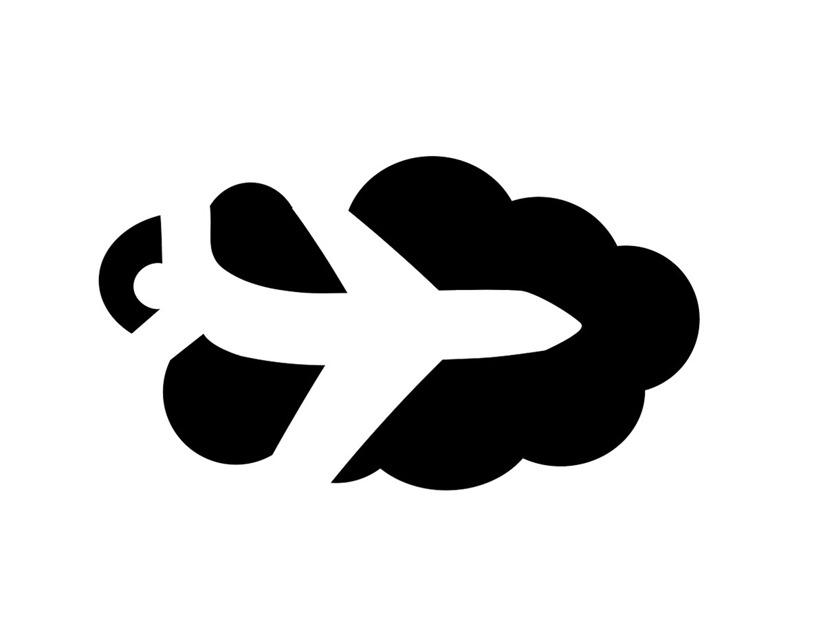
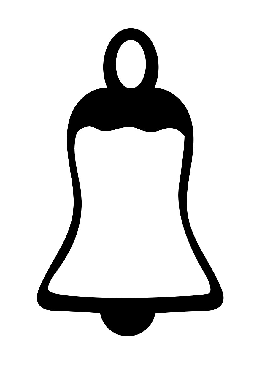
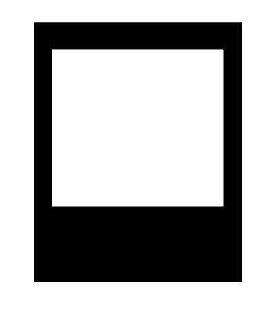
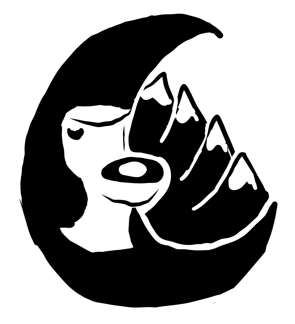
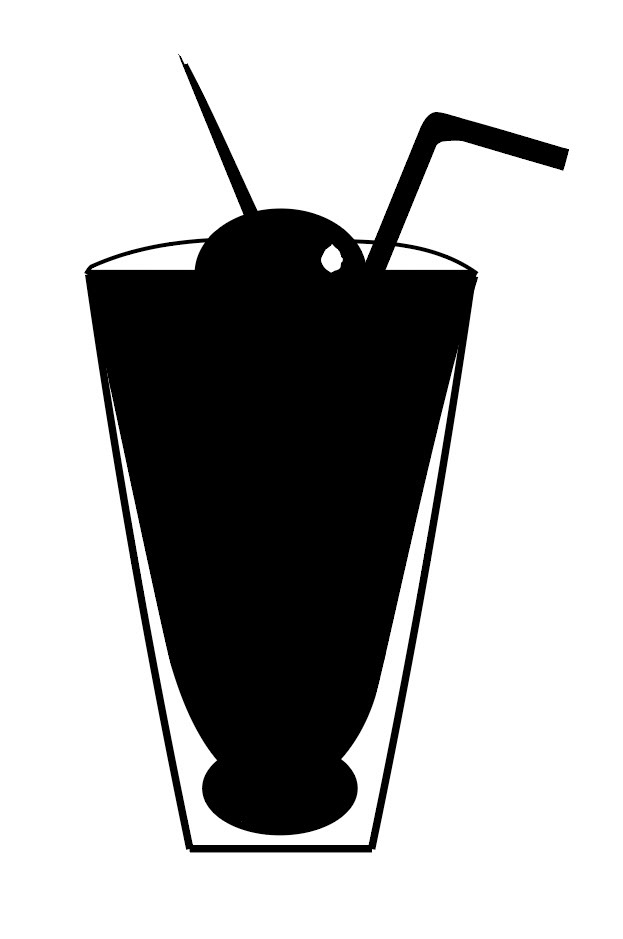
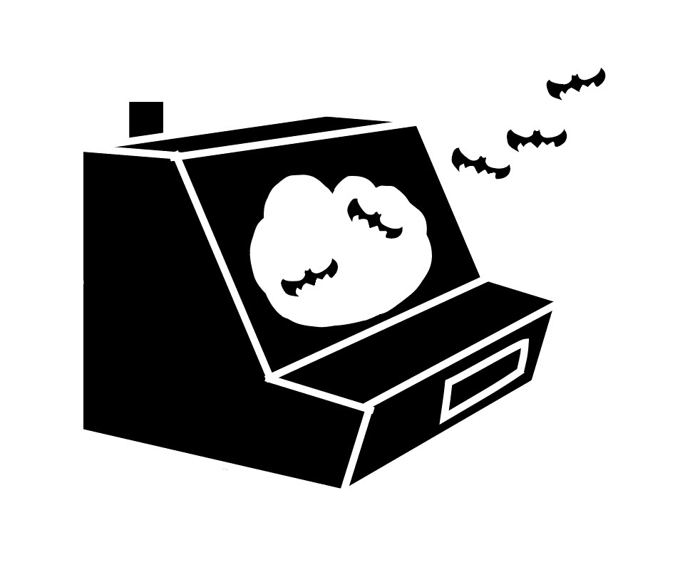
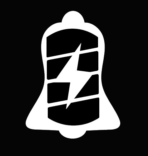
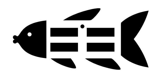
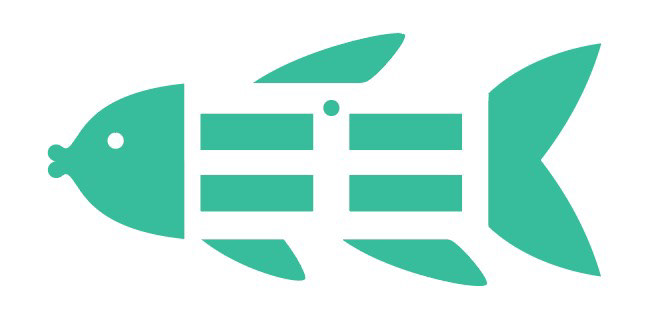
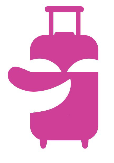
Finalized Icons Black & White
It went through a final revision that simplified it even more. I removed the outline of the toilet paper roll and put fewer lines to represent the moving water. I even widened the space for the mist from the falls. These changes and innovations improved the quality of the design for the outdoor restroom. I applied this creative thinking to my other word pairs as well. Where you can see how they progressed from sketches to finalized icons.


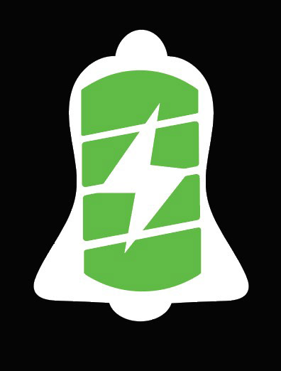
Finalized Icons Color


Ending Thoughts
This project taught me that less is more. Each revision I did focused on removing detail. I also learned the value of symmetry. Icons must be clean and simple, and symmetry allows you to create a clean and refined design. Finally, I realized the significance of negative space. You can create an engaging and meaningful icon by using it thoughtfully and creatively. Because of this project my ability to simplify complex ideas into recognizable and understandable icons has strengthened.